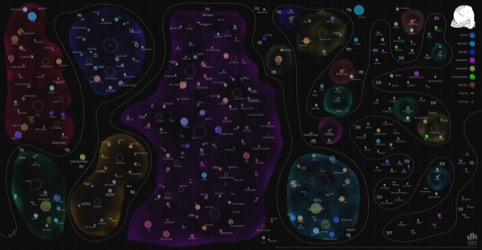
A map of the digital universe
A galaxy of digital consultancies has been mapped showing the relative sizes of different groups, clustered in solar systems and delineated by a time line.
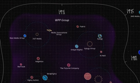
Neil’s Recruitment Company commissioned Jack Hagley to design and construct the infographic, which was a month in the making.
Director Neil Middlemass ‘knew exactly what he wanted,’ according to Hagley, who set about designing and executing the map which required 300 planets to be made.
It took Hagley to the limits of the universe ‘and the physical limits of what an illustrator can do. When there are so many items on the board, it pushes things off the edge and crashes,’ he says.

The Neil’s Recruitment Co brand features a lot of hand drawn assets so Hagley says he ‘looked to get a hand drawn inconsistency into things – particularly the line weight.’

Data/tech, digital, media, mobile, search specialists, and social media specialists are all represented and colour-coded by type, which is another way to read it.
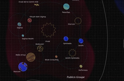
To see the chart in full – it’s quite large – head to: http://www.neilsrecruitment.co.uk/digital-agency-star-chart-ppc-seo-the-universe-everything/
Read this next

-
Post a comment


