Absolut Vodka unveils new-look bottle
Brand Union has worked with a calligrapher and an engraver on the design of the new bottle, which has also changed structurally and sports a new “A” icon.

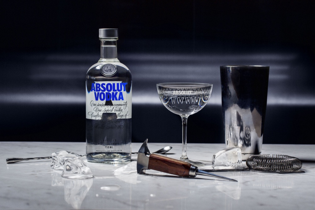
Absolut Vodka has unveiled a new bottle design which incorporates a new two-line logo, new script and redesigned medallion into a new lighter bottle.
Brand Union, which overhauled the Absolut masterbrand last year, has overseen the project, incorporating some of the design cues it has already proposed.
On the front of the bottle the wordmark has been clarified and the strapline Country of Sweden, which used to appear in between the words “Absolut” and “Vodka” has been dropped so the identity appears on two consecutive lines.
On the reverse of the bottle a large “A” symbol has been introduced as a “signifier”, which in time Absolut wants to use as an icon in its own right.
Calligrapher Luca Barcellona has created a new script for the bottle, which is inspired by Swedish lettering but is also “cool, simple and modern” he says.
Illustrator and engraver Martin Mörck has redrawn the seal on the bottle depicting a portrait of Absolut founder Lasrs Olsson Smith. The final design is a “bold image which depicts Lars Olsson Smith at the height of his success,” he says.
Structurally the bottle is stronger with more “clearly defined shoulders”, a straightened neck and body and a flattened bottom. Less glass has been used to reduce its environmental impact.
The new look hits shelves in autumn and winter this year.


Not a huge fan of the calligraphy, a bit to Scriptina for me. I love the subtle serifs from the brand overhaul though. Refined and simple – and it works.