Blue Marlin overhauls J20 packaging
Blue Marlin has created the new look for Britvic’s juice drink J20 as the company looks to bring design in line with reformulated recipes.
The consultancy, which has worked on other Britvic brands, won a pitch for the project in February 2011.
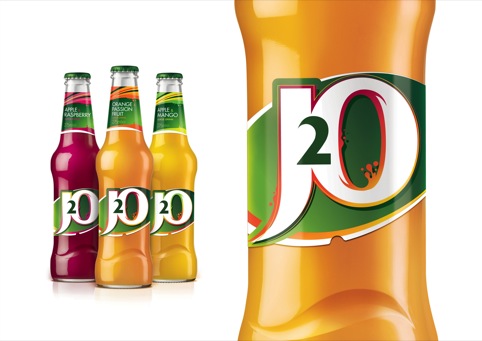
A brighter colour palette has been combined with ‘splash and drip detailing’ to communicate ‘fruit taste and liquid refreshment’ according to Blue Marlin.
A flat label background has been replaced with a gradient effect and shading which according to Blue Marlin London creative director Simon Pendry, ‘creates a new depth around the brand marque that increases its impact and embodies J20’s multi-dimensional fruit combinations.’
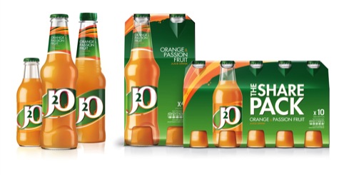
Blue Marlin’s 3D team has redesigned the 275ml bottle to appear ‘seemingly taller’ and an embossed wave on the front indicates that flavours are blended.
The new designs are being rolled out across core variants: orange and passion fruit, apple and raspberry, and apple and mango.
Read this next


My son is autistic, he cannot speak, uses limited signing and needs everything to be the same day after day. He likes J2O as part of his daily regime and drinks two every day. Whilst you couldn’t call this a major redesign it was sufficiently different for him to refuse anything in the new packaging and bottle shape. With careful retention and refilling we have continued to present him the old style packaging. We are down to (not very pleasant looking) old bottles. Has anyone got some obsolete apple and raspberry labels we could use to continue to meet his expectations