BrandOpus completes Twinings redesign
The consultancy has finished refreshing the design of the Twinings tea packaging portfolio, having recreated the classic and Earl Grey ranges with a brighter colour palette and more illustrations.
BrandOpus has completed its redesign of the Twinings tea portfolio, having just added the new look to the classic and Earl Grey ranges.
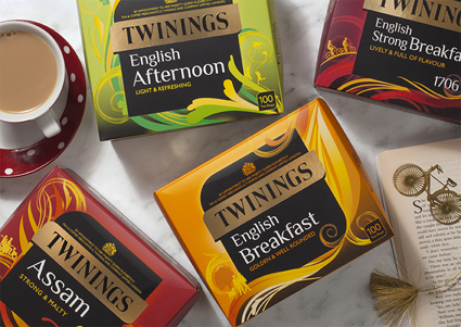
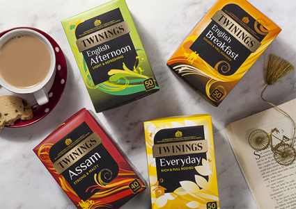
The design, which includes a brighter colour palette, more organic shapes and illustrations, was initially applied to Twinings’ range of 22 black blended teas in October.
It aims to make the brand more approachable for a younger generation.
The look has now been added to the “every day” range, including English Breakfast, English Strong Breakfast, English Afternoon, Everyday and Assam. It is accompanied by illustrations of “every day activities”, such as people walking the dog, with the aim of making the product more “relevant” for its audience.
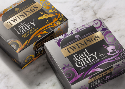
It has also been added to the Earl Grey and Lady Grey range, which aims to reflect quaintness and quirkiness by incorporating “tea-party inspired” illustrations.
Paul Taylor, executive creative director at BrandOpus, says that the design work will help to make Twinings’ range of teas “accessible and of today”.
The redesigned classic blend and Earl Grey teas have begun rolling out nationwide.


Another week, another Twinings’ redesign.