Chip Kidd on the power of the first impression
In this excerpt from Chip Kidd’s upcoming book Judge This, the US designer looks at how to use clarity and mystery to form impactful first impressions.
Learning to judge.
I am often asked: “What inspires you?”, then, “When you have a creative block, how do you unblock it?” First, the unhelpful answer is that I am inspired by just about everything, both good and bad. But when you have a problem to solve — whether it’s fixing a leak, or keeping deer out of your yard, or trying to mend a broken relationship — your inspiration, your first cue on what to do lies within analysing the problem itself. That’s where the origins of the solution can be found. As for creative block: my psychic Drano, so to speak, is my environment and the things and people in it. I am lucky enough to live and work in Manhattan, and when I’m stuck, I have only to walk two or three blocks in any direction in the thick of the city, and I’m constantly reminded of the resilience of humanity to create things in the face of impending massive indifference, and mounting expense. You see examples of design that astound (MoMA, the Chrysler Building, Central Park), some that are a disaster (subway passages too small for crowds, taxi off-duty lights, poorly demarked sidewalks suddenly closed for construction), and everything in between.
But you don’t need to be a New Yorker or a designer to appreciate how things are created and how they function in the world. You just have to be interested. And yes, you have to judge, often based on a first impression. Why not learn how to do it better?
When should you be clear?
That depends on the message you want to get across, and its nature. You should be clear when you need people to understand you immediately. You want others to be clear when you need vital and specific information — say, technical guidance for your computer or phone, or when you’re lost and you ask someone for directions. In either case, what is needed is clarity, and when it’s not there we all know the results can be very frustrating. Especially when your GPS cuts out.
A more extreme but not uncommon example is when you hear recordings of 911 calls on the news. I always think, “If I were taking the call, would I be able to understand what the situation is?” The answer varies, and of course the calls are usually made in moments of intense panic, but these are definitely situations when a person needs to be understood. If we apply this idea to design in our everyday lives, the examples start to become, well, clear: Highway signage. Instruction manuals. Alarm clocks. Emergency escape routes. Wedding vows. When decoration—a pretty facade, ornamentation, elaboration—really doeaasn’t matter at all, clarity is most needed.
Clarity is sincere, direct, reasonable,basic, honest, perfectly readable.No-nonsense.
But when it’s automatically applied to everything, things can get kind of boring.
Now, let’s look at the yin to this yang, and ask:
When should you be mysterious?
Ah, the allure of Mystery. And the fun of it. Or, if we’re not careful, the disappointment of it. Mystery is an extremely powerful tool; just ask Gypsy Rose Lee (kids, do a Web search) or the creators of Lost. You should be mysterious when you want to get people’s attention and hold it, when you want your audience to work harder—when, frankly, you have something to hide.
Mystery is: a puzzle that demands to be solved, a secret code you want to crack, an illusion that may not be an illusion at all, a dream you’re trying to remember before it fades away.
Mystery, it must be said, can also be terrifying: phantom pain, sudden change, irrational behavior, the loss of power. The threat of the unknown. In my own work, mystery is hugely important. I design covers for all kinds of books: fiction, nonfiction, poetry, history, memoir, essay, comics. Each demands its own visual approach. Sometimes I want the viewer to “get it” right away, but more often I want to intrigue him or her enough to investigate the book further (i.e., to open it up, begin to read it, and hopefully buy it).
I am going to show you by talking through some examples of objects and places that form my ideas about design and how it can work, or not.
Bite.

When I heard that one of my graphic design heroes, Peter Saville—the legendary designer for Manchester’s Factory Records (whose recording artists included Joy Division and New Order among many others)—was going to re-design the iconic Lacoste shirt crocodile (below), I was as surprised as I was delighted. Here were two of my favourite worlds: preppy clothes and postpunk music, colliding unexpectedly and deliriously head-on.
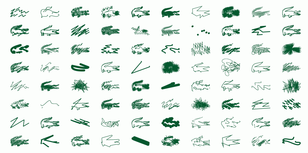
The original logo was created by French tennis star René Lacoste in 1933, when he decided to start a sport-shirt company with partner André Gillie. Nicknamed ‘The Crocodile’ for his tenacity on the court, Lacoste was thus inspired to make his mark. For its 2013 limited edition of the shirt, the Lacoste label hired Saville to reinterperet it, and he did so with inspired fervour. He generated 80 variations in all, commemorating the 80th anniversary of the company. These abstractions are recognizable because we know both the source material and the context: over the heart on a white cotton polo shirt.
First impression of the original logo: Cool metaphor. First impression of Saville’s variations: Even cooler.
How refreshing.
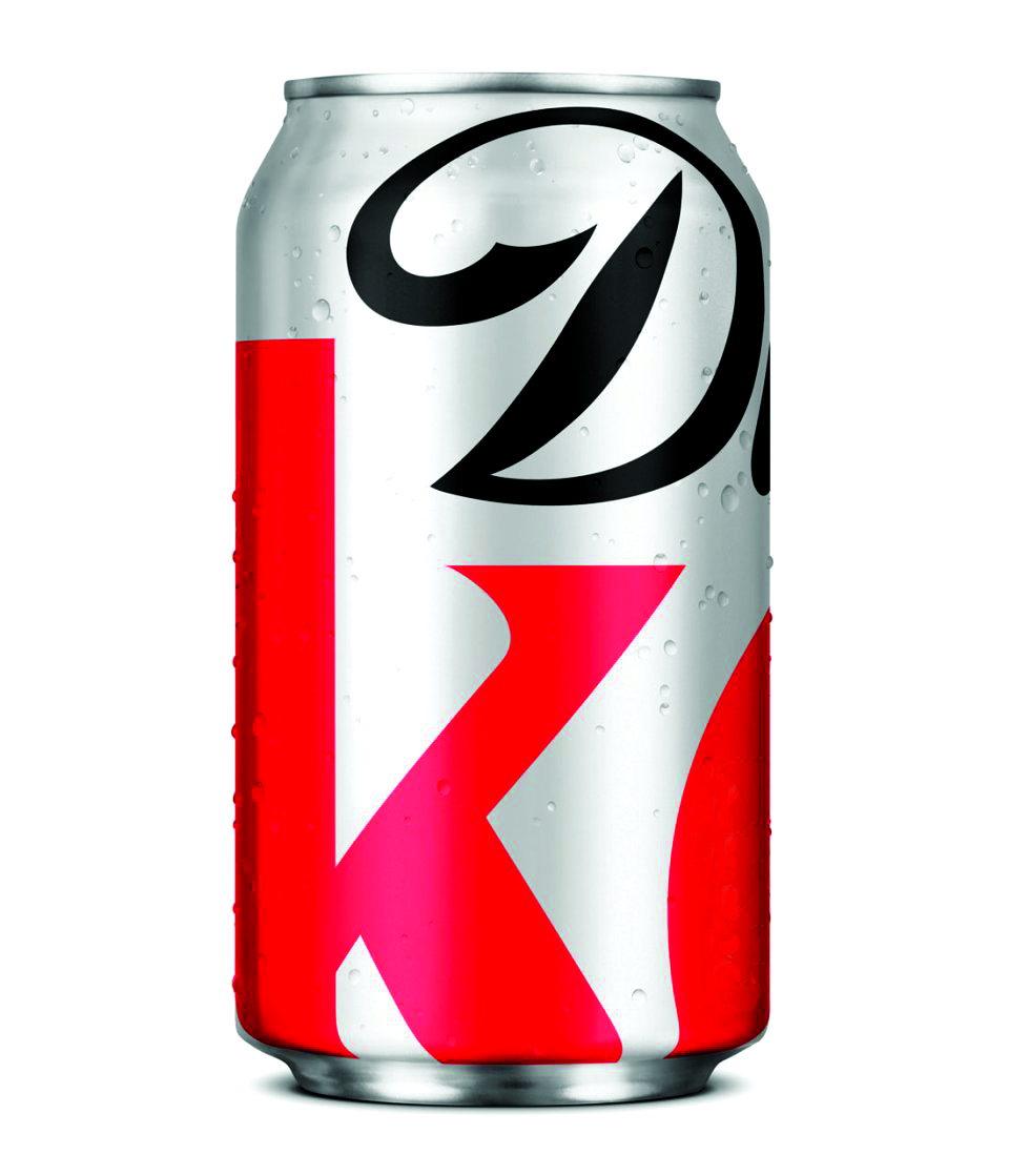
This re-design of the Diet Coke can is mysterious in the best possible way. Besides being formally striking, it assumes a level of intelligence and sophistication in its audience that is truly commendable, drawing on the principles of “Less Is More” as espoused by the architect Mies van derRohe. The visual vocabulary of the brand is reduced down to its most essential parts, and we understand immediately what we’re looking at, based on very little verbal information.
This is made possible by our decades-long familiarity with the logotype of the product and its application to a soda can. It’s a cherished friend in fabulous new clothes, a BBF’s make-over that you thought never could or would happen.
Truly great packaging.
First impression: Instantly recognisable, I don’t even need to be able to read it. Thank you for trusting me.
How much?
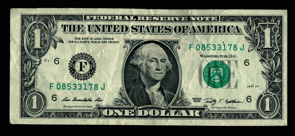
The clarity of the design of the dollar bill has been consistently effective for more than one hundred and fifty years, no matter how it has varied: the image of George Washington is just perfect as the representation of the birth of the United States and its currency: he can be trusted, relied on, and believed in (he can’t tell a lie!).
The two green tones (soothing, reassuring, earthy), the pre- cise engraving and stamping, the texture of the resilient cot- ton and linen paper in the hand that can withstand countless transactions—this is great graphic design that hundreds of mil- lions of people interact with every day.
First impression: In this we trust.
Can you read the top line?
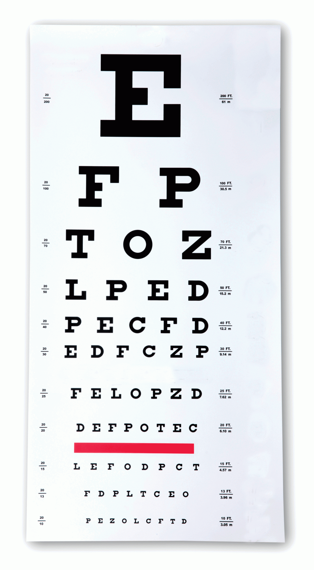
Eye charts — developed in the mid-19th century by Dr. Franciscus Donders and his colleague Herman Snellen in the Netherlands — fascinate me because they are meant to be read, but not in any conventional sense (out loud, without conveying coherent meaning). They start out extremely clearly at the top, and then get more mysterious line by line, depending on your eyesight.
Form and content are completely divorced from each other here, because if the letters spelled out actual words, it would be easier to cheat at reading what they are. Most examples, like this one, use serifs on the letters — the extra lines on the ends — to render them harder to make out as they get smaller.
This is a simple, inexpensive, and low-tech solution that has become visually iconic and is still in use after 150 years.
First impression: E! Now how low can I go?
Judgment at work.
Okay, let’s put our judgment to work. Here are some more examples of images and objects I see every day, but now I’ll show how I’ve applied them to solving design problems in my working life (mostly involving book covers).
I’ve found it important to be constantly alive to the possibilities in my environment; that way, everything becomes fodder for ideas.
You never know when something might be useful, even if it’s you . . .
The American People, by Larry Kramer (a novel about the history of the United States)
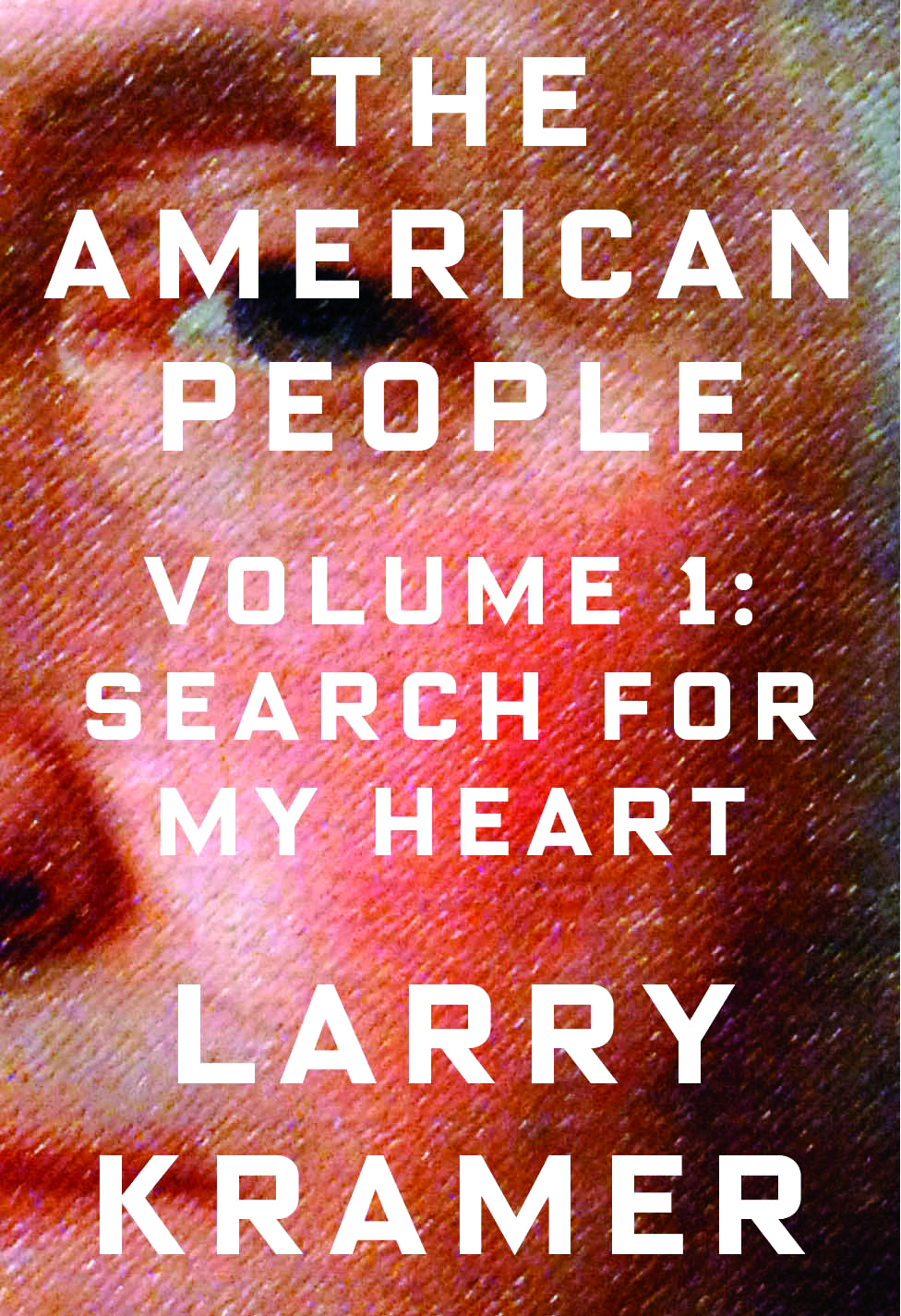
Larry Kramer’s searing fictional revisionist history of the United States includes a panoply of well-known figures, including George Washington, Abraham Lincoln, Malcolm X, Martin Luther King Jr., and many more. I chose to start at the beginning, with Washington, and take a detail of a famous portrait of him from 1796 by Gilbert Stuart. I was definitely influenced by the dollar bill, but I thought that by actually using that, this would look too much like a book about finance, which it definitely is not.
Even though the close-up is extreme, we know Washington’s face so well that, coupled with the book’s title, the viewer can easily put two and two together: this is going to be a new point of view on the American Story. The boldness and modernity of the typeface (Blender by Nik Thoenen) signals that this is a contemporary take on historical material.
The Mind’s Eye, by Oliver Sacks (a book about how eyesight works in the brain)
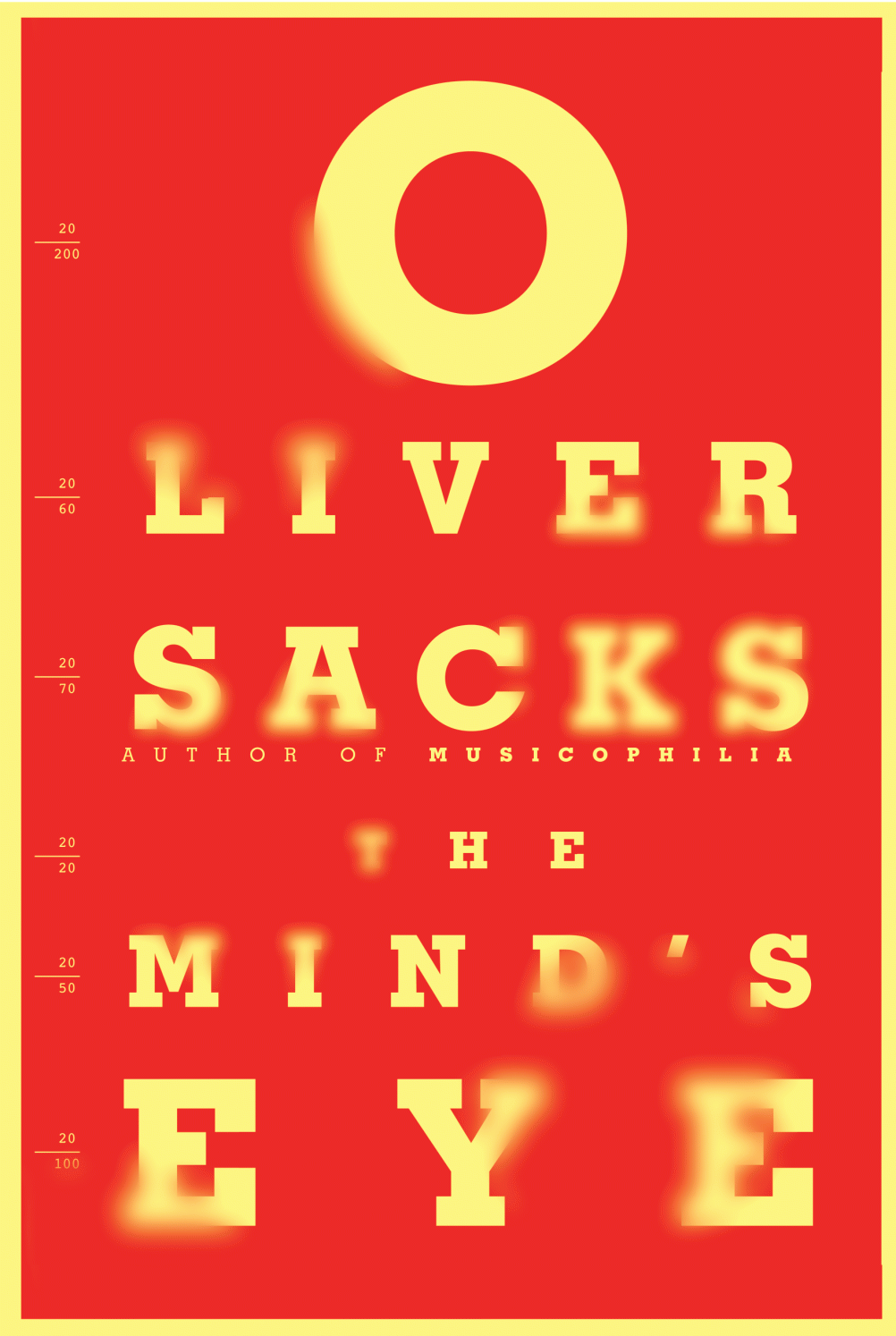
So the famed neurologist and writer Oliver Sacks goes to the eye doctor for his annual checkup, and the letters on the eye chart start to do funny things. Thus begins his exploration of visual perception in the brain, along with an investigation into the cases of six other extraordinary people who have learned to cope with extreme and often potentially devastating changes in their vision.
The visual vernacular here of an eye chart was a no-brainer (sorry), but what makes this different is the letterforms going in and out of focus to mimic Sacks’s experience. On a book cover, something like this has to be handled very carefully so that it remains readable.
And then there is the colour. My original design was much more muted, skewing to the generally monochromatic nature of the source material, but Oliver wanted something livelier, because the stories are actually about overcoming adversity. He was right: the iconography of an eye chart is so recognisable that it can easily withstand being rendered in bright red and yellow.
And its calling attention to itself on the bookshelf didn’t hurt, to say the least.
Excerpt from Judge This by Chip Kidd to be published by Simon & Schuster & TED on 4th June @ £7.99. Copyright © 2015 by Chip Kidd.
Read this next

-
Post a comment


