Creating limited-edition projects for the Queen’s Diamond Jubilee
The run-up to the Queen’s Diamond Jubilee in June is bringing with it scores of limited-edition branded products.
Designers are having to reconcile brand guidelines with national and celebratory imagery without being too kitsch or jingoistic.
Other hurdles include legality – no pictures of the Queen – and the fact that there are no official branded jubilee products.
One solution is to create non-specific national celebratory imagery, while avoiding muddling the statement with that other national celebration this summer, The London Olympics.
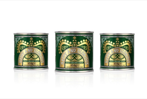
Design Bridge’s limited-edition packaging for Tate & Lyle’s Golden Syrup launches this week and the consultancy has done away with ‘Lyle’s Golden Syrup’ in favour of ‘Happy and Glorious.’
The 19th-century brand, which was founded under Queen Victoria’s reign carries a royal warrant, and Asa Cook, design director of Design Bridge says there was scope to ‘avoid any jingoistic or cliched connotations’ and instead look to ‘the emotional aspect and a sense of community.’
Cook says ‘Some of the icons for these events are obvious. I don’t want to write in huge letters Jubilee. It’s important to celebrate without being seen as jumping on a band-wagon’.
Detail from the brand’s filigree style rendering have been applied to a crown design and the logo arch ‘seamlessly blends’ the new Happy and Glorious language, says Cook.
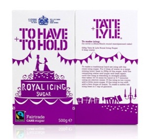
The project follows Design Bridge’s To Have To Hold Royal Icing Sugar Work for Tate and Lyle last year in the run-up to the Royal wedding, where the consultancy again built a design around playful language and consumer familiarity with the brand.
Hornall Anderson’s Jubilee edition of Marmite – or Ma’amite as they’ve branded it (geddit?) – takes a similar route, conveying occasion and ceremony, with the tag-line ‘Toasting the Queen’s Diamond Jubilee.’
The colours have been changed to red white and blue and a reference made to the national flag ‘in a way which doesn’t detract from the brand power, yet still honours the celebration,’ says Hornall Anderson design director Matt Gandy.
‘With other limited editions we’ve done for Marmite, the design has been led by the change in flavour – like Guinness, or champagne, but this time we’ve got Union Jack and crown equities to play with as well,’ says Gandy.
The crown has been played with very carefully mind, within guidelines set by the The Lord Chamberlain’s office.
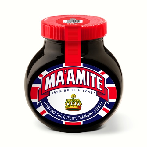
‘You can’t use the Queen’s crown, coat of arms, or lots of other personal imagery, so we’ve redrawn the crown in a more “Marmite” way,’ says Gandy.
These designs will soon be joined by many others. Brandopus has already delivered Jubilee packaging for Twinings tea and is currently working on no less then four separate jubilee briefs for other companies. Roll out the bunting, and the barrel maybe.
Read this next


Neat ideas – love’em