DC Comics unveils new identity
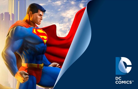
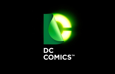
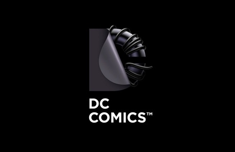
Landor has created new identities for DC Comics, the publisher of Batman, Superman and Wonderwoman, as well as its parent group DC Entertainment.
The new branding has been developed by the Landor San Francisco office.
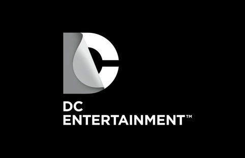
In both identities the DC element has been given what DC Entertainment calls a ‘peel effect’ – placing the D over the C, with a page-like reveal.
Nicolas Apariacio, executive creative director at Landor San Francisco, says the new identity is ‘dynamic and provocative’ and forms a ‘living expression which changes and adapts to the characters, story-lines and ways fans are consuming content.’
He adds, ‘The new identity is built for the digital age, and can easily be animated and customised to take full advantage of the interactivity offered across all media platforms.’
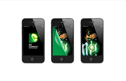
A roll-out will begin in March with new identities appearing on comic books, graphic novels and websites before DC Entertainment products are updated, including, film, television, interactive games and merchandise.
Read this next


Don’t like it. Not one bit. I love the current logo—I liked it from the first moment I saw it. I thought it was perfect for DC’s identity. This new logo makes DC look like a wanna-be architectural firm. I hate it and it’s a big turn off for me.
Nice idea, the peeling back bit; I like the reference to the pages of the comic and I can understand its versatility. But I can’t help thinking the final solution leaves something to be desired. The peeled plane is too thin; next to the muscle-bound Superman (and any superhero for that matter) it looks completely inappropriate; it should look ‘unpeelable’. It’s the visual equivalent of saying ‘Use the Force, Luke’ in the voice of Charles Hawtrey! And if it had been peeled back, as is implied, why is the corner rounded off? All too soft, which is what superheroes aren’t.
Not sure enough thought’s gone into the font, either, although its simplicity is right; maybe it could have had some kind of very subtle distinctive ‘DC comic-ness’; perhaps one or two letters could look like they’d sustained some collateral damage from a fight between a villain and a DC character -would have to be very subtle, like a dent or a piece chipped off the ‘D’ and ‘C’. Or something…..
I agree, If it aint broke dont fix it. I too consider the original brand to be iconic.
The new logo looks like a logistics company.
I like the logo as a whole. But it does feel too soft with use of the peel – almost like it’s part of a water drip when blue.
I love the ability to use just DC-CO for recognition.
I think the main problem with this is that I love the old one and the amazement it gives me to see the production reel before a movie starts.
Is it me or does it look like it belongs on a children’s tv network?