Design Studio’s Olympic posters
As Great Britain’s Olympians re-enter the headlines by dominating the BBC’s Sport’s Personality of the Year award shortlist, here is a graphic reminder by Design Studio of Team GB’s achievements.
A set of London 2012 themed prints inspired by ‘the purity and strong visual identity of the Olympic medals’ have been designed by the studio’s creative director and co-founder Ben Wright.
What started out as a personal project soon had the backing of the studio according to Wright who says, ‘Initially, I wanted to create something that commemorated the success of the London 2012 games. However, when both prints were finished, we felt that selling them to raise money for charity made sense.’
The design itself is a simple formula – ‘Information combined with design to create art,’ he says.
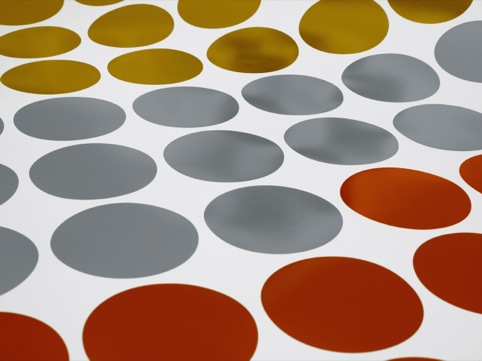
Foil blocking the posters presented technical difficulties as failure of the foil to adhere in any one of the medal areas makes the sheet redundant.
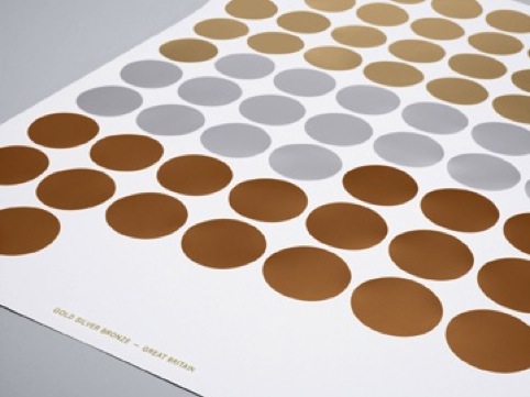
The foil blocking was produced in six different dyes to accommodate both the large dimensions of the sheet and the number and size of the foiled medals.
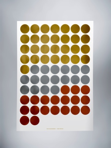
Gold Silver Bronze – Great Britain poster shows Team GB’s medal haul at the games and is available as a three colour screen print in metallic ink, on Accent Smooth Glacier white measuring 100x70cm, priced £50, or foil blocked for £100.
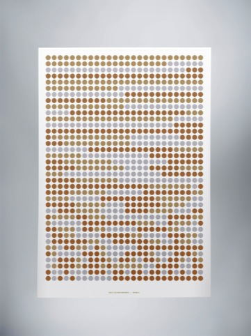
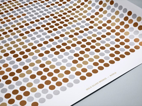
Gold Silver Bronze – World shows the number of medals won by all teams, in order of winning country. Each medal is actual size, (85mm).
This poster is also available in metallic ink or foil blocked and all posters, which are limited to a run of 100 are available from http://designstudio.bigcartel.com/
All profits from sales go to charity Access Sport, which looks to give children more access to local sport
Read this next


Sorry but this really is another example of totally dead boring treatment… reflects nothing of the value and achievement – really sucks and could have been designed by an Olympic park car park attendant… no dis intended to the car park attendant.
NGS
I like it—very striking. It’s a shame that it is identical in concept to the cover of UK Sport’s 2008 Annual Review (http://www.uksport.gov.uk/publications/annual-review-2008), right down to the chronological medal order and use of foil blocking.
I think Nick is being a bit harsh. It’s about getting off ones back side and making things happen – nice job Design Studio.
That said, ‘out of the starting blocks’ are very apt here as I got this in my inbox the morning after the closing ceremony back in August 2012.
I think these guys took the idea a little further…
http://goo.gl/Io9sft
Nice ideas are nice ideas. Period.