Good design that gets right in the face of Government
Awards like the Design Museum’s Design of the Year scheme generally throw up the issue of how difficult it is to objectively judge design.
Witness last year’s victor – Barber Osgerby’s London 2012 Olympic Torch. A beautiful object no doubt, but really the best design from that year, or simply the most impactful?
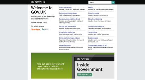
But this year’s winner – the Government Digital Service’s gov.uk website – is surely a worthy one.
This is a project that cuts costs, makes life easier for millions of people and is relentlessly user-focused.
It is the latest in a long and distinguished heritage of key British public design projects, from Harry Beck’s Tube Map design, through Calvert & Kinneir’s motorway signage to Sir Kenneth Grange’s Intercity 125 train designs.
Indeed, the project explicitly fits into this lineage. GDS head of design Ben Terrett tells me he was inspired by a visit to the Design Museum’s Kenneth Grange exhibition shortly before accepting the job, and when he was designing the site he even went as far as bringing in Margaret Calvert as an unofficial ‘mentor and critic’.
But, for the design industry, the most important aspect of Gov.uk is that it is an example of good design that gets right in the face of central Government. How many other award winners get a press release quote from the Prime Minister extolling their virtues?
As David Cameron says, ‘This is just another example of Britain’s world-class design talent standing out on a global stage.’
You’re right Mr Cameron. This is what good design looks like, and the estimated £1.8 billion a year savings are just one of the many things it can achieve.
Gov.uk has shown the Government what good design is, and proved what it can accomplish. Now the coalition has no excuse not to support the good that the design industry can do.
Read this next

-
Post a comment


