Hewlett Packard Enterprise launches new identity following HP split
Hewlett Packard Enterprise chief executive Meg Whitman describes the new identity as “different”, pointing to the colour choice and move to connect the two Ts in the wordmark.
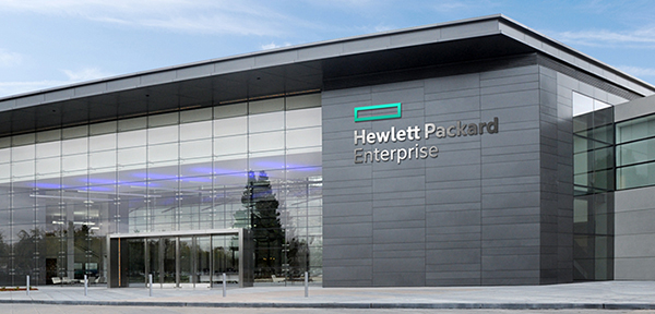
Hewlett Packard Enterprise – one of the two companies formed by the split of tech giant HP – has unveiled its new identity.
Last year HP announced plans to split the company. It is now reforming as two separate independent groups – Hewlett Packard Enterprise, which will deal with corporate hardware and services, and HP Inc, which will comprise the company’s computer and printer business.
Hewlett Packard Enterprise president and chief executive Meg Whitman says the company was aiming for a “singular and defining” identity that would “stand out among our customers”.
The new identity uses a green rectangle above a wordmark. Whitman says: “The colour we picked is no accident. I wanted us to stand apart… It’s different, I know.”
Whitman adds that the two Ts in the Hewlett Packard wordmark now connect “for the first time in our history”. She says: “That connection is symbolic of the partnership we will forge with our customers, partners and our employees.”
Whitman says: “To bring our ideals to life, we needed a logo and a design system that would be singular and defining. We needed a design that would express our renewed commitment to focus and simplicity.
“And we needed a logo that would be as transformative, flexible and agile as we are becoming, while standing out from the pack. Finally, the logo needed to work across all the ways we would use it.”

Read this next

-
Post a comment


