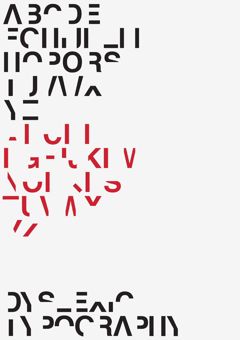
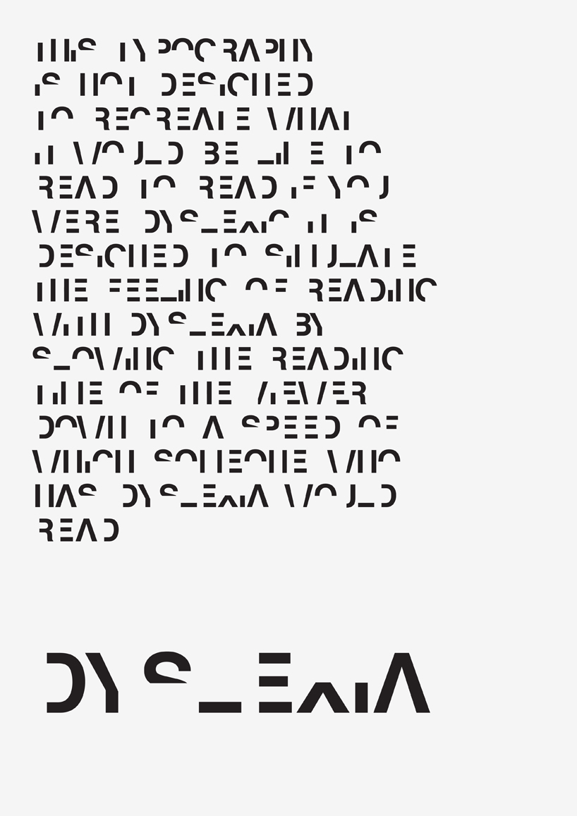
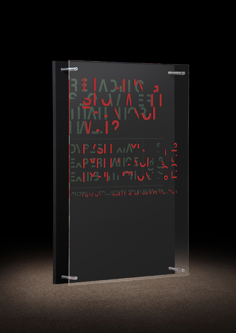
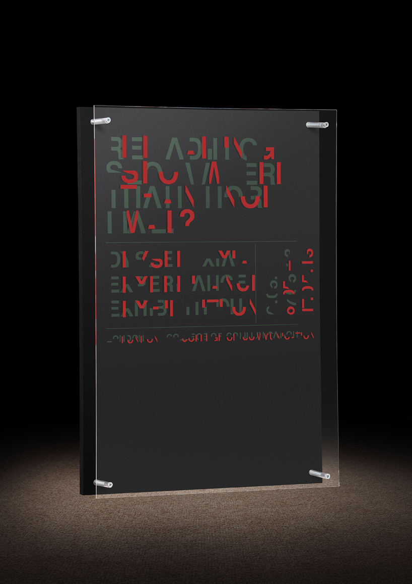
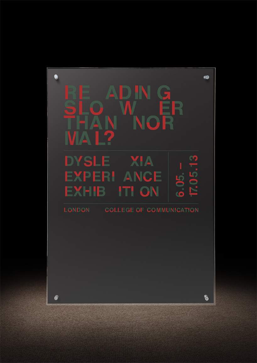
Dyslexia typeface, by Daniel Britton
Designer Daniel Britton has developed a typeface which aims to replicate the reading experience for people with dyslexia.
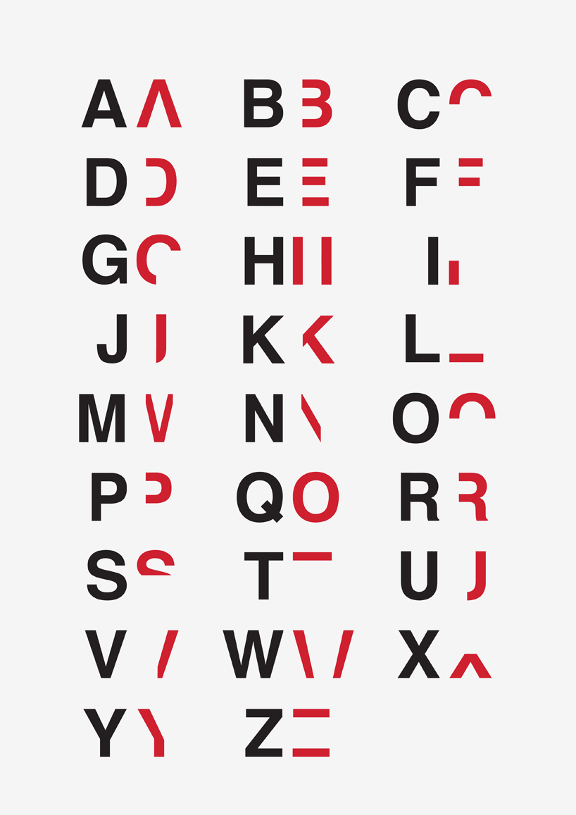
Britton says: “What this typeface does is break down the reading time of a non-dyslexic down to the speed of a dyslexic.
“In 2D the type is split into two and only one section of the type if revealed, just enough for you to eventually piece it together.
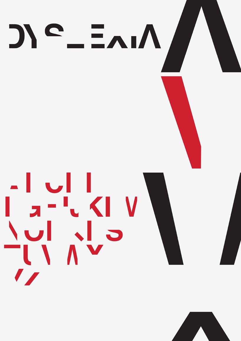
“in its 3D form both sections of the type are there, one placed directly on top of the other which is perfectly legible from front on, but the moment you move to either side or you view the poster from above or below the type breaks to which you have to physically move yourself to read the text.”
The designer, who is dyslexic himself, says: “I wanted the viewer to have to work to read something so simple as a poster and it is this feeling of work, aggravation, effort, stress, embarrassment that recreates the feeling of reading with the condition.”