Joe Delucci’s gelato branding, by Aesop
BESbswyBESbswyBESbswyBESbswyBESbswyBESbswyBESbswyBESbswyBESbswyBESbswyBESbswyBESbswyBESbswyBESbswyBESbswyBESbswyBESbswyBESbswy
![Delucci_group_lo_res[2]](https://s3.eu-central-1.amazonaws.com/centaur-wp/designweek/prod/content/uploads/2015/07/Delucci_group_lo_res2-1002x668.jpg)
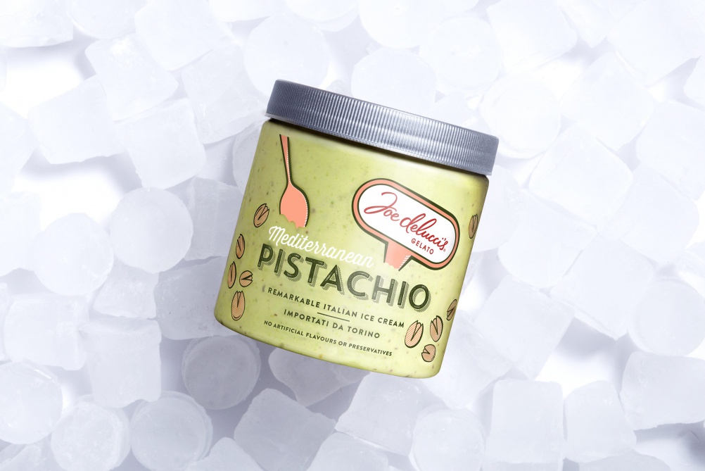
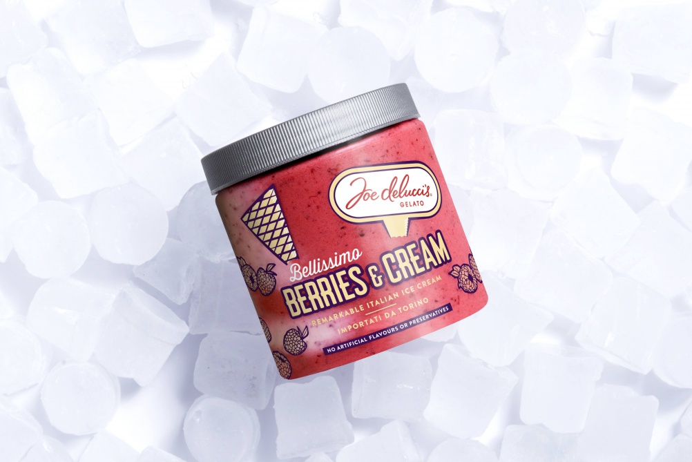
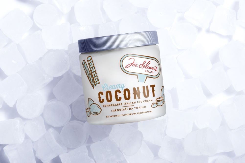
Aesop has redesigned the packaging for Italian gelato brand Joe Delucci’s.
The consultancy has aimed for a “pared back” look, using clear packaging to “hero” the product itself, it says.
The three flavours – coconut, berries & cream and pistachio – use individual typefaces and imagery, but incorporate a consistent graphic device of the logo, shown as a label “stuck in” the gelato.
Danii Kedik, lead designer at Aesop, says: “The clear plastic tubs are unique, with most brands in the category opting for paper tubs – we wanted to create a brand that looked premium yet playful.”
The redesigned packaging is being rolled out across selected supermarket shelves.
![delucci_copy_close_up_lo_res[1]](https://s3.eu-central-1.amazonaws.com/centaur-wp/designweek/prod/content/uploads/2015/07/delucci_copy_close_up_lo_res1-1002x669.jpg)