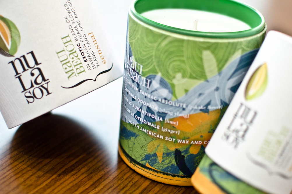
Nula Soy candles branding, by Visual Sense
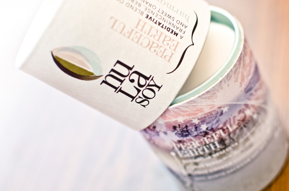
Visual Sense has designed the branding and visual identity for new soy wax candle range Nula Soy.
The consultancy intended the logo to have a “natural, organic character”, so aimed to create one that looked simultaneously like a seed and a flame.
“As an identity it’s quite fluid and adaptable,” says Stacy Douch, senior creative at Visual Sense. “The left-hand side of the marque always carries the main brand colours – brown and green to reflect the organic qualities of the brand. The colours on the right-hand side of the marque are matched to the fragrance colour.”
Illustrations have also been created to demonstrate the fragrance of each candle visually, “both literally and metaphorically”, says Douch. “For example, with Maui Beach we included illustrations of both the Pikake flower and also the moon as this is the time of the day when the flower’s fragrance is released,” she says.