Tåpped packaging, by Horse
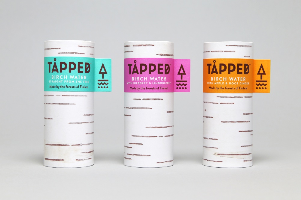
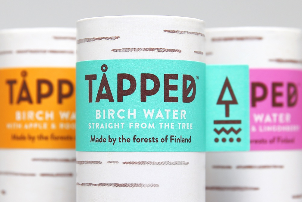
Design studio Horse has created the brand identity and packaging for organic birch water brand Tåpped.
Birch water is a traditional drink in Finland but a new concept for consumers in the UK, the consultancy says.
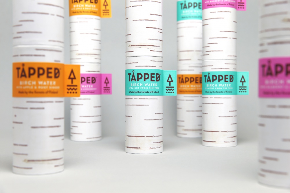
Ian Firth, creative director at Horse, says: “Clarity of product communication was therefore paramount, so we used the packaging structure to our advantage. To help communicate provenance, the water is packaged in a cylindrical paperboard can which we designed to resemble a real birch tree. This helps overcome some of the challenges of communicating an unusual new product, but equally distinguishes the water from other beverages.”
The fully recyclable can is made from 75% wood sourced from sustainably managed forests.
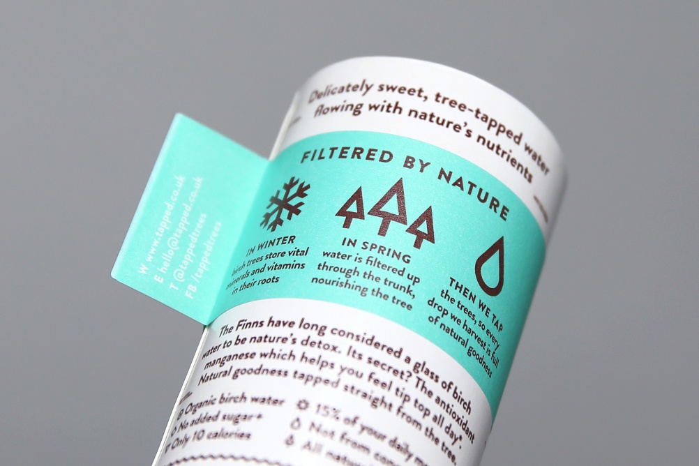
Horse says: “The packaging ‘tree’ design is further reinforced by using a secondary branded 360º wrapped label, a reference to tagging of young saplings.
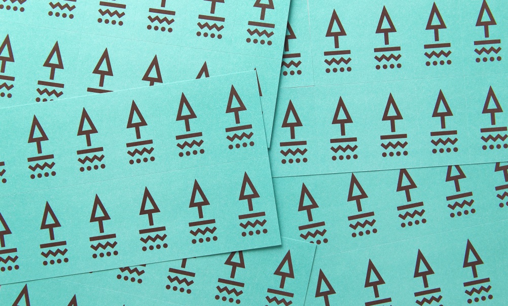
“The brand logotype and motif nod to the water’s Nordic roots by referencing Norse iconography, and the motif helps tell the story of how the sap travels up the tree by doubling as an upwards pointing arrow.”
