Why record sleeves are the “perfect” design format
To mark Record Store Day on 18 April, we ask designers including Paula Scher, Michael C Place and Stuart Hammersley why they think the vinyl format has stood the test of time.
Design Week: Why do you think the vinyl record is such an enduring format?
Stuart Hammersley, creative director, Give Up Art: Firstly, vinyl records last for years— I have records I bought 25 years ago, records I buy now that are 40-odd years old, that still sound fantastic today. I can’t imagine CDs or MP3s holding up that well. And because it was such a massively popular format there’s just so much stuff out there to discover that can still surprise and delight you – crazy music, or wonderfully odd, imaginative sleeves. There’s also just something innately pleasurable in handling and playing records. That combination of the physical artefact, the music and the artwork means that a record just occupies a bigger piece of your memory and experience than digital music – whether it’s the memories associated with an old record or the excitement of playing something brand new.
Paula Scher, partner, Pentagram: I think it’s the size. They are real objects with scale and dimension and made with specific materials. CDs always felt like a fake version of the original.
Andrew Heeps, founder, Art Vinyl: It’s quite simple: the level of pleasure that you’re going to get from buying a record is far greater than that from a download, because of the inclusion of work and the sound quality. The listening experience with a vinyl record is a commitment – you commit time to listen to that record, and read the record notes and the inner sleeve as a celebration of that perfect format. The digital format becomes wallpaper.
Paul Pensom, founder, Studio Pensom: There are numerous reasons — a record comprises a happy union of generously-sized artwork, rich warm sound, tactile format and, despite what the naysayers believe, surprising durability.
Michael C Place, founder, Build: Like a life raft in this increasingly digital world of streaming and downloads, the record sleeve is a reminder of the physicality of music. It’s all about the ritual — taking the record out of its sleeve, placing it on the turntable, dropping the needle, poring over the sleeve as the record plays. Nothing beats this.
DW: Why do you think it is such an attractive format for designers?
Paul Pensom: Because of its purity and simplicity — it’s just a large square housing a large circle. It can be rediscovered and reinvented in perpetuity, like an artist’s canvas.
Andrew Heeps: I speak to a lot of designers and it comes back to that same thing of a record cover being the perfectly sized canvas to create intrigue and to venture further into what the music is about. Any smaller – a CD for instance – and any work that the designer is doing immediately becomes less significant, particularly if they’re doing quite intricate designs. There’s also got the back cover and inner sleeves with records, which provide an opportunity to take the front cover lead design to another level and further the creative process – I’ve seen glow in the dark record covers before.
Stuart Hammersley: It’s the size and the possibilities I suppose – all that space lets you make an impact with the design, or be subtle and explore scale and composition much more. It’s harder to do anything that impactful with the CD format – unless you can experiment with different materials or special print processes. Plus, with vinyl there are multiple surfaces – the front, rear and inner sleeves, gatefolds and labels, even the vinyl itself – that really lets you play around with different elements, and how they are revealed. It’s by far my favourite kind of music packaging to design.
Michael C Place: I don’t think it’s about the format per se – it’s the music contained within the sleeve. When I left college in 1990 all I wanted to do was design record sleeves. It was the cool job: everyone wanted to be the next Peter Saville, the next Vaughan Oliver – I know I did anyway. Some people might say it’s easy but it’s not: to try and capture such an abstract concept as music and give it a visual identity is hard. Back to the question, why is it attractive? Simple: it’s music and design – the marriage of two of the most beautiful art forms.
Paula Scher: There are 12-inch record covers that open up called interpacks – they open up to be 24-inch posters. Scale matters – there is room for everything, room for play. Someone can listen to the album and read the lyrics and the liner notes, or look at images of the musician, or complicated artwork. They can do all this while they are listening to the music. It creates a memorable, total experience where the graphic design of the album cover becomes an integral part of the music and is associated with that music forever.
DW: What is your favourite record sleeve of all time and why?
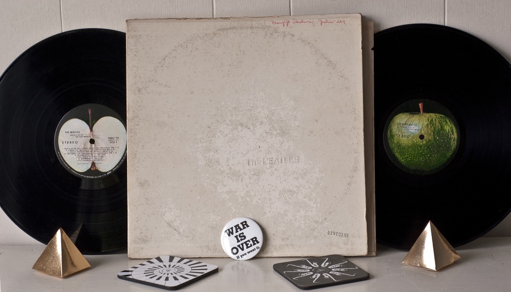
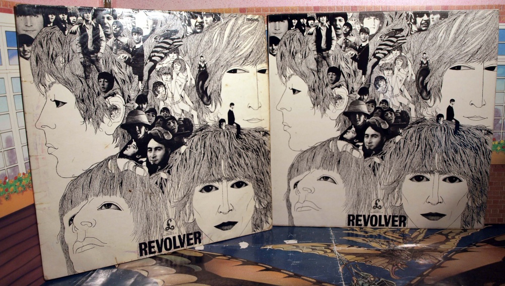
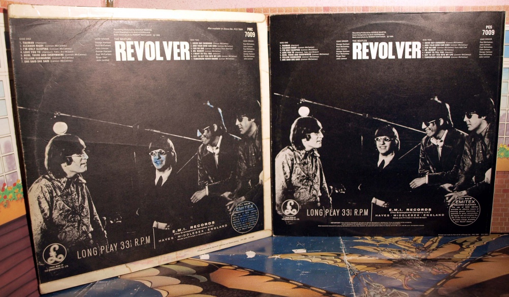
Paula Scher: I have three and they are all Beatles album covers: Revolver, Sgt. Pepper’s Lonely Hearts Club Band, and the White Album. I have learned so much about graphic design from those three covers. Revolver taught me about complication and obsession in illustration. Sgt. Pepper taught me about the power of pop cultural references, surrealism, and the beauty of perfect execution. The White Album was the ultimate concept cover and something only the Beatles could do because of the scale of their popularity.
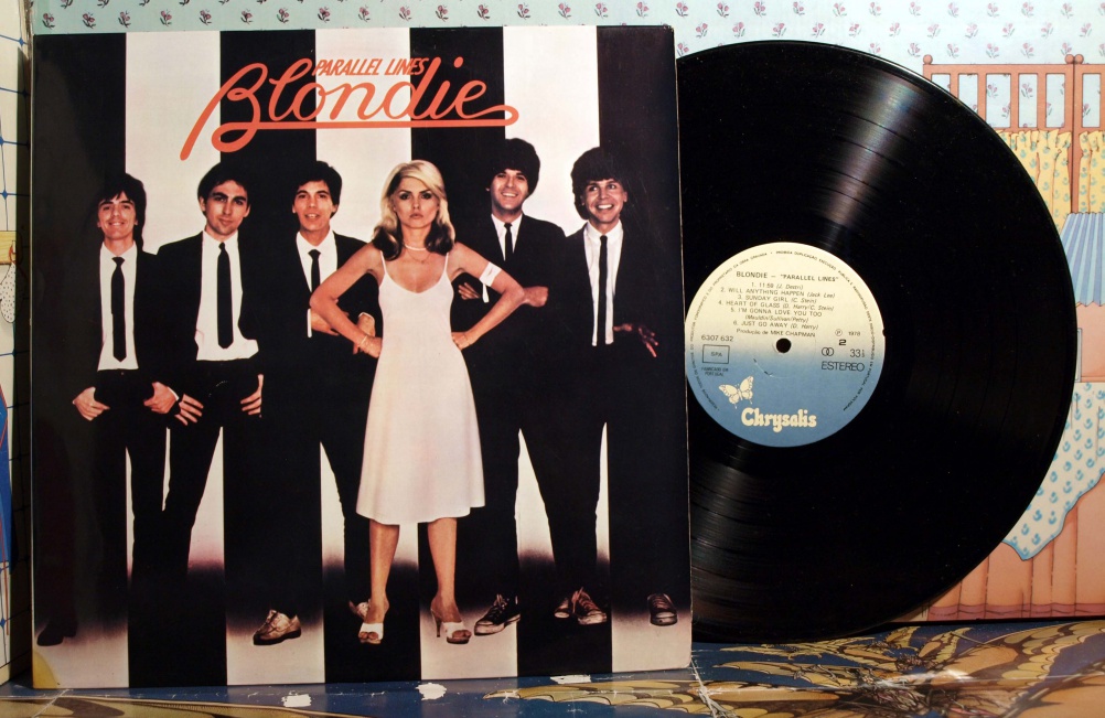
Andrew Heeps: Blondie’s Parallel Lines. Probably because I was 10 years old when it came out and the only graphic representation I had of that band was the album sleeve. There’s a bit at the bottom of the artwork that has everyone’s shoes on it and you have to work out which shoes belonged to each member of the band. There weren’t countless YouTube videos. Nowadays, you have all the additional stuff – it’s a difference in time as much as anything else.
Paul Pensom: That’s a very tough question! I’d probably have to go for something from Blue Note by Reid Miles — surely one of the most consistently excellent sleeve designers of all time. Which to choose though? How about It’s Time, by Jackie McLean from 1964. Nods to Op Art are evident here in a typically bravura piece of typographic play.
Michael C Place: To narrow it down to just one is impossible. One of my many favourites is the first album by Ultra Vivid Scene on 4AD designed by Vaughan Oliver. It features a picture of a toothbrush part obscured by duct tape (which is embossed). The back cover is really beautiful – there’s no track list and the spine is repeated over half of the cover. When it came out in 1988 it blew me away, but to be honest most of Vaughan’s sleeves did that (I wrote my thesis on his work). It looks super abstract but completely captured the music within. It’s a masterful piece of visceral graphic design.
Stuart Hammersley: Sorry, I can’t name just one – that’s way too hard, and it changes frequently. But today, Fucked Up Inside by Spiritualized comes pretty close – it’s a live album recorded at the Albert Hall in 1997. The cover features a green and red solarised shot of the stage, with the guitar effects pedals 3D-embossed in silver foil. There are no design credits given on the sleeve, but it’s psychedelic and beautiful.

Read this next

-
Post a comment


