The Design Week Awards 2016 – the winners in full
All of the winners from the Design Week Awards, project profiles and reaction from the judges.

Best of Show
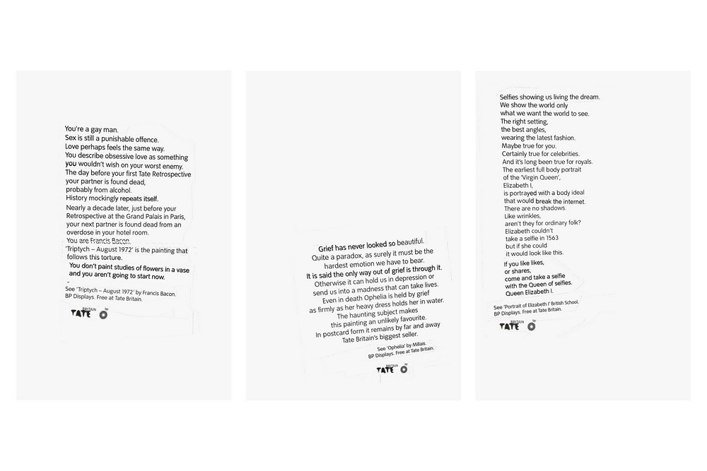
This campaign by Grey London for Tate Britain saw three simple posters created using only copy to help readers imagine three works of art from the gallery.
Its intent was to resonate with a modern audience and intrigue them enough to visit the works in person.
The posters ran on the London Underground, in press and on the Tate website, in addition to free postcards of the ads, which could be picked up from the gallery.
Each of the paintings described in the texts features in BP Displays, Tate Britain’s permanent collection.
Grey London’s Pete Gatley, Jonas Roth and Rasmus Smith-Bech wrote the texts, which refer specifically to Steven van der Meulen’s Portrait of Elizabeth I (c.1563), Francis Bacon’s Triptych from 1972 and John Everett Millais’ 1852 painting of Ophelia.
Love, grief and self-reflection are put into context and the words are presented in a way which corrupts the Tate font. The text’s fractured and distorted form only serves to make it more thought provoking however.
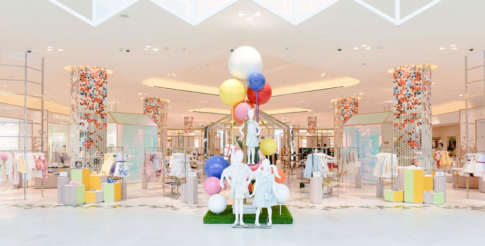
Identity Design
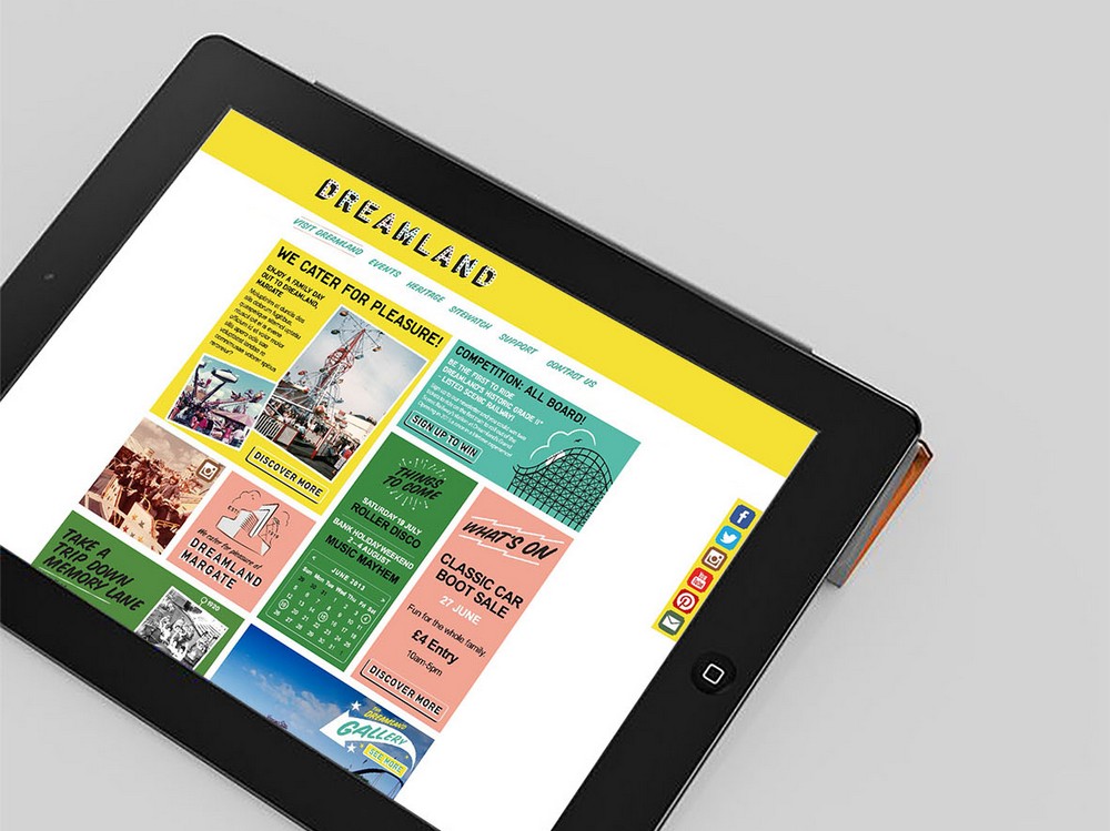
Winner: Dreamland Margate Identity by HemingwayDesign
HemingwayDesign was appointed by The Dreamland Trust in 2011 to develop a vision, create a brand, tone of voice, and lead on the full design proposition for a re-imagined Dreamland amusement park in Margate. The consultancy says: “With the brand we spent a long time creating something that addressed the history, but something you couldn’t quite place. It feels seaside, it feels pleasure park, but it is screamingly of the now.”
The judges said: “A design, which manages to reconcile the past and the future of the park, while not forgetting its sunny, seaside outlook.”

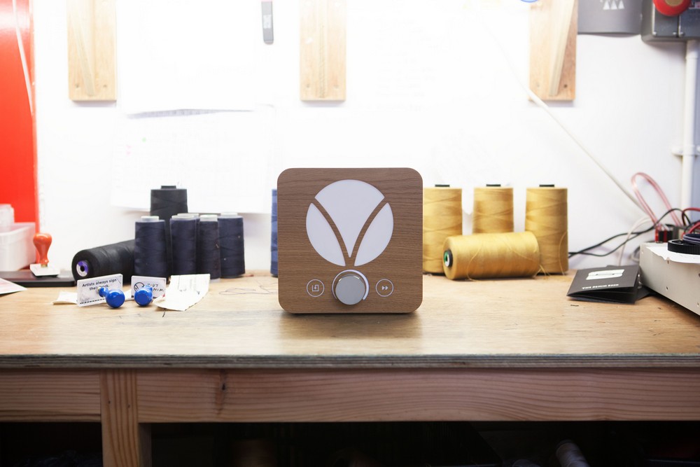
Product Design – Consumer
Winner: Junior Amp by Paul Crofts Studio for Audioberry
UK brand Audioberry was looking to disrupt the market by introducing a super high quality amplifier that you can buy direct from the manufacturer. The design concept was to create an amp of superior quality with a lifetime of use. Paul Crofts Studio says: “This ‘back to basics’ approach ultimately informed the super minimalist design for the Junior Amp.” The volume control was the central focus of the design.
By creating an over-scaled dial that would be the visual standout in an otherwise completely scaled back object, the simplicity of the form allows the ultra high quality sound of the amp to take centre stage.
The judges said: “It redefines visual language of technology. It’s not just another black and silver box – the success in its restraint.”
Packaging Design
Winner: Coco de Mer – Pleasures Collection by Williams Murray Hamm
Coco de Mer collects and curates the finest erotica online and in its London boutique. The brand sought WMH’s help to revise its identity and create new packaging that would reinforce its luxury positioning across their toys, oils, lubricants, candles and other products.
WMH says the new packaging is inspired by history’s grandes dames of seduction. Nell Gwynne, Georgiana the Duchess of Devonshire and Catherine Howard look out knowingly through a risqué peephole in the outer box of the toys range. On the lubricants and candles, the peephole offers teasing glimpses of erotic prints that lie behind.
The judges said: “Clever all round, naming products after the women is a nice addition. The peephole is clever but restrained. Timeless luxury but also funny and lighthearted.”
Furniture design
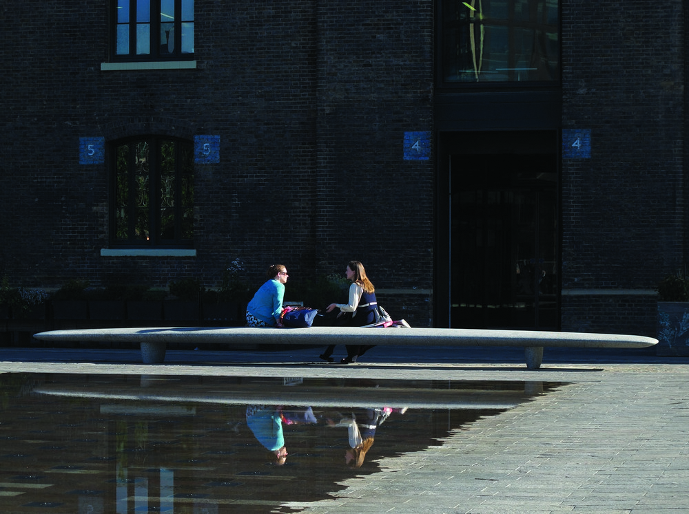
Winner: Granary Square Benches by Ian McChesney for King’s Cross Central Limited Partnership
This was a commission for eight giant benches at Granary Square for the King’s Cross Central Limited Partnership. The benches are provided for the enjoyment of the people that inhabit the square and formally complement four fountain pools at the centre of the space – originally designed by Townshend Landscape Architects and The Fountain Workshop. Carved in granite, each bench is 8m long by 1.2m deep and weighs around 4 tonnes.
The judges said: “This is faultless, stunning sculpture. The scale and generosity of the work is impressive – it’s not easy to be so expressive in the public realm. The bench is timeless like a pebble on a beach – the complex use of materials and design comes across simply and cleanly.”
Exhibition
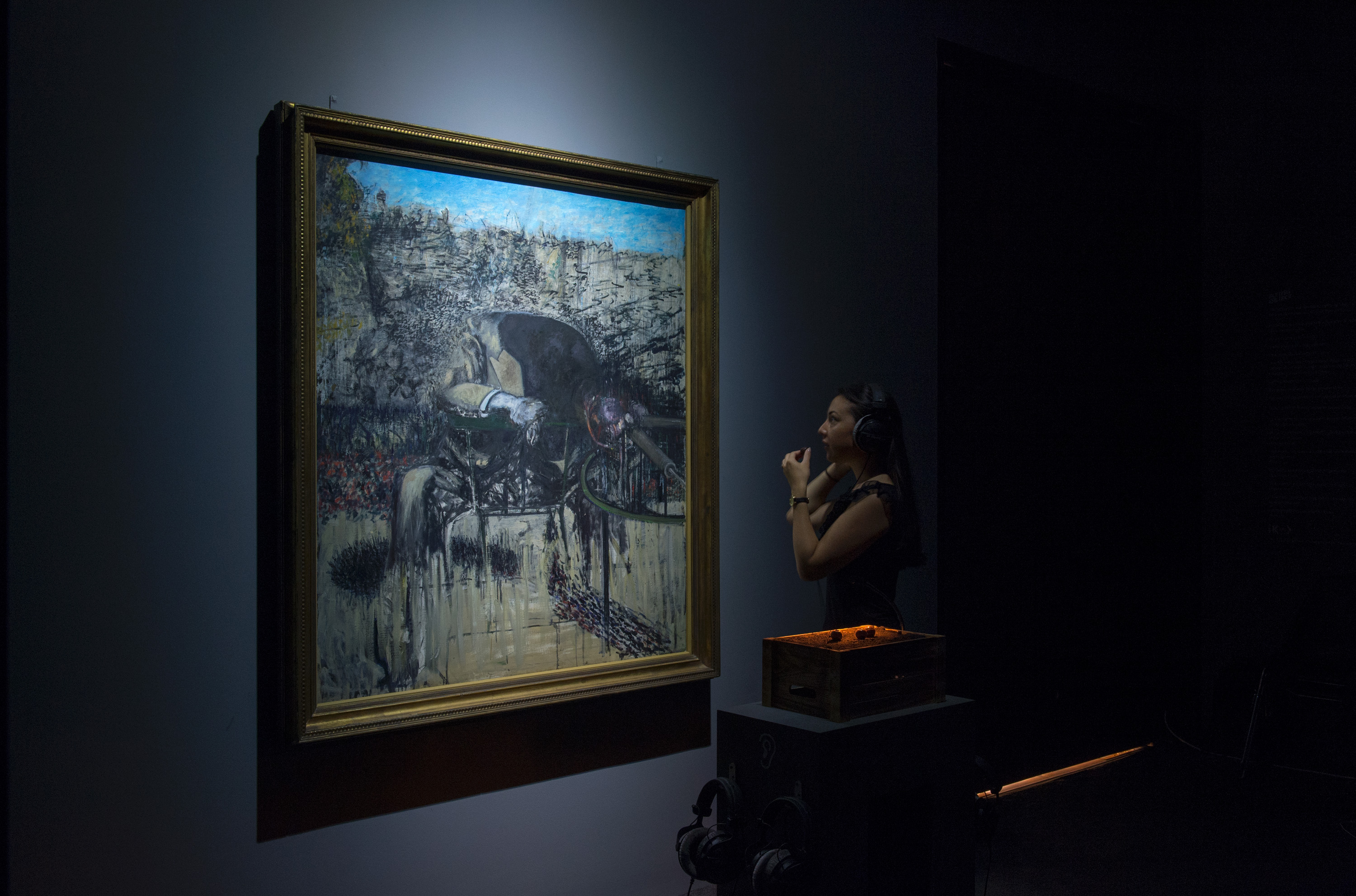
Winner: Tate Sensorium by Flying Object
Tate Sensorium was the winner of IK Prize 2015, an open commission from Tate to “connect the world with art”. Tate Sensorium was a multi-sensory art display that ran for six weeks at Tate Britain, housed in a closed gallery, with timed ticket holders admitted in small groups. Four paintings from the Tate collection were each paired with combinations of stimuli to taste, smell, hear and touch.
Visitors’ biometric data, collected with wearable technology, showed their physical responses and was used to create completely personal multi-sensory tours of Tate Britain, expanding the idea across the whole permanent collection. Flying Object accompanied each artwork by designing multi-sensory landscapes, developed by specialists, deploying technologies like ultrasound haptics, dynamic fragrance release and directional speakers.
The judges said: “This is a game-changer for experiencing art exhibitions in its use of science and technology. It’s a pathway for the next 100 years in exhibitions.”
Wayfinding and environmental graphics
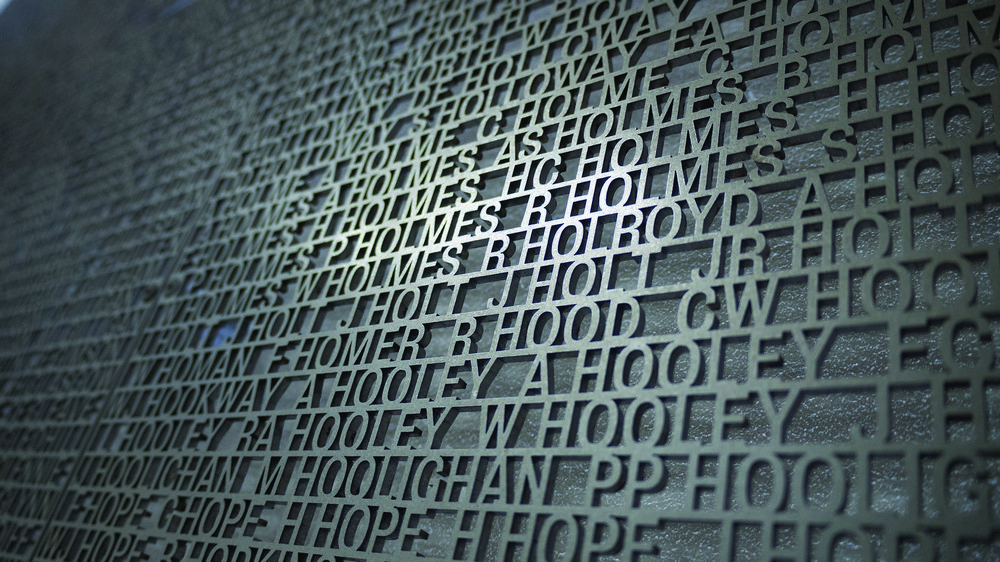
Winner: Salford Lads Club – Wall of Names by Why Not Associates
The Salford Lads Club was founded by two philanthropic brothers, James and William Groves, from a family of local brewers. Used for the sleeve of The Smiths album The Queen Is Dead, it has become one of the most iconic buildings in the country and a tourist attraction. There have been over 22,500 members throughout the club’s history. A letterpress printed card was created for each new member, which listed their name, date of birth and job title. These records show members’ progression from factory nippers and cabin boys to foremen, providing a unique social history resource.
Why Not Associates were approached by the club’s project manager and fine artist Leslie Holmes to discuss the possibility of putting these names permanently onto one of the archive room walls.
A team of volunteers over several months transcribed all the names from the membership cards into one Excel file. The starting point for the design was the typeface Bureau Grotesque, inspired from the original fonts on the letterpress archive cards and the names were then typeset to fit within 60 panels.
The judges said: “The judges fell in love with this project, a beautiful and fitting intervention.”
Self-promotional Projects
Winner: Overlooked by Pentagram Design
Since 1975, Pentagram has produced a series of signature annual documents, known as Pentagram Papers, exclusively for clients, friends and colleagues. Each Paper explores a unique and curious topic of interest to the Pentagram partners, – from Mao buttons to rural Australian mailboxes. The latest Pentagram Paper is created by Marina Willer and is a collection of London’s street covers. The book honours the covers as impeccable pieces of industrial design and as examples of the beauty threaded through the functional fabric of a city.
The judges said: “It’s unpretentious and a nice observation – the way it has been modernised is very original.”
Editorial design
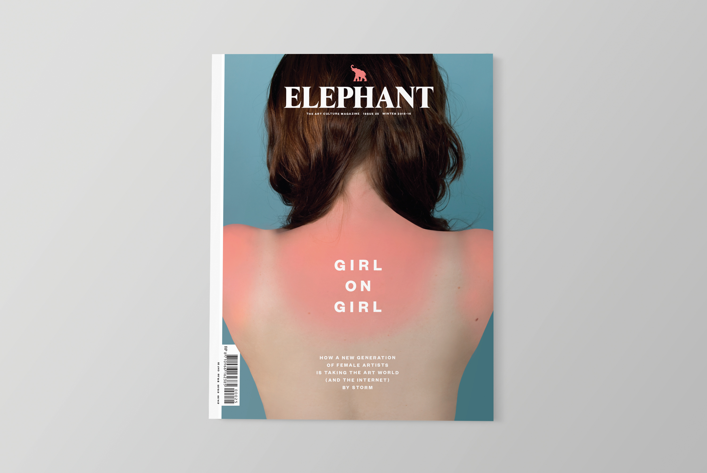
Winner: Elephant magazine Issue 25 by Design By Atlas & Partners for Frame Publishers
Atlas & Partners says it was commissioned by Frame Publishers to redesign Elephant magazine, making it timelier, more journalistic and lifestyle-oriented, more readable and enjoyable and “less like a design magazine”. The main headline typeface in every issue changes, which Atlas says: “Adds an element of surprise and playfulness within the parameters of a branded design”. For the Girl on Girl issue the consultancy used Founders Grotesk Bold in small caps, set in vertical.
The judges said: “A good mix of pace, simplicity and freshness in an overcrowded field, with great attention to detail.”
Interactive
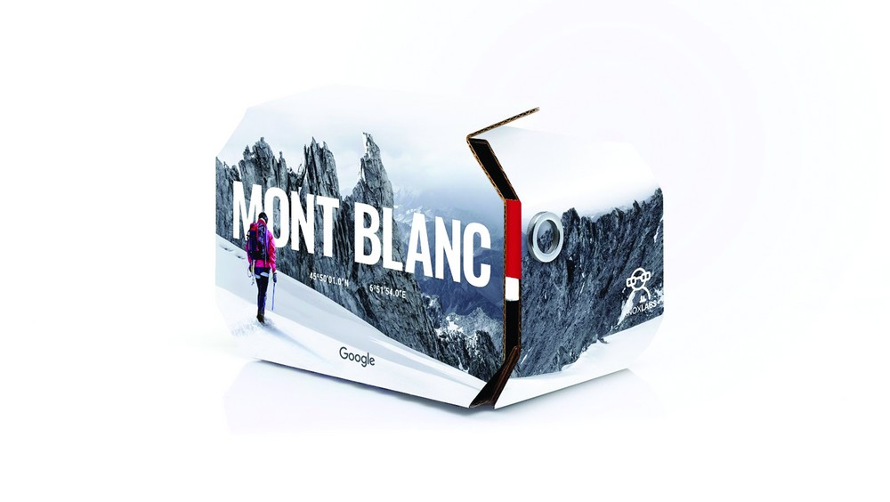
Winner: Mont Blanc Cardbaord by Phantom Studios for Google Brand Studio
France’s Mont Blanc is the highest mountain in Western Europe. Phantom Studios set out to design a fully interactive, guided VR experience that would bring the mountain to everyone and enhance the Google brand in France. The VR experience is built entirely in the web browser rather than a native app, and optimised across IOS and Android devices, either with or without Google Cardboard.
It allows users to experience Mont Blanc as if they are standing on the mountain itself, wearing a set of smart ski goggles that feeds information about your position, altitude, and temperature via a heads-up display. Guided by the voice of high mountain guide Patrick Gabarrou, users can navigate the five key steps along the famous Gouter route using a timed cross hair to focus on icons embedded in the 3D space.
The judges said: “The best example of interactivity in the category and a taste of an unexplored small snippet of experiences. It allows you to experience what you wouldn’t normally be able to – borrowing a viewpoint of a few privileged people.”
Digital Installations
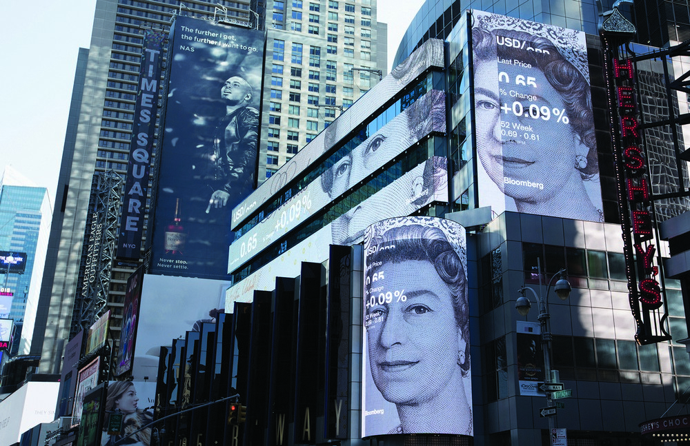
Winner: Digital Signage by Framestore for Morgan Stanley & Bloomberg
Framestore’s Labs team created a new content system for the LED displays at Morgan Stanley’s 1585 Broadway headquarters in New York, bringing interactive data to the thousands of people who traverse Times Square every day. The team built a custom hardware system that would allow Morgan Stanley’s marketers and Bloomberg’s internal creative agency to efficiently create content, to display in Framestore-designed templates and graphics, combined with various data inputs and visualisations.
The judges said: “Mixing live, real-time data and reacting to the audience it becomes more than a broadcast. It’s a great branding flag.”
TV, film and video graphics
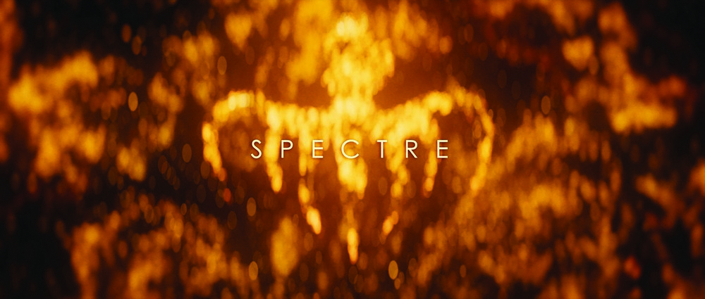
Winner: Spectre by Framestore for Eon Productions & Rattling Stick
Framestore worked with director Daniel Kleinman to create the title sequence for Sam Mendes’ Bond film Spectre. The creative process spanned almost four months and involved a broad team of artists, who worked closely with Kleinman to define the images, style and tone of the sequence. Plotting the sequence out with camera moves and segways was key to get a feel for the overall piece, which needed to both tease and represent the overall film. Primary elements included the octopus, and a focus on love and relationships not typical of recent Bonds. The staples remained – guns, girls, the occasional skull – but called for new iterations to maintain intrigue.
The judges said: “Playing with the institution that is ‘Bond’. It has all the ingredients you’d expect and has more than delivered.”
Brand campaigns

Winner: Nike Air Max Day 2016 by ManvsMachine
ManvsMachine worked with Nike Sportswear to create a global campaign for Air Max Day 16, an annual international event that celebrates the Air Max trainer. This year’s approach was to reveal the inspiration, design, and manufacturing process from idea to shop floor of each of the three most influential sneaker designers in the world: Hiroshi Furjiwara, Tinker Hatfield and Mark Parker, collectively known as HTM. The campaign shows the unique mechanics of each Nike designer’s mind through a series of kinetic sculptures of movement and energy as their vision is brought to reality.
The judges said: “Unanimous with our judges – the breadth and quality of the campaign is breathtaking.”
Print Communications
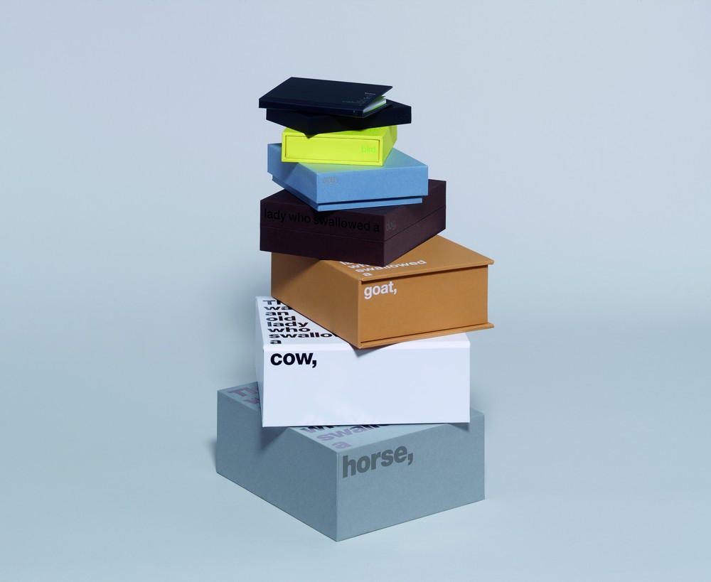
Winner: Boxes in boxes by Studio Sutherl&
Studio Sutherl& created a cumulative set of boxes to exhibit the different types of luxury packaging options Fedrigoni Papers and Boss Box offer. The children’s song There was an Old Lady was used as a narrative through the series of boxes. The typography goes from heavy to ultra light, to accentuate the relative scale of the boxes. The typographic placement highlights the format and construction of each box and leads the viewer through the set. The book at the centre of the box tells the whole story.
The judges said: “A fun idea, beautifully executed. It turns something boring and mundane into something engaging and enjoyable – and fun to interact with.”
Poster Design
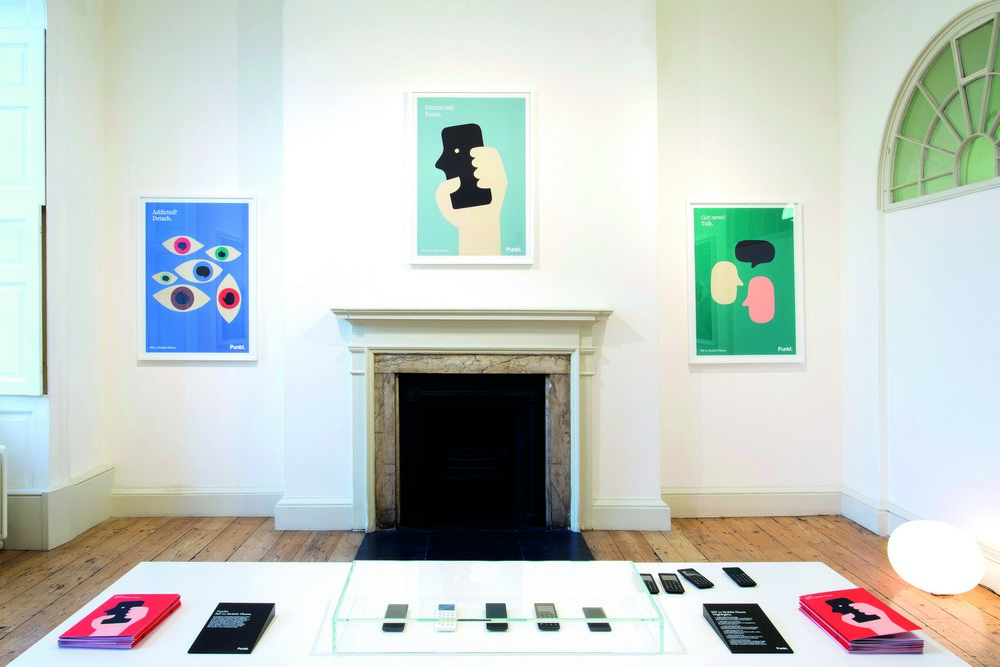
Winner: Punkt. MP01 Launch – London Design Festival by Rosie Lee
Consumer electronics company Punkt. commissioned Rosie Lee to produce a series of posters for the London Design Festival 2015 for the launch of the MP 01 mobile phone. Rosie Lee produced a series of 12 illustrations, with illustrator Anna Kövecses. The posters aim to capture human characteristics in technology and the role it plays in modern life. App icons were repurposed to become human profiles, speech bubbles are rotated to create human forms and a clutching hand creates a smiling face.
The judges said: “Fresh, enjoyable and humanising a technology-based topic. Something that creates a smile in a dry sector.”
Hospitality and workplace interiors
Winner: TRYANO by hmkm for Chalhoub Group
TRYANO is a new 20,000m2 shopping destination in Yas Mall, Abu Dhabi, and has been developed by the Chalhoub Group. It is described as “a completely new and revolutionary retail concept, creating a category killer destination shopping experience focused on the three specialisms of beauty, bags and childrenswear”.
HMKM designed the space around the concept of a “garden of imagination”, which the consultancy says is “a retail landscape that changes with the seasons”. The space features a marble-lined reception hall and a 20m-high central atrium. The winter-inspired beauty space features an interactive, digital “fountain of youth”, which the heart of the bag department houses a garden maze and the children’s department hosts a mirrored carousel.
The judges said: “Huge and wonderfully well-conceived.”
Writing for Design

Winner 500 Years of Stories by Grey London for Tate Britain
The brief to Grey London was to tell a story about the art in ideas or themes that are relevant today – stories so compelling people would want to see the art for themselves. Using words rather than imagery the campaign changes the focus on Bacon’s Triptych – from the artwork to his life struggle. And for Elizabeth I – changing the focus from a royal portrait to how you present your own image. Grey London says: “Although the posters contained no image of the work, we treated the words as an image in their own right – using the layout to reflect the story.”
The judges said: “Brave – purely copy lead for design. Genuinely emotional, which is hard to achieve.”
Product design – industrial
Winner: Hiut Music by Knit Ltd for Hiut Denim Co
The Hiut Denim Co is a denim brand founded 2009 in Cardigan, Wales by David & Claire Hieatt. It was created to restore the denim craftsmanship in the town after factories were closed down. Hiut Music was commissioned by Hiut and is an Internet-of-Things product that uses Raspberry Pi technology, powered by Twitter and Spotify APis which detect #HiutMusic song requests.
It connects consumers from across the globe directly to the Hiut crafts people through music and social media by streaming a globally sourced playlist live into the Hiut factory in Wales. Hiut fans can request a track to play in the Hiut factory by tweeting the hashtag; “#hiutmusic”, as well as the artist name and track title. Once detected the track is added to a playlist. The product itself illuminates whenever there is a request and uses colour to visualise how far away the tweet originates. A Hiut crafts person can like or skip tracks using touch-sensitive buttons.
If a track is liked, @HiutMusic sends a direct tweet letting the sender know that their request was appreciated. Hiut Music was manufactured using solid white Corian with an Oak veneered front. The rounded-square design references the shape of an app logo driven by the insight that Hiut Music is a physical app for the factory. The display is a shape abstracted from the Hiut logo and is designed to reference the aesthetic of early transistor radios.
The judges said: “Contemporary and contains lots of elements manifested into one final project. A very original over-reaching campaign. The brand’s values are manifested in a physical image.”

-
Post a comment


