The role of public typography
Graphic designer Craig Sinnamon has created the graphics for exhibition Never Mind the Bollards, at London’s NLA, which looks a the role of street furniture. In this piece, Sinnamon explains how he selected the “public” and “private” typefaces he used for the show.
Public space design encompasses the planning of large spaces right down to the smallest detail such as the conveying of information within them. This project gave me a great opportunity to research the role of public typography further.
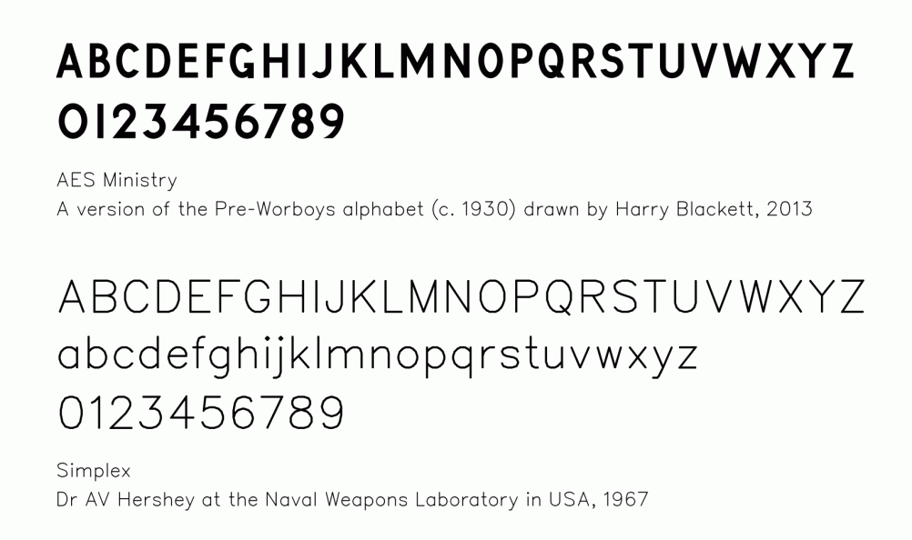
The history of Britain’s current road signs is well known. The building of the first motorway in the late 1950s created a need for a typeface that was legible when passing at speed. So Jock Kinneir and Margaret Calvert were commissioned to design the typeface “Transport” and the subsequent Worboys Report was formed to review all British road signage.
Although this has been rolled out nationwide, I have always been drawn to the many surviving examples of the Pre-Worboys signage, which used a clunky, uneven, all capitals typeface (without even a definite name — referred to often as Pre-Worboys or Ministry of Transport alphabet).
Manufactured in iron with protruding letterforms, the signage was designed so that they could be easily repainted. On Gower Street (near the NLA exhibition) you can compare and contrast a number of street signs using different typefaces.
During this research I was also struck by a typeface used to label all government technical drawings for things such as traffic signage and public space guidelines. It has a friendly, round shape, yet it is without any curves.
It is the default CAD typeface called Simplex – it was designed by Dr AV Hershey at the Naval Weapons Laboratory in USA, 1967. It is not a standard drawn typeface, but rather a collection of vector coordinates, which are connected by a drawn line. A sort of typeface dot-to-dot, that can easily be scaled and rotated. As such, it is used widely in computer aided design programmes but rarely in the physical world.
I like the idea of mixing together both a private and public typeface for this project, so it represents both sides of the design process; from the unseen planning to its use in a public space.
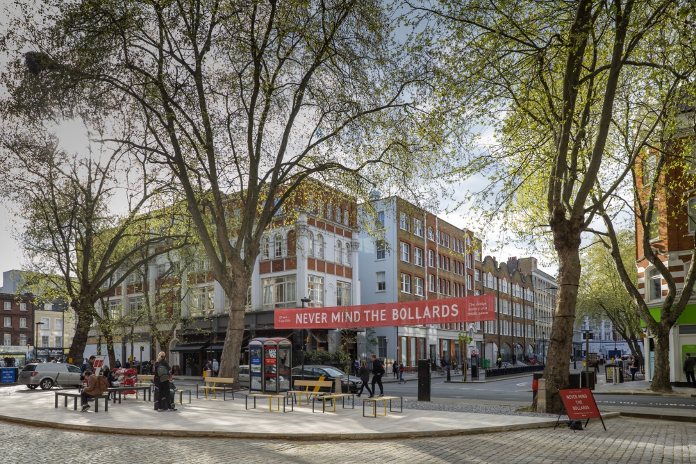
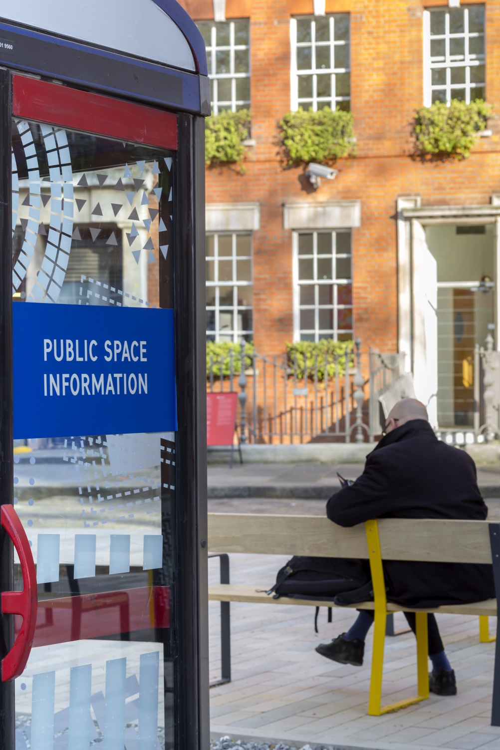
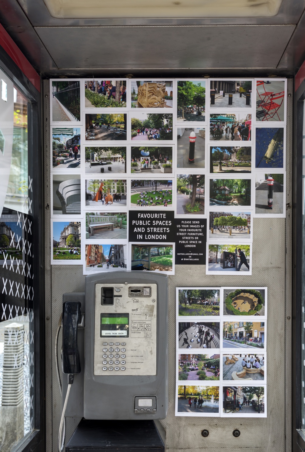
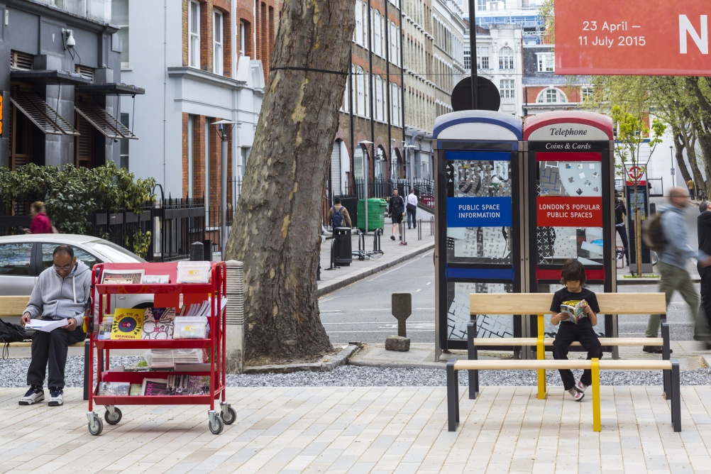
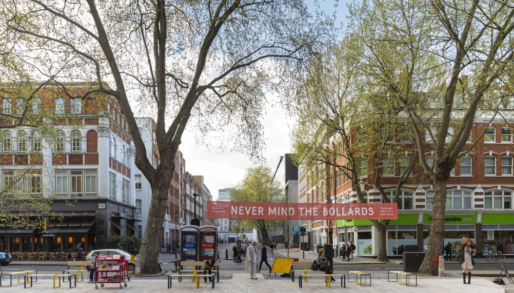
Never Mind the Bollards is an off-shoot of the Public London Exhibition at the NLA. It is on display at the Store Street Crescent outside the Building Centre, 26 Store Street, London WC1E 7BT until 11 July.
All images by Paul Raftery.

-
Post a comment


