Getting to know you through data visualisation – a hand-drawn project
Designers Stefanie Posavec and Giorgia Lupi, who live in London and New York respectively, have been getting to know each other through the medium of data visualisation in a postcard project.
For the past six months, designers Stefanie Posavec and Giorgia Lupi – who have met each other twice and live 3,500 miles apart – have been getting to know each other through the medium of data visualisation.
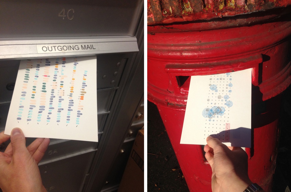
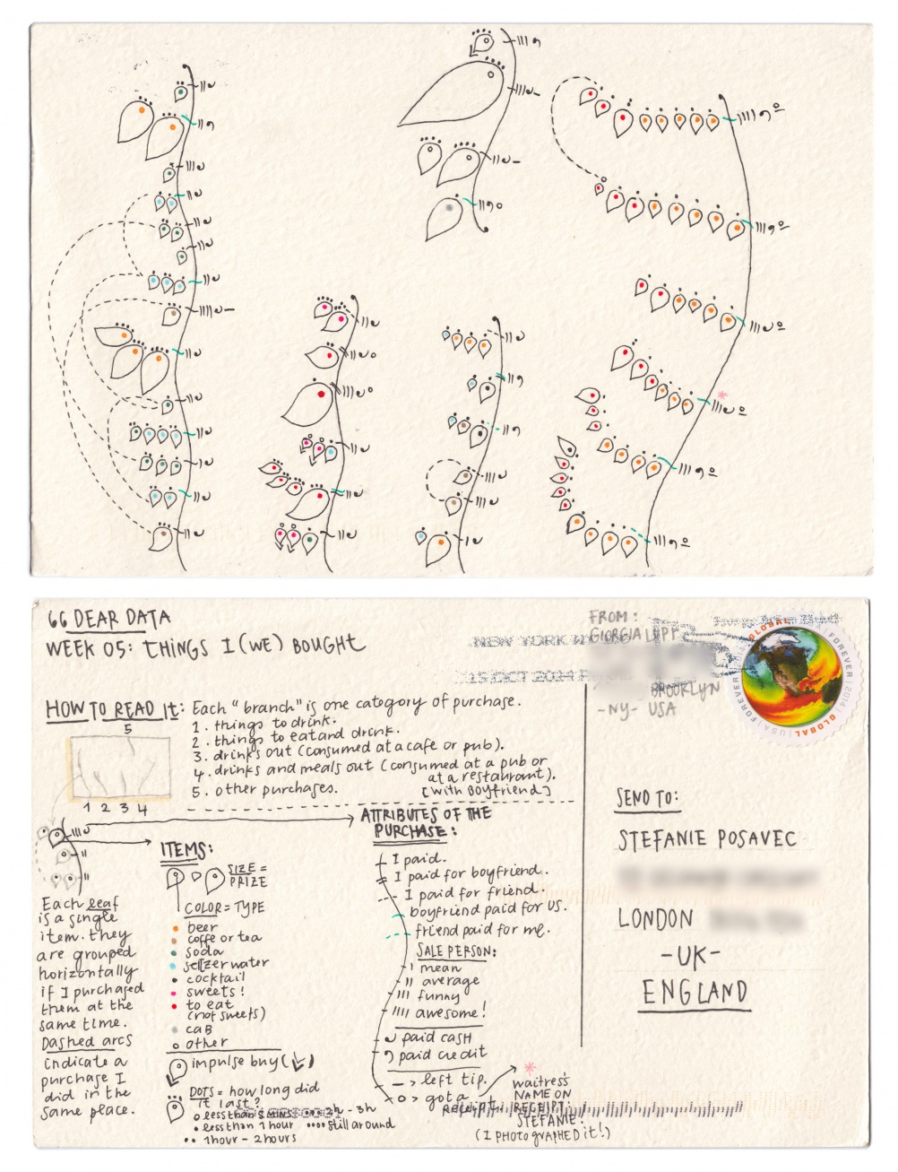
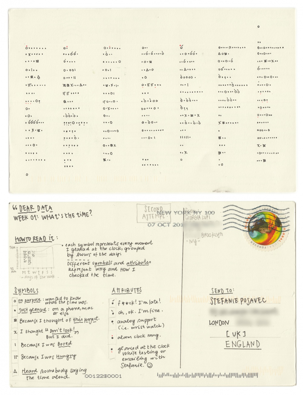
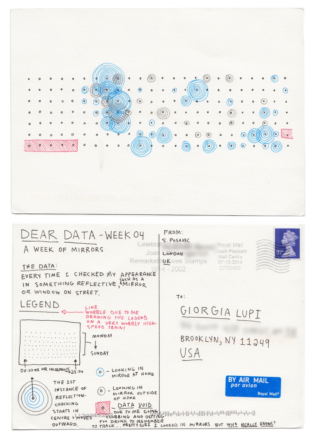
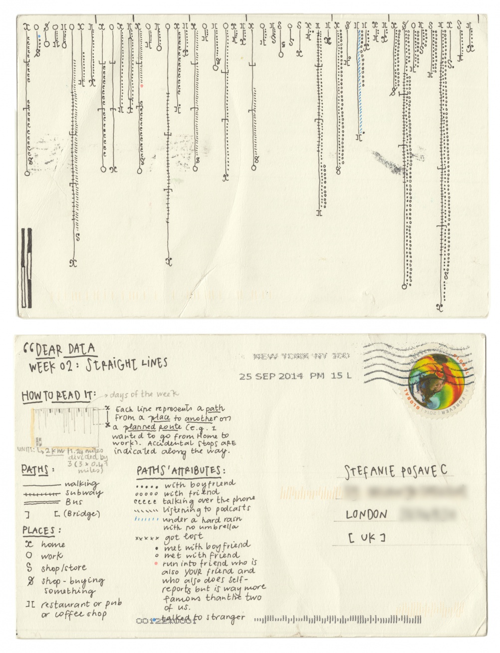
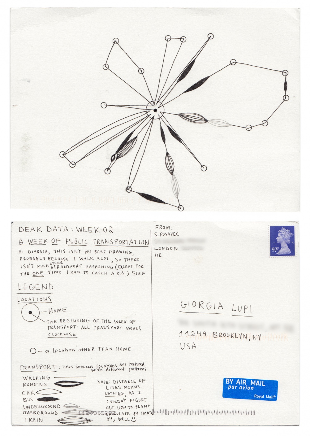
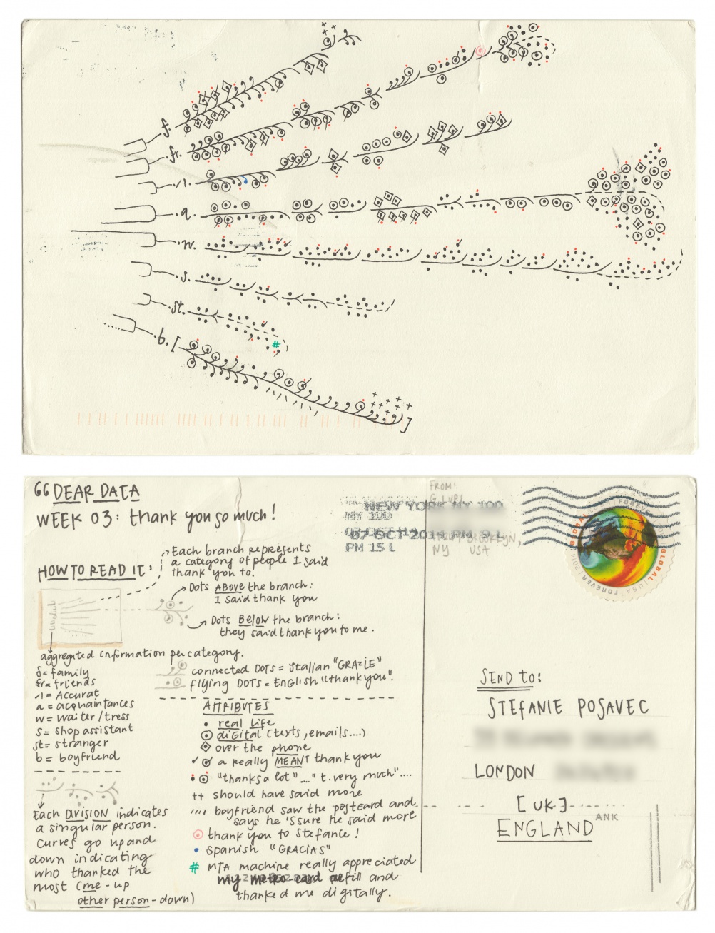
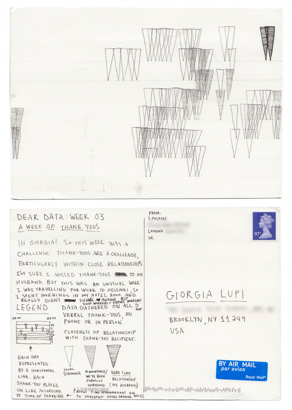
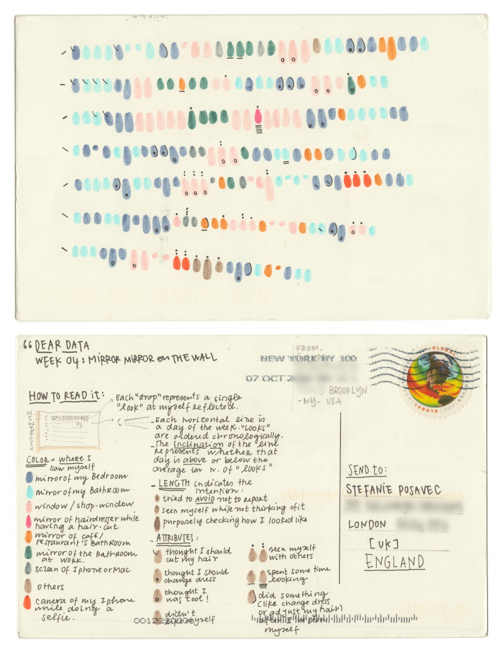
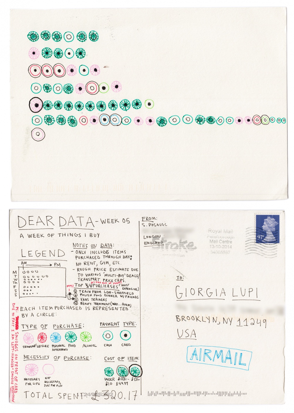
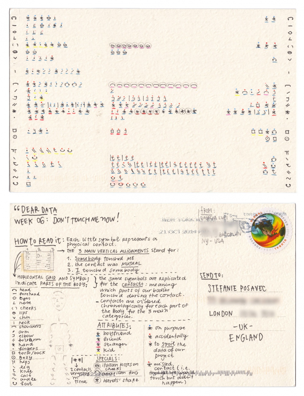
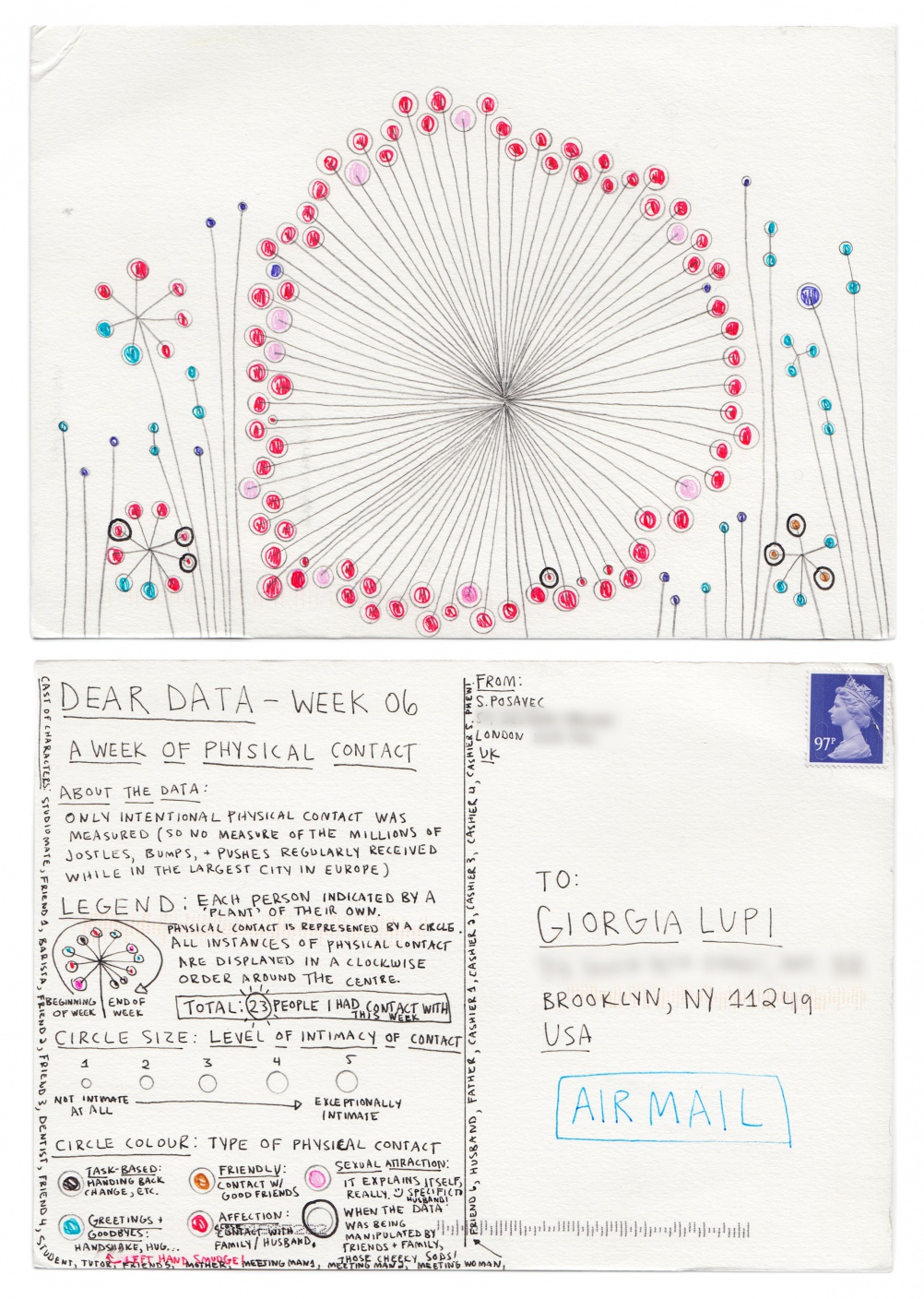
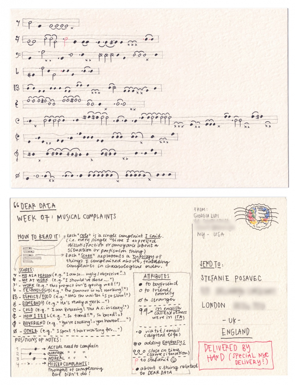
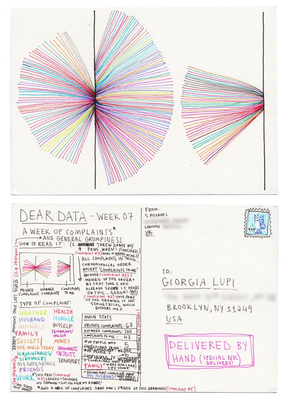
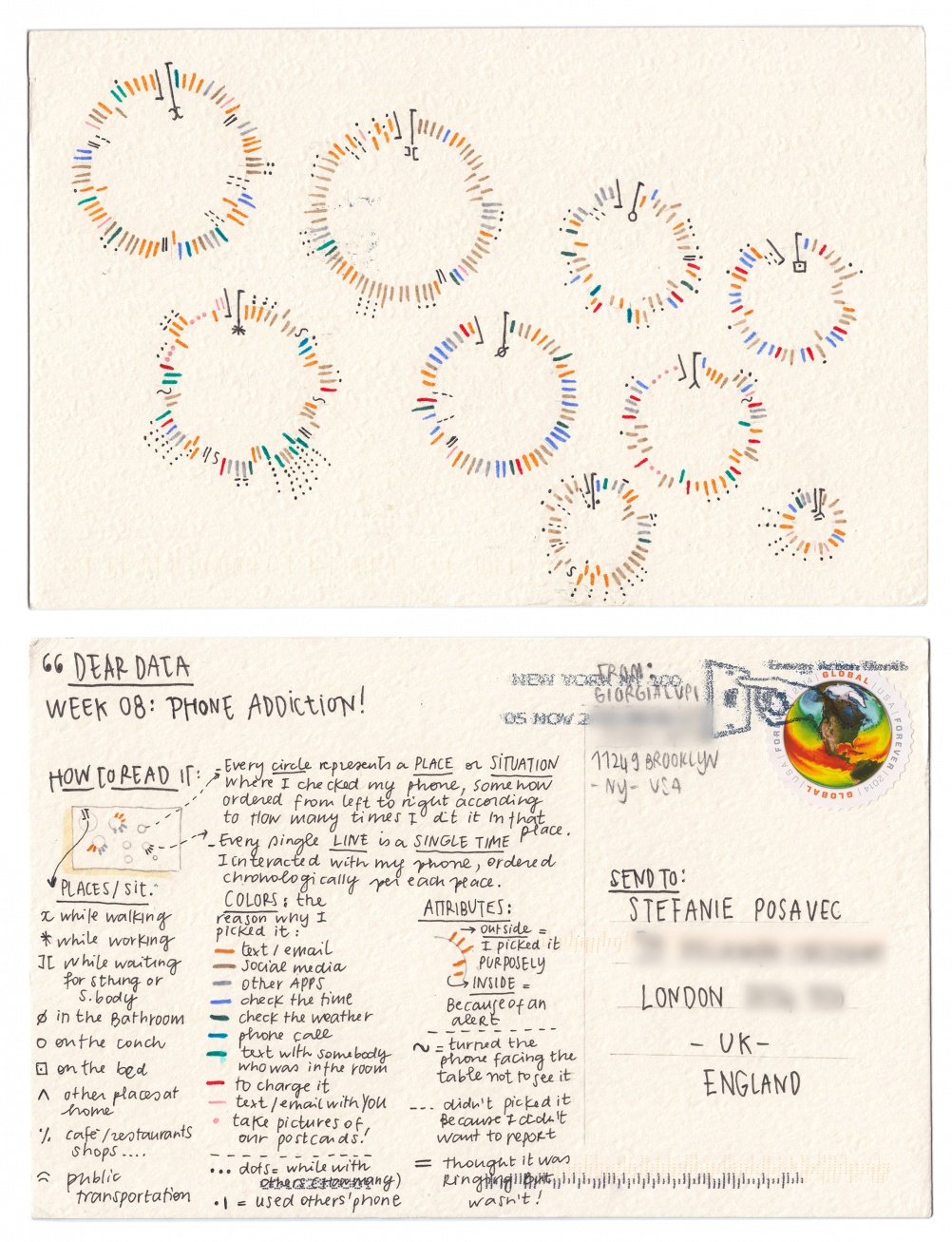
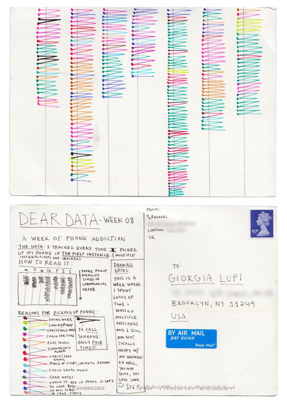
The pair have set up Dear Data – a project which sees London-based Posavec and New York-based Lupi send each other a hand-drawn postcard each week, revealing personal or everyday information about them such as journeys they have taken or the number of times that week they said thankyou.

As well as exercising their drawing skills and producing some interesting and beautiful postcards, the pair say they also want the project to tackle preconceptions about data and provide a counterpoint to “big data” – massive datasets that organisations are increasingly trying to analyse and take advantage of.
Posavec and Lupi describe Dear Data as “an art project that challenges the increasingly widespread assumption that ‘big data’ is the ultimate and definitive key to unlocking, decoding and describing people’s public and private lives.”
They add: “Dear data is an attempt to show how data is not scary and is not necessarily ‘big’ but is ever-present in everyone’s lives. One needs to know almost nothing about data to start collecting and representing it – just a pencil, a notebook and a postcard.”
Posavec and Lupi add that the project was partially driven by similarities between the pair. As well as both being data visualisation designers they are both also the same age, only children, and left their home countries to travel across the Ocean (Italian Lupi to New York and American Posavec to London).
They had met twice before, but wanted to get to know each other better and say that “as data and data visualisation is the language we speak every day for work, we decided to use this process as our mode of communication.”
Each postcard features a data drawing on the front, with a “how to read it” key on the back. Posavec and Lupi say: “It is important that this weekly data is experienced in the form of a postcard, creating a lovely physical interaction of ‘discovering’ while turning the postcard from the back, to the front, and then to the back again.”
Every week the pair aim to create a new visual model to represent their data and say they never start from standard visualisation templates. In addition, all the data has be manually recorded, which, they say, is far more time-consuming than using standard metrics gathered from technological devices.
The Dear Data project is currently at week 29, having started in September last year. Posavec and Lupi say they want to run the project for a year and are looking to develop it into a gallery show and/or book project.
The postcards are being uploaded to website www.dear-data.com, which is currently up to week ten.
Last month we ran an interview with Posavec, which looks at how she developed her career as a data visualisation designer.
Read this next

-
Post a comment


