How great posters were designed
An upcoming exhibition at New York’s Cooper Hewitt looks at the methods designers use when creating posters. We speak to curator Ellen Lupton about the exhibition, which draws from the museum’s 4,000-item poster archive.
A new exhibition is set to open at Cooper Hewitt, Smithsonian Design Museum in New York, which will look at the principles of poster design using nearly 125 works from the museum’s archive.
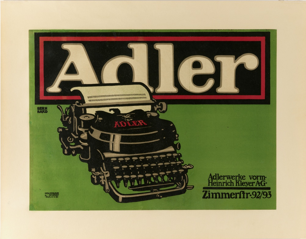
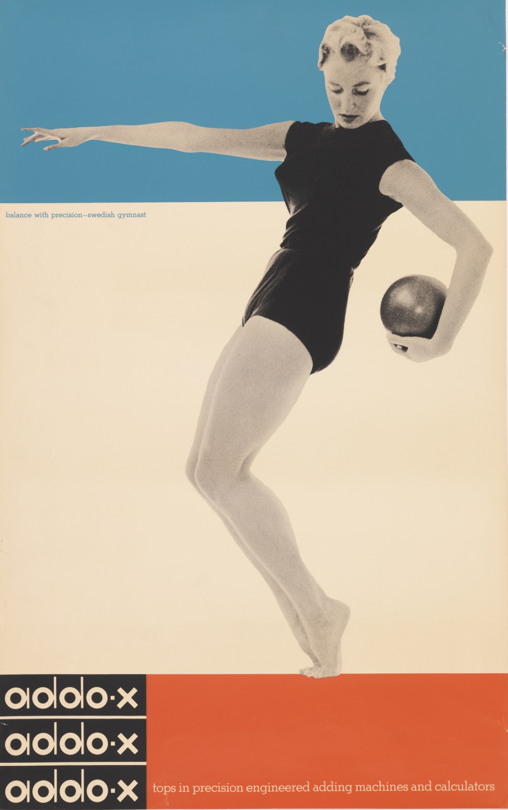
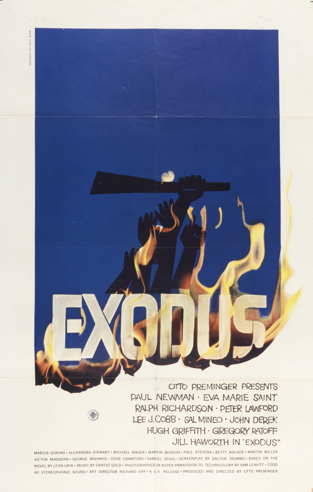
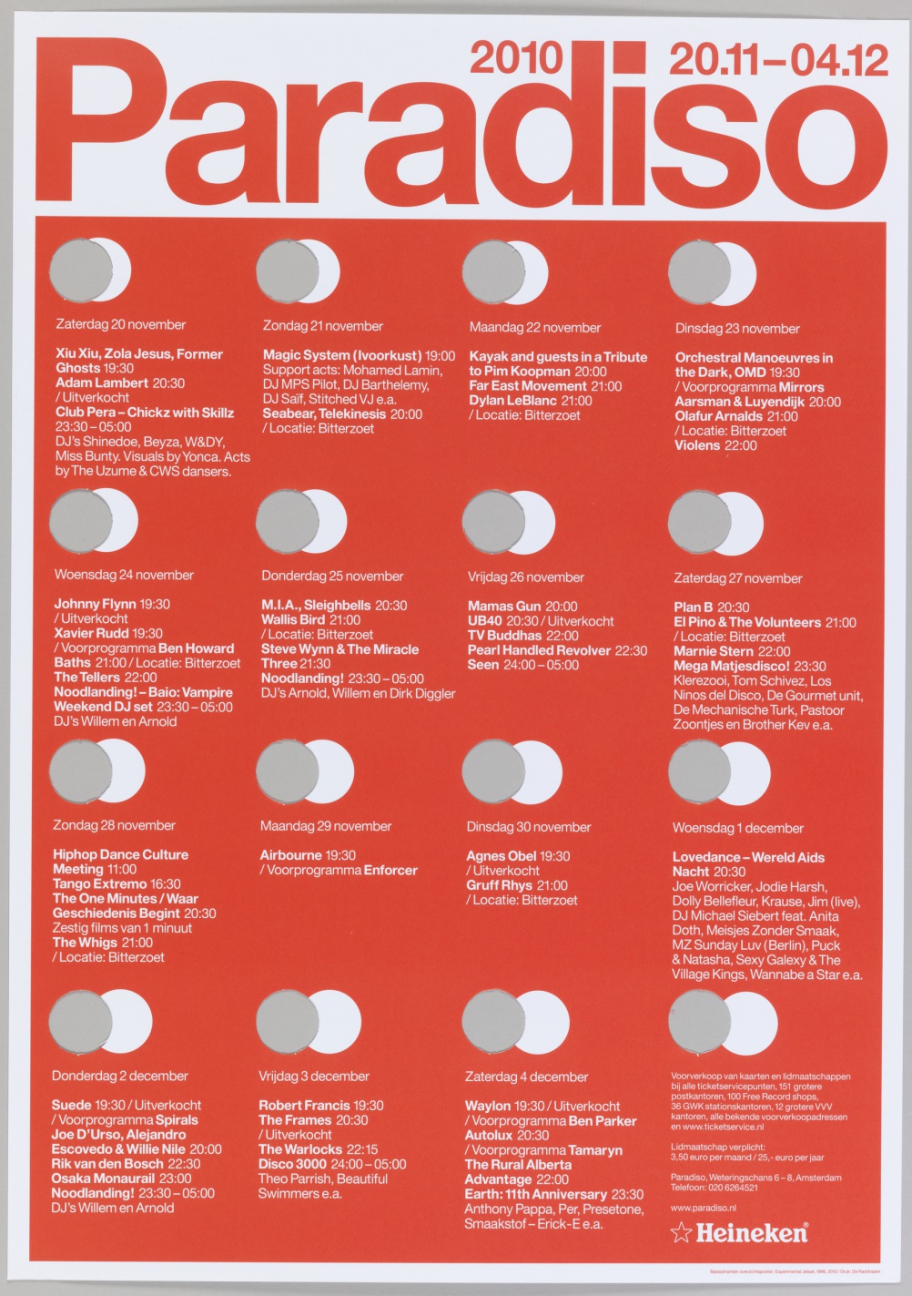
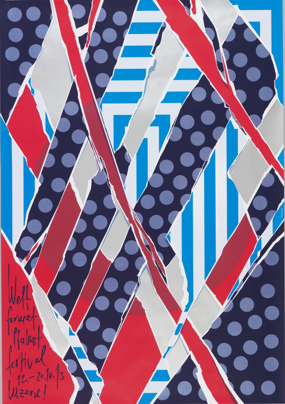
The How Posters Work exhibition features works from Herbert Matter, Paul Rand, Philippe Apeloig, M/M Paris and others – all taken from Cooper Hewitt’s collection of more than 4,000 posters.
The exhibition opens in May and is curated by Cooper Hewitt senior curator Ellen Lupton.
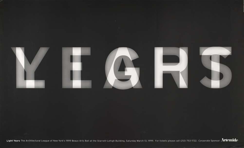
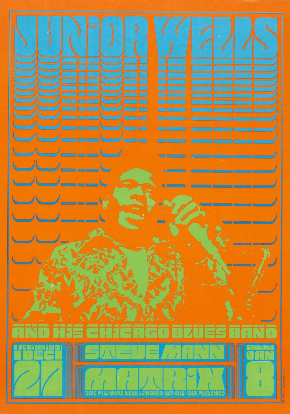
To categorise the works, Lupton has focused on 14 different principles of how designers create posters. This includes “overwhelm the eye”, which features psychedelic posters from the 1960s, and “use text as image”, exemplified by Michael Bierut’s 1999 Light/Years poster or Josef Muller-Brockman’s 1969-1960 Der Film work.
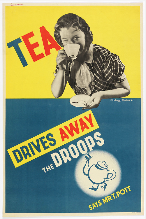
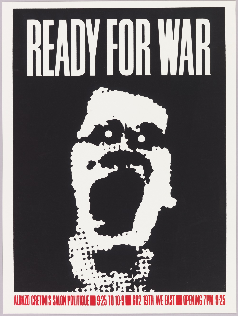
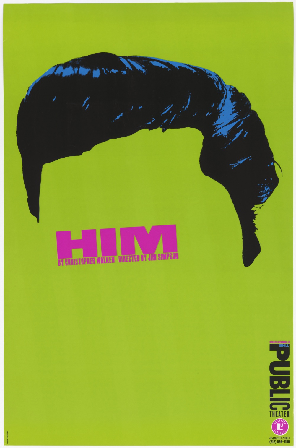
Other design principles highlighted in the show include “activate the diagonal”, used by E. McKnight Kauffer in the 1936 Tea Drives Away the Droops poster and “make eye contact” used by Richard Avedon in the 1967 John Lennon poster and Paula Scher in her 1994 poster for Him at the Public Theater.
We spoke to Lupton about how she curated the wide-ranging show and what her standout works are.
Design Week: What was the starting point for the exhibition – did you start with the works you wanted to display and then group them into different categories, or vice versa?
Ellen Lupton: We started with the idea of doing a poster show about visual thinking – rather than another history of style or a selection of “greatest hits.” I spent hours sifting through digital images from our collection, looking for patterns and tropes that are common to posters of different eras. As I started to identify themes, I would look for more posters that seemed to fit. The themes emerged over time.
DW: Were there any works that you found particularly difficult to categorise?
EL: The categories I came up with certainly don’t embrace every poster. For example, we have a series of information graphics in our collection created by Ladislav Sutnar that didn’t seem to fit anywhere in the show. Perhaps these pieces aren’t quite posters but something else.
DW: Of the design principles you identified, which do you think are the most popular in contemporary poster design and why?
EL: One of my favorite categories in the exhibition is “overwhelm the eye.” These posters include psychedelic works of the 1960s and recent pieces by Ralph Schraivogel, Michiel Schuurman, and Sulki & Min. These posters defy standards of clear, simple communication design in favor of a rich sensual assault.
DW: And which do you think have fallen out of fashion and why?
EL: The great Italian designer and critic Bruno Munari wrote an essay in the 1960s making fun of posters that have a big circle smack in the middle. This was a common Modernist design solution at the time and I had a lot of fun finding examples from the museum’s collection. I’d like to think that designers have more ideas now.
DW: What are you favourite works from the exhibition and why?
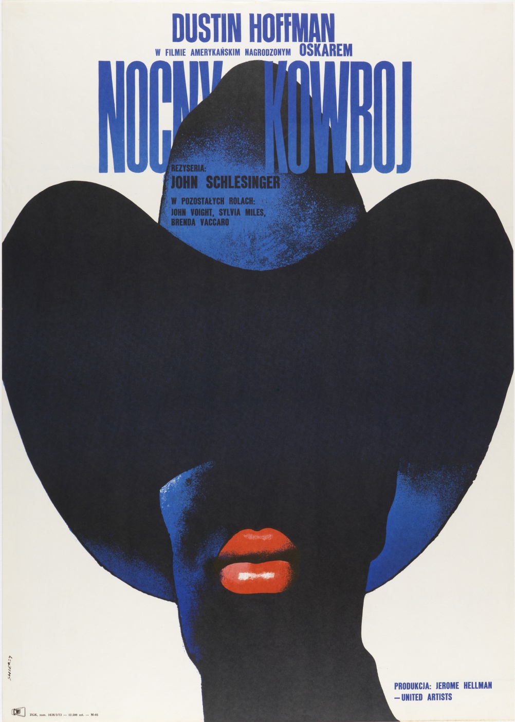
EL: I’m very excited by the Polish film posters featured in our book and exhibition, including Andrzej Pagowski’s 1984 poster for Rosemary’s Baby. These posters offer a personal narrative interpretation of Hollywood films that will take you by surprise.
How Posters Work is at Cooper Hewitt, 2 E 91st Street, New York, NY, USA, from 8 May-15 November.
All images are photographed by Matt Flynn and copyright of Cooper Hewitt, Smithsonian Design Museum.

-
Post a comment


