Jordan Amer flags up Semaphore London identity
Amer has branded PR and advertising consultancy Semaphore London creating a logo form and a secondary visual language based on real semaphore flags.

Jordan Amer has designed the branding for new PR and advertising consultancy Semaphore London by using real semaphore flags to create different graphic expressions.
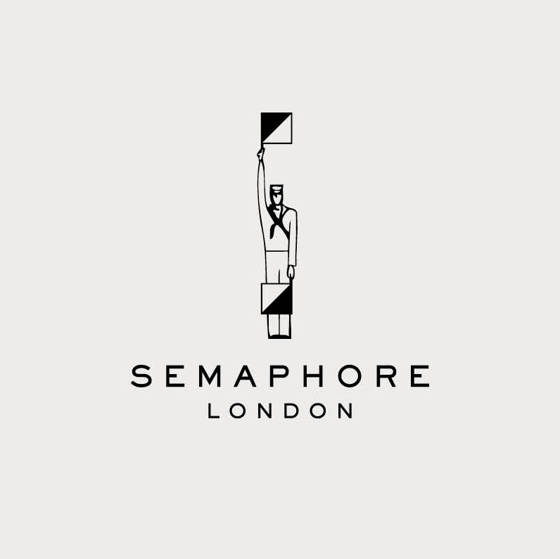
The identity depicts a semaphore signalman next to the Semaphore London wordmark, which completes a “conceptually appropriate” metaphor Amer says.
In addition he has created a broader visual language, which takes in all of the official semaphore flags and also extrapolates some of the colours and patterns to make further expressions. He has collaborated with designer and illustrator Hana Tanimura on the execution of this.
Although the semaphore flags are bold, tonal and communicative, Amer says: “They don’t lend themselves to a single logoform; the alphabet as a whole has vast, flexible potential for communication but as a single mark, it came off as arbitrary and generic.”
For this reason he chose two routes – “Signalman as emblem, flags as language” says Amer, and although this breaks the rule that “good branding should be singular” Amer and the client felt that it works.
Co-founder of Semaphore London Liam Fay-Fright says that this duality “reflects the two sides of the agency – advertising and PR.”
Fay-Fright adds: “If you look at the flags closely you can see they also have a painterly texture.”


-
Post a comment


