Elmwood rebrands Gressingham Duck
Elmwood has created a new identity for Gressingham Duck, which uses a hidden duck’s head in the letter G.
The consultancy was tasked with developing a brand identity that would encourage people to eat duck more often.
It says, ‘There is a fear of cooking duck and a general ignorance about what to do with it among consumers, and the main role of the brand rearticulation and packaging redesign was to instil more confidence and understanding in people.’
Elmwood says it took its cues for the branding from other sectors, including alcohol, that ‘do premium really well’.
It developed an identity which uses a warm duck-bill amber colour and features a duck’s head in the letter G. It also introduced a strapline ‘the remarkable duck people’.
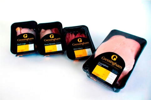
Simon Preece, group client services director, says, ‘Previously, while the packaging used premium cues of black and gold, the brand itself lacked standout and relevance.
‘The new packaging stand out on shelf, and has lots of added details such as the bright amber information box, and the 1,2,3 cooking guide to remove the fear for consumers.’
Elmwood was appointed to the work after being added to a credentials pitch list as a result of its work for Saucy Fish.
Read this next


‘Elmwood says it took its cues for the branding from other sectors, including alcohol, that ‘do premium really well’
….not to mention the previous branding, which used a ducks head (actually just a bird….as Gressingham sell other poultry too) as the ear of the double-storey g and was executed much better in my opinion! it was subtle and refined, this one by comparison looks quite clumsy!
Hmm, did the budget not stretch to a professional photo ?
Loving the remarkable duck people line very nice. Maybe the mark is a bit bloated still fun though
Should I assume that ‘anonymous’ had something to do with the previous one as they sound slightly bitter…..I like the new one, nice work Elmwood.
It’s nice, but, imho, the previous was cleaner and more adaptable. There’s a touch of the late 80s about the new one.
I predict another re-design within the next 3 years.
The previous logo was far more high wrought and certainly much more appealing to one’s eye, and as Belmoo (above) says -‘cleaner and adaptable’.
The new logo’s visage is less winsome and certainly not as inviting. The luxury has been lost in the re-design, and is far less polished.
But who is to blame here for this new look? The designers or the Gressingham company for picking the finished product logo? And of course, we have all heard of ‘If it ain’t broke, why fix it’. That is clearly what has happened here!
Lets hope the taste of the food is not as insipid and heavy as the new logo is.
In the design and technology world that is continuously moving forward, why opt for downgrade… ???