New Liechtenstein logo chosen after public poll
Citizens of the tiny European country of Liechtenstein have chosen a new national logo following a poll open to the principality’s population.
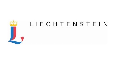
The new identity has been created by UK-based designer Marc Weymann, himself a citizen of Liechtenstein.
According to the Liechtenstein government, Weymann’s identity was chosen from a shortlist of five following a nationwide poll open to all citizens of Liechtenstein aged 14 years or over – around 30 000 people.
The initial shortlist was drawn up by a panel chaired by Crown Prince Alois of Liechtenstein from around 60 entries from design and advertising groups across Europe.
The competition launched in January and the entrants were briefed to create a logo using the Liechtenstein national colours of blue, red and gold and reflect values such as self-determination, independence and security.
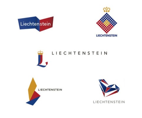
Weymann’s logo picked up 6072 votes from across Liechtenstein to win the competition, seeing off shortlisted entries from consultancies and designers in Spain, Germany and Switzerland.
Weymann says, ‘I come from Liechtenstein so obviously I keep up with the news from there. When I saw the competition online straight away I knew it was for me.’
He adds that he hopes to be involved further to develop the identity as it goes into uses across different touchpoints.
The new identity will come into use on 1 May, and replaces a previous identity created by Wolff Olins, which launched in 2004.
Read this next


Oh how sweet – when will it be available in the shops? What do you mean, it isn’t cat food?
Nice one Mark. Glad it went to a true Liechtensteiner.
terrible trash!
Great typeface–its versatile, and you can use solid lines vs the dots across multiple media, and apply a range of various photography / graphics / images to compliment. This truly seems versatile and won’t need a rebrand anytime soon.
Can’t wait to see actual applications in real settings!
When you organize a public poll to choose your #logo, obviously you will get the most traditional one http://bit.ly/HGDjHr #Liechtenstein