Voxpop – What is your favourite book cover design?
Today (1 March) is World Book Day. What is your favourite book cover design?
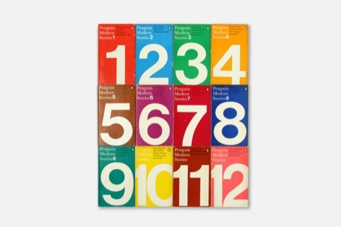
‘What an impossible task, to name just one, so I’m going to say what comes to mind first – All of John McConnell’s Editions Payot and his early Penguins; anything David Pearson touches; some Derek Birdsall covers instantly stand out (To Kill a Mockingbird, for example). A cover that I am never bored with is Maurice Sendak’s Where the Wild Things Are, for its sumptuous illustration, and because I love the story. However when I recently found this Penguin Modern Stories collection (1969-1973) in my favourite shop, the Oxfam book store in Ealing, I fell in love with them – David Pelham’s beautiful and timeless design appeals to my graphic sensibilities.’
Alan Dye, director and designer, NB Studio
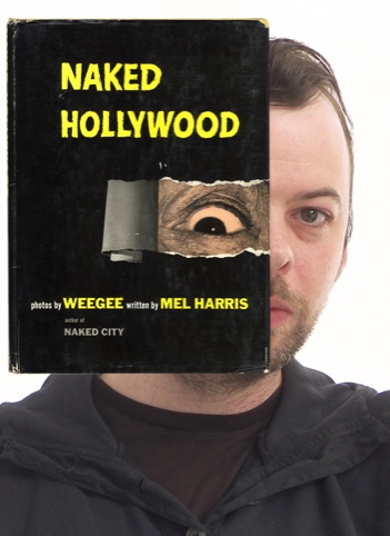
‘Never judge a book by its cover… which is of course totally untrue because everyone does! Besides a good cover should express the sentiment and style of what’s inside the book. I’ve chosen my copy of Naked Hollywood by Weegee and Mel Harris from 1953, a follow up to Naked City and Naked People, which has Weegee moving the location of his subjects from gritty New York to glamorous Hollywood. However as the cover suggests once Weegee and his beady eye have peeled back the layers the result is just as outrageous and shocking.’
James Webb, director, Webb & Webb
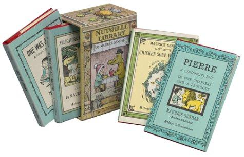
‘For me it’s got to be The Nutshell Library by Maurice Sendak. My grandparents had an old copy and it lived in my room at their house in Devon. The beauty of the warm hazy colours, the gorgeous illustration and it’s delicate size make me smile every time I look at it. It epitomises everything wonderful and precious about my childhood and I’m guessing that’s the measure of a true masterpiece.’
Lizzie Mary Cullen, illustrator

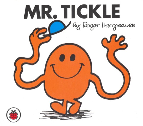
‘The first books I truly loved were The Mr Men series designed by Roger Hargreaves. The books’ simple covers, feature brightly-coloured, boldly-drawn illustrations. All 42 characters are cleverly distinguishable through unique shape, colour and personality. The Univers Bold titles provide a wonderful contrast to the fluidity of Hargreaves illustration style. My favourite anecdote about the books is that the first character (Mr Tickle) was created after Hargreaves’ son asked his father what a tickle looked like. Wonderful.’
Mike Rigby, creative director, Interbrand Australia
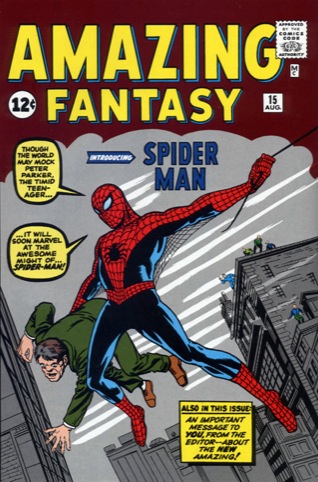
‘My favourite cover design belongs to Amazing Fantasy #15 (August 1962) – when the world was introduced to Spider-Man. The iconic costume (they nailed it first time!) with its eye-bleeding red zinging off the monochrome background and the utterly exhilarating composition make for an amazing first glimpse of an enduring character. This cover more than any other is etched into my mind and continues to inspire to this day – one of our current studio projects is based around the language of superheroes. Nuff Said.’
Adam Giles, co-founder, Interabang

‘I have a problem. I’m easily seduced; I’m a sucker for a pretty face. Alluring, beckoning me in, they implore me not to leave them on the shelf. I bring them home, full of excitement and sincere in my desires, but I lack stamina. As soon as I slip between the covers my interest begins to wane and I fall asleep. I’ve slept with hundreds; they’ve all been beautiful in their own way. I couldn’t possibly choose a favourite.’-
Michael Smith, director, Cog Design
Read this next


@michael smith – what a goon