WeTransfer aims to bolster its creative credentials
As with services like Google, YouTube and Facebook, in its short four-year history WeTransfer has fast become a digital brand it’s tricky to remember a time before.
The Amsterdam-based file-sharing service was founded in 2009 by Bas Beerens and co-founded by Ronald Hans – better known as Nalden, a shortened version of Ronald used in the Netherlands that was used as the title for the entrepreneur’s blog, Nalden.net, where the advertising model of WeTransfer was developed.
Perhaps unsurprisingly for a brand that caters for the creative community and those dealing in the visual side of things, WeTransfer is keen to shout about its creative credentials.
It’s looking to enhance those further with the announcement that designer and artist Nelly Ben Hayoun – best known for her projects with Nasa, such as the International Space Orchestra – has been appointed the WeTransfer head of experience.

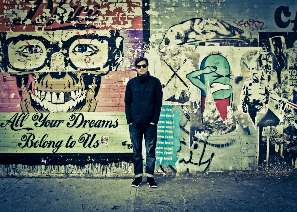
Source: Neil Berrett
Nelly Ben Hayoun
In her new role, she will advise WeTransfer on developing user experiences. What these will be, and their scope, however, are yet to be revealed.
She will also upload a weekly ‘visual diary’ to the site, documenting her practice.
Ben Hayoun was approached by WeTransfer following a talk she gave last year. She says, ‘I get to keep doing what I’m doing, but put some critical thinking into [WeTransfer]. I’ll be a creative catalyst, so I can come up with projects and initiatives they will support.
‘I’ve always tried to being the scientific community together with the art community and the design components, but I hadn’t really connected the digital side of it. It’ll be about how to bring in experiential and physical elements to WeTransfer’.
Ben Hayoun’s input will run alongside the service’s existing commitment to showcasing creative work, with 50 per cent of the site’s background space given free of charge to selected designers, illustrators, artists and photographers.
‘I’m a big believer in beautiful aesthetics that speak for a brand’, says Nalden. ‘I see it as a museum to give back to the creative community’.
All the branding and site design for WeTransfer is carried out in-house, with the look and feel prioritising ease of user-experience.
‘Most of our time and effort is put into the design of the simple user experience’, says Nalden. ‘We’re digital natives from a creative community, but I always stick to the rule that it should be something my dad can understand.’
While WeTransfer still operates from a 14-person-strong Amsterdam office, it has recently employed what it terms a ‘culture hunter’ in New York whose job it is to tell the brand about what he deems to be the ‘most exiting cultural work’ in the Big Apple. The brand it looking to employ a London-based person in the same role early next year.
However, for all WeTransfer’s ‘giving back’ to the creative community, its creative collaborations and its ‘museum’ of imagery, its still, of course, a tech-based brand.
‘Design allows people to embrace technology – that’s why we embrace design’, says Nalden.
‘If you want to stand out it’s so important to try and establish an emotional connection with the brand and make the branding as human as possible’.
And for all the talk of its design credentials, the brand’s identity seems to have been developed with something of a blasé attitude.
The WeTransfer brand mark has been unchanged in the brand’s four year history, and uses an “e” that ‘looks a bit like a smiley’, Nalden explains.
‘We learnt that from Heineken, another Dutch entrepreneur’, he says. ‘The rest [of the branding] is pretty generic. We use Museo web font, which I think looks friendly, and blue because it’s my favourite colour. We’re simple people’.
Read this next

-
Post a comment


