Proud Creative’s ‘printerly’ identity for Armoury
Proud Creative has designed a new visual identity for moving image production company Armoury.
The consultancy began work on the project about four months ago, having worked with Armoury founder Jack Laurance on a project for teenager-focused American television network Teen Nick.
Roger Whittlesea, Proud Creative partner, says, ‘Their previous identity wasn’t terrible, but it didn’t quite do them justice either.’
He adds, ‘They needed to look the part, and we felt they needed to look a bit slicker.’
The new identity retains the Armoury logo symbol of six dots forming a circle, designed by independent designer Imogen Grasby.
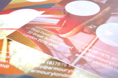
The designs use abstract crops of images and stills created by Armoury for previous projects, with the logo symbol overlaid either as a dark overprint, just revealing a part of the image behind; or with a white foil, giving a hint of image beneath.
A new sans serif font, Relative, has been introduced, chosen for its ‘clean’, ‘legible’ qualities, says Proud Creative.
Dan Witchell, Proud Creative founder and creative director, says, ‘It was a conscious decision to make it very printerly, with the foils and interesting printing techniques. The printing experiments took quite a long time.’
He adds, ‘[The designs] aim to take the emphasis away from the film still imagery and back to Armoury.’
The consultancy worked with Brighton-based Generation Press on the project.
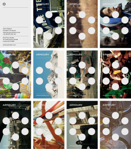
The new look is being applied to touch points including the website, business cards, document covers and other printed materials. Each member of the Armoury team will have eight different business card or postcard designs, and there are four different images for document covers.
Read this next


Suitably slick for a super slick outfit.