Carter Wong gives Cornetto a new look
Carter Wong has brought a new look to Cornetto, redrawing the brand’s identity for the first time in its 50-year history.
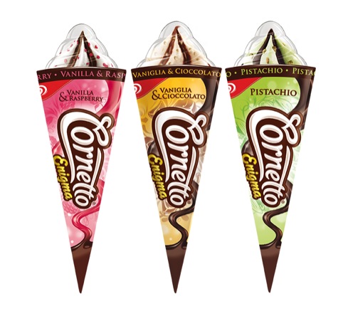
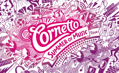
As the new look rolls out, the consultancy is already working on packaging designs for new products.
Carter Wong has a long working history with Cornetto brand owner Unilever, developing the Walls heart marque in 1998, which united 52 ice cream brands, and carrying out rebrands for other products including Carte D’or.
According to Carter Wong account director and partner Sarah Turner, the consultancy was brought in around December 2012 to present ideas for a Cornetto rebrand, as the client was not happy with the direction early work, not involving Carter Wong, was taking.
The outgoing Cornetto brand was aimed at an over 35 market, while the new brand has been positioned at the 15-25 year-old market.
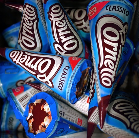
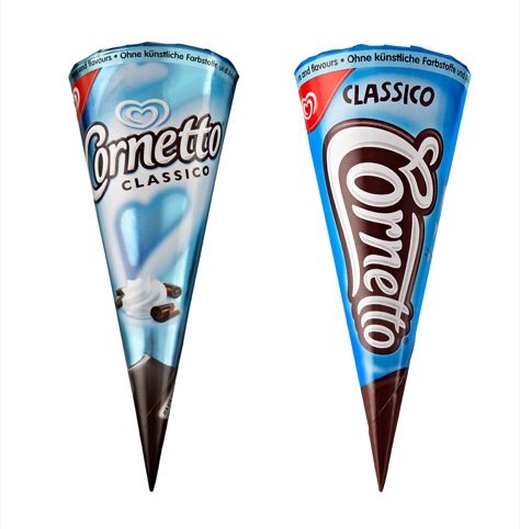
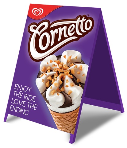
The Cornetto identity has been redrawn in a way which makes it ‘own the cone’, following the contours of the product’s conical shape, according to Turner, who says the consultancy worked with typographer Geoff Halpin.

‘It looks appetising and has a chocolatey and creamy voluptuousness and incorporates a heart in the C, which adds warmth,’ says Turner.
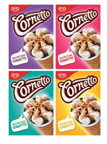
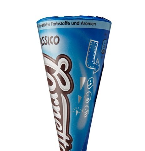
A secondary hand-drawn typeface has been developed, a set of ‘bright, youthful, vibrant, summery colours,’ and a set of illustrated icons, which can be seen across packaging and point of sale material.
‘Rebranding is the first step. Moving forward into 2014 we’ll be looking to bring in more edge and youthfulness with packaging innovations,’ says Turner, who is anticipating further product development.
Read this next


I commented but it seemed to get lost somewhere in my posting – hopefully I’m not repeating myself!
A good, strong and vibrant solution. One slight comment about the logo itself though – I like the way it incorporates the heart, but I can’t help but see the word ‘Pornetto’ within it – for better or for worse! Eeek or good fun? ; )
Haha! Thanks for that, I will never read Cornetto as it is intended.
Perfect approach, eye handy, strong identity, cover worldwide market
Bravo!
I believe it s fresh and eye handy, clean identity