Dot Dash creates new identity for Flatpack Film Festival
Consultancy Dot Dash has created new branding for Flatpack Film Festival, which takes place in venues across Birmingham this weekend.
The festival is now in its eighth year, and Dot Dash was appointed in November last year to create a new look that was ‘recognisable, yet flexible’, according to consultancy founder Justin Hallstrom, who set up Dot Dash this year having previously worked as a designer at The Plant.
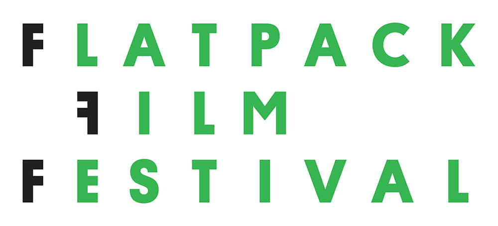
The new identity heralded a name change for the festival, bringing the word ‘film’ into the title.
The look is based around a backwards ‘F’, aiming to ‘showcase’ the quirky nature and eclectic programming of the festival’, says Hallstrom. This can be used alone or in a graphic lockup with the other three ‘Fs’ of the festival’s title, referencing the idea of a film-strip.
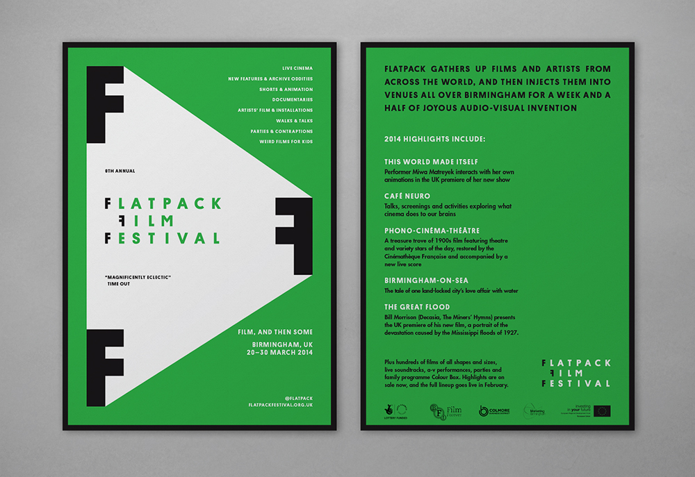
When applied to flyers and posters, the graphic has been tweaked ‘to give it a feel of projection reflecting both film and the transient nature of the festival’, says Hallstrom.
The green colour palette was introduced to help establish the new identity, though this may be changed for each festival in successive years, according to Dot Dash.
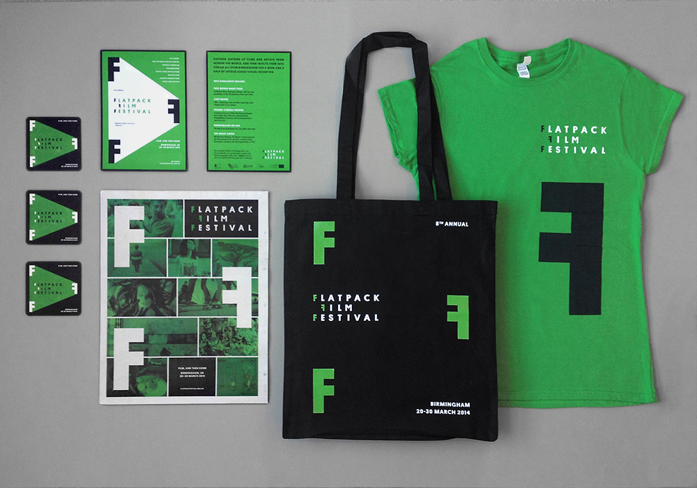
The new identity is used across all festival materials including the website, a 44-page newsprint programme, promotional materials and merchandise such as bags and t-shirts.
Flatpack Film Festival sees screenings take place in venues such as churches, warehouses, pubs and canal boats, as well as galleries and cinemas. The film programme is accompanied by discussions, performances, events and art installations from artists including Paper Cinema, Broadcast and Synth Eastwood.
Read this next


Really Design Week… Really!!!?!