2012 Review – the year in print design
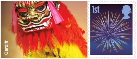
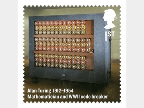
With the 2012 calendar boasting such Herculean moments such as the London 2012 Olympic Games and the Queen’s Jubilee, it’s been a busy year in stamp design. Hat-Trick brought in the Chinese Year of the Dragon by creating a special sheet of 20 stamps for Royal Mail in January, while the following month Purpose designed a new set of stamps celebrating Britons of Distinction, including architect Augustus Pugin and WWII code breaker Alan Turing.
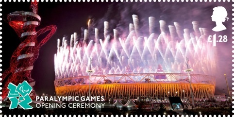
Heralding the summer’s season of patriotism, the Diamond Jubilee stamps were launched in May, designed by Kate Stephens and sold in a presentation pack designed by Silk Pearce. Hat-Trick designed the London 2012 Olympic stamps and Pearce Marchbank was behind the designs for the Paralympic set; with The Chase ensuring the games weren’t forgotten in its Royal Mail Memories of London 2012 stamps, the final of its Olympic and Paralympic special stamp issues, which launched in September.
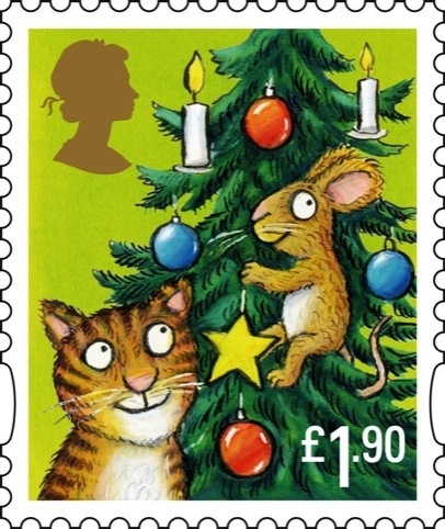
Rounding off the year stamp-wise is the very cute set of Christmas stamps, based on children’s book The Gruffalo. Webb & Webb worked with The Gruffalo illustrator Axel Scheffler to design the set of five stamps.
Pick Me Up at London’s Somerset House in March showcased a host of brilliant work from emerging and established print designers.
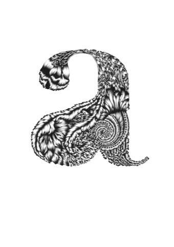
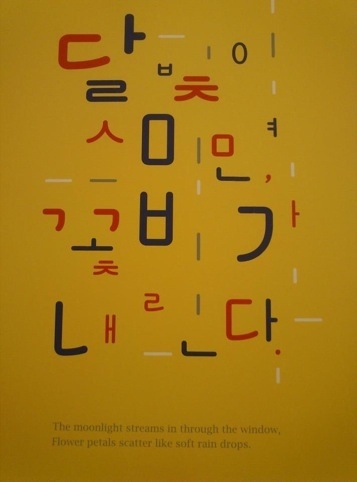
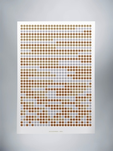
And while opinions were mixed on the overall standards and presentation methods at this year’s degree shows, there were a number of wonderful print pieces that caught our eye. We were impressed with the execution of RCA student Susanne Stahl’s MeteoPoem, a visual programme that describes weather conditions by colour; LCC student Louis Vincent’s cover design for Wrap magazine and MA Communication Design student Woo Jeong Chon’s experiments with Korean typefaces, shown at the Central Saint Martins show, and in this year’s New Designers show.
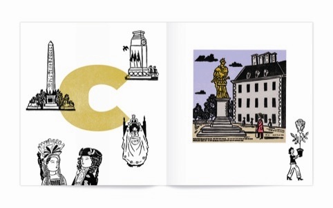
It seems the Olympic spirit seeped into a wealth of wonderful self-initiated projects throughout 2012, many of which celebrated the inclusive spirit that engulfed even the most curmudgeonly over the summer. We loved the Random Postcard Project, which launched in January, which saw typography group Random Project invite member of the public to submit postcard designs relating to a randomly-assigned word relating to either 2012, London or the Olympics. Another London-based print project that caught our eye was the wonderful Alphabet of London book, by illustrator Christopher Brown, showing some gorgeous lino-printed images celebrating the city he loves.
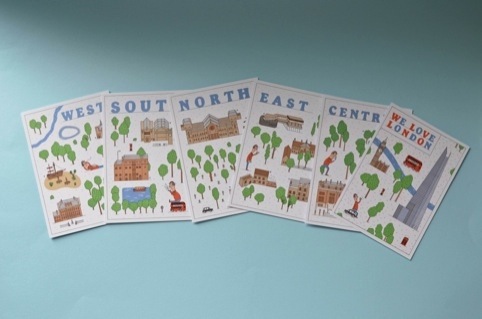
Brown’s sentiments were echoed in Anorak Press’ charming We Love London postcard guides for families, illustrated by Jay Wright and written by Anorak founding editor Cathy Olmedillas.
Design Studio took a more minimalist approach in its London 2012-themed prints, which took cues from ‘the purity and strong visual identity of the Olympic medals’, according to the consultancy.
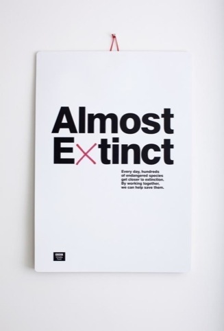
It was an environment-based print project that scooped The Chase the Print Communications prize at the Design Week Awards this year, with its brilliant calendar-based campaign for the BBC Wildlife Fund. The calendar was sent out with a red pen, letting users cross out a different species of animal every day, highlighting the issue of extinction. Other very strong projects on the shortlist included Magpie Studio’s Imagine campaign for paper manufacturer Robert Horne and Mark’s poster campaign for Virgin Unite and Australian homelessness organisation Oasis Youth Services Network.
More nicely designed compassion followed, with the Fallon-initiated We Are Family poster project, which tasked another 30 designers to create a poster to the brief ‘bikes and family,’ which were sold to raise money for MacMillan Cancer Support.
In a seemingly busy year for Fallon, the consultancy was also behind the great bookmark-style ‘zine Dog Ear. Looking to create something ‘short and to the point’, Fallon came up with a 10-sided publication that fits easily within the pages of a book, packed with tiny illustrations, poems, and epigrams.
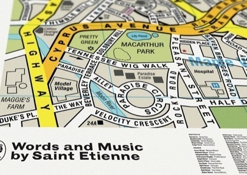
The Best Art Vinyl show, which opened last month, proved 2012 was a great year for record sleeve design. One of the stand-out sleeves was consultancy Dorothy’s Song Map artwork for the cover of Saint Etienne’s album Words and Music. Dorothy created an updated map for the band using its song titles, and with a layout based on the streets of Croydon, where the band grew up.
The year was rounded-off with a rather special D&AD Annual cover – or covers – with 50 designers tasked with each creating a different cover for the book, marking the organisation’s 50thbirthday. The project was project was art-directed by Michael Johnson and outgoing D&AD president Rosie Arnold, and designers and artists that created the covers include Quentin Blake, Richard Seymour, Paula Scher and Neville Brody.

David Azurdia, creative director, Magpie Studio
‘It’s not so much a single piece of work that’s illuminated my graphic design world this year, as a growing movement towards craftsmanship in the industry. Exemplified by practitioners like Here Design and MadeThought, whose work is typically original, non-iterative and refreshing. It’s been our experience that the best results go hand in hand with longstanding client relationships, where the value of craft and attention to detail has been well established. Look no further than Here’s work with The Balvenie, or Design Miami from MadeThought. Keep up the good work.’

-
Post a comment


