Designing the Obama campaign
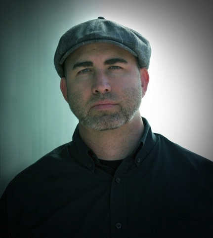
After designing ‘non-official’ art and graphics to support Barack Obama’s 2008 presidential campaign, Josh Higgins joined the re-election campaign permanently in September 2011 to become design director.
Higgins left his position as creative director at California based ad agency Departure to head up the Obama For America team, comprising 21 designers, who he hand-picked.
Speaking from Chicago, Higgins gives his first interview since Obama’s victory last week and talks to Design Week about designing a winning campaign, the changing role of art and graphics, and the ‘lack of creativity’ from an opposition which ‘copied’ ideas.
Design Week: In 2008 Obama’s first campaign had already inherited an identity created by Sol Sender, who was commissioned by Chicago-based consultancy, Mode in 2006. To what extent were you involved at this time?
Josh Higgins: I was involved but not in an official capacity. I was working with different artists to make posters and raise money. There was another gentleman that had my job. His name is Scott Thomas and he was the design director [of Obama’s campaign] in 2008.
DW: In your unofficial capacity what were you trying to achieve in 2008?
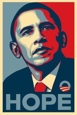
JH: There was a huge grassroots campaign outside the official campaign. I’d never been really involved in politics in any way and I saw what Shepard Fairey was doing with the [Progress] poster and a friend of mine named Raphael Lopez from the same town that I am [San Diego] – he’s Latino – said we should do a poster to target Latinos, so he and I and several other people worked on a poster. The campaign was called Voz Unida. He designed and illustrated the poster and I created a website. We had a bunch of people donate what they could, we printed thousands of posters and shipped them out around the country.

DW: In 2012, how had the landscape changed, and how did you address the design challenges now that you were working for Obama?
The landscape changed in a couple of ways, firstly the design aesthetic of 2012 was different to what was happening in 2008, and secondly Barrack Obama was our president, so some of the things that you could do in 2008 when he was running you couldn’t do now. There is always a very fine line between pushing the visual language of the campaign and also being able to represent the president in a sophisticated way. I think we did a really good job in capturing what Barack Obama stands for, which is progression, and also his role as president.
DW: In 2008 The Voz Unida poster was one of ten unofficial posters to be selected, officially, and used as a fundraising tool – the Art for Obama initiative. The unofficial work was impacting on the official campaign in 2008, but in 2012 you were on the other side of the fence. Presumably your approach was completely different?
JH: We were pretty successful in trying to bring in some of that grassroots feel. Before I came out here and was offered the position I did quite a bit of research on presidential candidates – and at that time all the different Republican candidates were running for nomination. The graphic design they were doing was all very much the same; everything has always been very much the same – dark blue and reds. It all felt very stale to me and that’s not what Barack Obama stands for – whether that was in an official or un-official design capacity – he always seemed very different to anybody else, so my goal was to represent that. I chose very different shades then anybody else was using – they’re a lot brighter.

DW: How much involvement does Obama himself have on the design of his campaign?
I don’t think he really does. Any senior staff were part of the bigger decisions, I don’t think he was directly involved at all.
DW: In terms of the strategy did you look to connect with voters in the 2012 campaign? Was there any research undertaken, or did you look for feedback?
JH: There was never any direct research on the design itself as far as colours and the look. We just went with our gut. There was some polling on messaging obviously but that was not part of my team.
DW: Now the dust has settled on the election itself, can you tell us what you thought of the Republican competition in design terms?
JH: I just thought it was lacking and there’s a lot of duplication. A lot of the things we saw in their work were very similar to what we were doing; it just seemed that there was no clear direction on the other side. It seemed like it was just rehashing what we were doing.

DW: Can you give any examples?
JH: Well every time our homepage changed theirs changed. Also the type foundry we used in 2008 and 2012 is Hoefler & Frere-Jones. We used Gotham & Sentinel as primary typefaces for campaign branding. Gotham was also used in 2008 and Sentinel was added for 2012. Romney used different typefaces – though the styles were similar – but the same foundry. They had copied things from us all the way from our bumper sticker through to T-shirts and at one point we think they had copied and pasted text from our website. I just think there was a lack of creativity from them.
DW: How much influence do you think the design of the 2012 Obama campaign has had in his victory?
JH: I don’t think that there’s any direct way to measure that. I think everything as a whole – media placement, strategies from senior staff, and definitely the people on the ground knocking on doors getting people to vote made up the victory for sure, but I think if there hadn’t been good design… there were big shoes to fill from 2008 and if those shoes hadn’t have been filled that would have been a big negative because people were expecting us to fully push design as part of the strategy for the campaign.
DW: In our pre-election analysis of both Republican and Democrat brands, one observation that was made by Michael Bierut at Pentagram was about the difference between the 2008 and 2012 elections. He said compared to four years ago, social networks – which played a big part last time – are this time in his words ‘design neutral.’ What he means is in 2008 there was lots of graphic expressions bouncing around, like the Shepard Fairey poster, and the one you worked on with Lopez, but this time it was about language, catchphrases and hashtags. Is that fair?
JH: I think that is fair. In 2008 it was a completely different landscape politically and Shepard’s poster was very influential to a lot of people and it really encouraged and inspired other artists to do similar things. This time around the focus of the campaign wasn’t to try to recreate that. What happened with all the graphics online in 2008 was organic, that happened on its own. And so there was never an effort on the campaign chart this year to recreate that. The pure focus was to reflect the president. If more graphics were being designed that would have been fine but it was never a focus to try and get that to happen. We did do a couple of poster projects over the campaign and there was the 30 Reasons campaign this year. Michael Bierut actually did a poster for that campaign which went live in the last 30 days and there was a poster released every day. We did quite a bit of art on behalf of the president but I don’t think it got the same coverage as in 2008.
DW: What do you think were the key elements of the 2012 campaign?
JH: I think the Forward phrase was definitely the key element, the different colour palette was big, and the typography. There was lot of attention paid to the campaign and whether in literature or online it was always first and foremost how the type looked and what type we were using. I think that the attention to design was a huge differentiation between this campaign and our opponents’. A lot of innovations that were happening this time around were on a back-end perspective from our website. Our website was completely responsive, which means it was built to be viewed on a phone first, and I think we’ll see the majority of websites start to go in that direction. And that’s something we did right after we launched the website in 2011.
DW: What are you most proud of?
JH: The team, who are so talented. They didn’t answer any job ads. They were hand-picked and it showed.
Read this next

-
Post a comment


