Facts Are Sacred – a defence of data-journalism
‘Data’, says Guardian editor-in-chief Alan Rusbridger, ‘is at its core little more than a term for the aggregation of facts.’

For such a simple and seemingly intuitive concept, data-journalism has always been a surpisingly controversial field, raising hackles among graphic designers and journalists alike.
Derided as ‘coffee-table graphics’ by its critics, and questioned by some journalists (possibly threatened by its growing ubiquity?) who ask ‘What is data journalism? Is it journalism to publish a raw database?’

New book Facts Are Sacred, by Guardian news and Datablog editor Simon Rogers, one of the leading proponents of data-journalism, presents the case for the field, and its importance to today’s media.
As Rogers points out, the concept of data journalism is hardly new. William Playfair’s 1786 Atlas of Graphs and Florence Nightingale’s famous Crimean War death-rate graphs are presented as the forerunners of today’s Wikileaks and Iraq War graphics.
What has changed? ‘Now we have spreadsheets and files formatted for computers,’ says Rogers, ‘Which means we can make the computers ask the questions.’

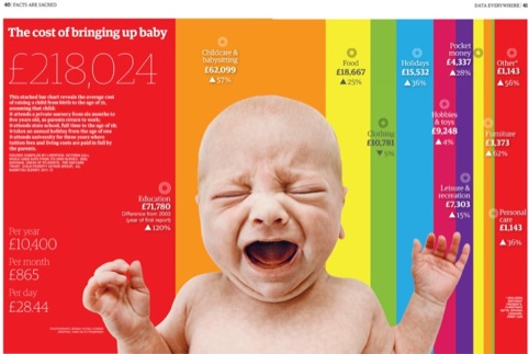
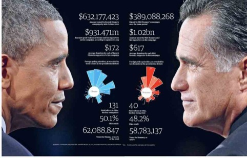
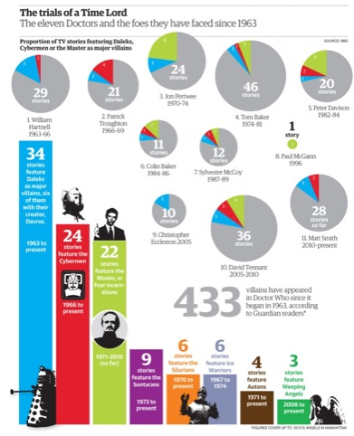
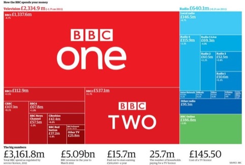
These same computers can also be used to present data in engaging and beautiful ways – with tools like Google Fusion Tables, Wordle charts and graphic maps all explored in the book.
That isn’t to say Rogers isn’t a strong proponent of design. He touches on the Newsnight barney between Neville Brody and data evangelist David McCandless from a couple of years ago, and presents Alberto Antoniazzi’s rather brilliant skewering of ‘most popular infographics you can find around the web’.

Rogers says, ‘Good design still really matters. Something like our guide to the senior civil service, or who knows what in the News of the World hacking affair work because they’re designed not by machine but by humans who understand the issues involved.’
It is here that Rogers touches upon the main fear, and main defence of data-journalism. Like all forms of journalism, it only works when managed by people who understand – and are responsible about – the stories they are reporting. Distilling vast amounts of data in a beautiful and easily understandable chart is pointless and potentially mendacious if that information is either worthless or false.
In Facts Are Sacred, Rogers presents a compelling case for data journalism, but rather modestly fails to address the key factor in its success or failure – journalists like himself.

Facts Are Sacred, by Simon Rogers, is published by Faber and Faber on 1 April, priced at £20.


The two biggest issues with data journalism, I believe, are 1) which data receives the greatest emphasis (bias); and 2) the fact that we remember information presented visually better than the written word. Tie those together, and you have a recipe for rapidly spreading bad information. As a graphic designer, sometimes called on to present information graphically (we call it “information design”), I also must carefully examine what information to emphasize, and ask whether I am being sufficiently objective to serve my audience. I look forward to reading the book.