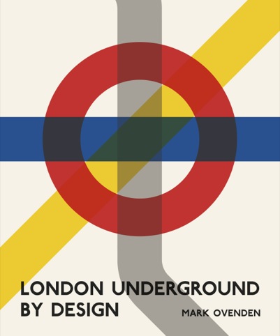
London Underground By Design
With the London Underground in its sesquicentennial (150th) year, we’ve already seen celebratory and commemorative design gestures including stamps and coins.
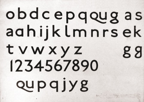
And now new book London Underground by Design is distilling 150 years of Tube design by telling the stories of people like Frank Pick, commercial manager for the Underground from 1912, who worked with a ‘design fit for purpose’ philosophy in mind and commissioned typographer Edward Johnston to create a new letterform.
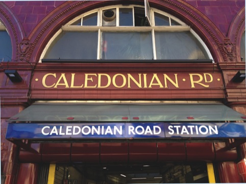
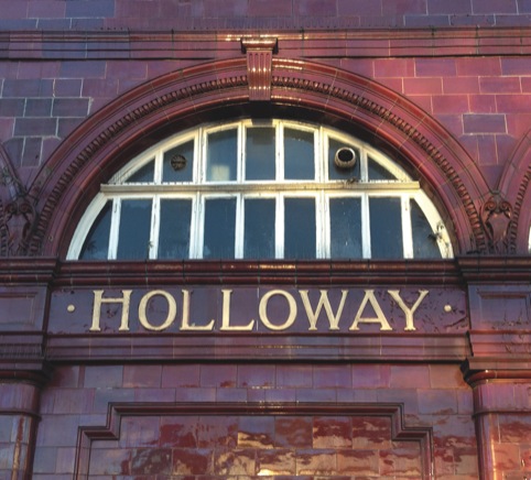
Other notable characters include Leslie William Green, a young architect commissioned in 1903, who designed and oversaw the construction of some 50 surface buildings in three years, and created interiors in a distinctive arts and crafts style.
Harry Beck is of course commended for his 1931 reinvention of the Tube map, which saw the equalization of station spacing and the use of horizontal, vertical and 45° lines.
Meanwhile, when new trains rolled out in 1938 it was Marion Dorn whose leaf or ‘Colindale’ design was upholstered on seats in the now ubiquitous moquette.
If ever we were to look in one place for exemplars of architecture, interiors, branding, typeface design, map design, textile, posters, and signage it would be the Underground.
Here are two excerpts taken from the book that document the Tube’s design development:
Corporate Identity Trials 1906-8
The importance of [Leslie William] Green’s contribution to an overall unified style for the Underground is often overlooked. It was not simply a question of some nice architecture and pretty tiling; his pioneering wayfinding work permeated every step of the passengers’ journey. On entering the station they would find the ticket hall filled with colour. About 1.5m from the floor a vibrant green dado rail with a leaf motif ran around the room , the wall beneath it covered in dappled green tiles. At intervals were the beautiful ticket windows (inspired by those first seen on the CLR in 1900) with the words ‘IN’ and ‘OUT’ set in relief on tiles either side (in an exotic condensed version of Green’s letterform) and ‘TICKETS’ (in a letterform much like those of the direction signs) curved overhead, with letters also in relief. The words ‘BOOK HERE’ were also displayed in a separate panel and the lettering was consistent with that used for other signage. The window shape and lettering were echoed at platform level in the ‘WAY OUT’/‘NO EXIT’ cartouches (installed later and not at every Green station. Even the air vent above each lift had a stylish wrought –iron grille featuring flamboyant Art Noveau emblems. This reflected Green’s desire to project the desire of linking everything up, from the entrance to the platform, and to improve the passengers’ experience. The only downside was that the styling could not easily be retro-fitted to older stations and that it did not incorporate the new collective name Underground.
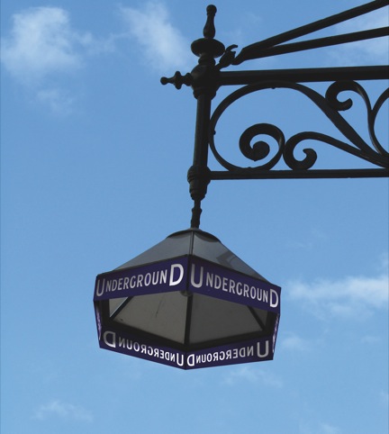
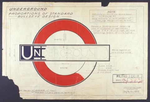
Edward Johnston’s Standard Ring, 1919-22
[Edward] Johnston’s bar (using his own typeface) and the new ring as opposed to solid red disc) – now collectively known as the ‘roundel’ – were printed on map covers for the first time in June 1919. By October, post-war print restrictions had been lifted and the ring was printed in red for the first time. The new design included the replacement of the somewhat clunky dashes above and below the middle letters by what Johnston termed ‘ribbons’ separated by ‘chevrons’. This decoration remained on the logo until 1939/40. Johnston was not satisfied with his first attempt, however, and in 1920 he modified the ring, enlarging its diameter so that it was more in proportion with the length of the bar. Only the enlarged U and D now projected over the edge of the ring, giving a more balanced feel. The modified roundel was first seen on a 1921 map cover and just as the general bus logo influenced the Underground roundel, so the wheel turned full circle and Johnston designed the bus logo as part of the ‘Combie’ family. He also designed the logos for the Tramways and Green line coaches.
London Underground by Design, by Mark Ovenden, is published by Penguin on 31 January priced at £20.
Read this next

-
Post a comment


