Obama and Romney: A case of identity
Following our analysis of the US presidential campaigns we asked Interbrand’s New York office to give an insight into the design of President Obama and Mitt Romney’s brands. Interbrand New York’s design director Forest Young and editorial, IQ, and associate director of verbal identity Peter Cenedella share their views:

The Obama Identity
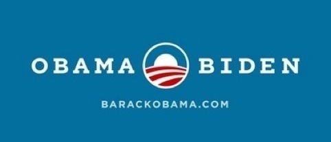
Inherent in the Obama “O” logo is the architecture of a timeless emblem. In 2008, the rising sun over the amber fields signaled the promise of a new day. The American flag, a flat and traditional patriotic signal, was transformed into a dimensional and visionary landscape, one that seemed to invite the viewer (the citizen) to enter, to participate. Sol Sender and his design team deftly anticipated the need for a compelling visual shorthand for “Hope and Change”, one that embodied the collective desire for optimism and political renewal. The heliocentric disk was a rendering that focused on the allegorical and the mythological so as not to inhibit the political vision or saddle it with the symbolic baggage of any one identifiable platform or discernable ideology. The logo was elastic, reworking the most basic elements of American national iconography in a way that accommodated all visions of a better future, and welcomed newcomers to the political discourse.
The Obama logo still conjures up a myriad of intertextual echoes: the generosity of spirit of Saul Bass’ United Way mark; the optimistic dawn of the Carbonfund.org identity; the crop rows of the Bank of America mark; and surprisingly, the graphic potency and colorspace of Elvis Presley’s Follow That Dream label from 1999.
As a visual expression of the “Hope and Change” message, the Obama logo was malleable enough that audiences could find what they wanted to in the brand platform. But this very broad, open-ended messaging platform was bound to create a conundrum for the brand come reelection time, and 2012 has not been easy. The main reason is familiar to most brand managers: a sense of broken brand promises.
If the messaging and identity of 2008 created a widely-held expectation for a radically transformative presidency, now in 2012, “FORWARD” anticipates the possible sense of broken promises and implicitly makes the case that the only way to realize the promises of 2008 is to continue on the present course. This approach accommodates positive and negative messaging polarities, notably implying a regression in a lapse of loyalty to the Obama brand.
This also helps to augment the political emblem by placing the onus on voters to share in the responsibility of realizing Obama’s promise. Within the campaign toolkit of this election year, the Obama logo can be seen embedded in the counter of the “0” in 2012 and the “O” in “FORWARD”, and working as a visual avatar, changing form factors for the DNC, incorporating a vibrantly silhouetted gathering that exudes a spirit of cooperation and community. For this election, Obama commissioned type designers Hoefler & Frere-Jones to create a proprietary slab serif cut of the typeface Gotham, made famous by its memorable moment in 2008 political history, now tailored to suit the emboldened incumbent.

The Romney Identity
Romney’s often criticized “triple R” identity recalls the lyrical buoyancy of the toothpaste in the Aquafresh logo, with its red, white, and blue tri-line that tapers to a point, and the like-minded “triple R” identity for German shoe brand Romika. The graphic potency of the “R” in Romney is offset by the old style serif typeface Trajan Bold, designed in 1989 by Carol Twombly. This is intentionally imperial and aims to position Romney as the legitimate heir to the presidency. While the “O” logo focuses on Obama’s vision for the country, Romney’s campaign identity focuses on the man — appealing to his proven strengths and credentials as a business leader, perhaps better suited to rescue the country from the throes of a recession than a seemingly failed if visionary incumbent.
The campaign tagline “Believe In America” is often locked up with the wordmark, which is displayed on a white field. This is in contrast to Obama’s visual expression which is frequently reversed out of a shade of Bleu de France. While Romney’s mark doesn’t appear to “over-promise” as the dawn of a new day, it also does not resonate as a world changing emblem or provide a collective canvas upon which anyone can imagine a better tomorrow. Its strength—and its weakness—is its sense of being an empty vessel, a simulacrum upon which audiences may project what they see fit.
A deeper dive, however, reveals the underlying negativity of the seemingly positive polarity in the message. The implied “I” that opens the “Believe in America” message may be taken as the candidate, or as the audience. In this way the warmth and humanity of belief is undercut by the baggage of the critique against Obama: that he does not believe in America, that he is an “other,” nonwhite, lacking a legitimate birth certificate, and perhaps a nonbeliever in any number of ways.
-
Post a comment


