Praline designs Polpo cookbook
Praline has designed the first cookbook for Venetian restaurant Polpo, which opened in London’s Soho in 2009.
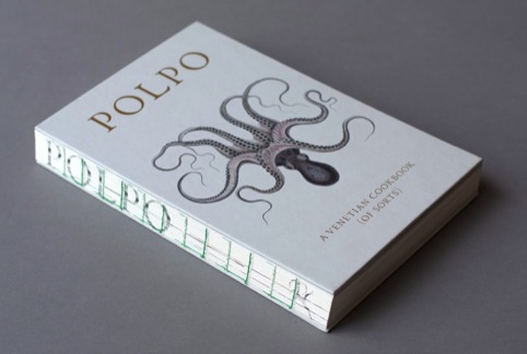
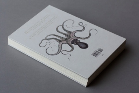
The consultancy researched old Venetian books and typography, before developing a design with a stripped-away spine, which uses the Venetian typeface – but only type sizes that would have existed in letterpress printing.
In place of a spine, the book’s binding is revealed – with stitching in bright green. Praline says the decision to remove the spine was also a practical one, as it allows the book to be laid out flat in the kitchen.
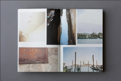
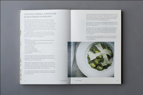
The book also features matt gold on the cover, and photography from Jenny Zarins is used throughout.
Praline creative director David Tanguy says, ‘We wanted to create a book which felt at the same time old and contemporary, capturing both the spirit of the real Venice and the unfussy charm of Polpo and its location in London’s Soho.’
Polpo founder Russell Norman, who also worked on the restaurant designs, says, ‘Just as the restaurants are stripped back and raw, so too is the design of the book with the spine ripped away to reveal green stitching.’
Praline was appointed to the project having previously worked with publisher Bloomsbury.
The Polpo cookbook is published by Bloomsbury on 5 July.
Read this next


Congratulations to Praline on their design for the Polpo cookbook. I reviewed the book and found myself not only praising the content but falling in love with the design, photography, practicality and sheer delight of handling the book. Great work.
Great book! I immediately fell in love with it the moment i laid my eyes on it. simple and very tasteful recipes.. very delicious!!