Wolff Olins creates new USA Today branding
Wolff Olins’ New York office has created new branding for American news giant USA Today.

Marking the multi-platform news and information brand’s 30th birthday, the redesign has seen the implementation of a new logo, new editorial design for the newspaper and a new design across all the USA Today digital platforms.
Work on the new branding and strategy began about a year ago, according to Wolff Olins. The consultancy says, ‘The brand was looking dated. And internally, the pressures of navigating the changing media landscape had led to a fractured brand and a lack of consistent vision for the future.’
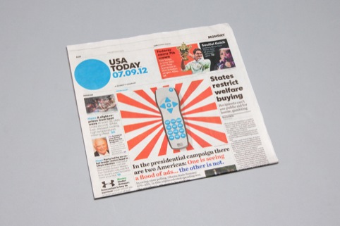
USA Today says the new logo is ‘designed to reflect the pulse of the nation and be as dynamic as the news itself’. The colour of the logo corresponds to different sections within the publication, with a photograph or image that represents the day’s key news stories.
The new editorial designs for the flagship USA Today printed newspaper aim to give a ‘unique modern’ feel for readers and advertiser, using more colour, photographic imagery and infographics. Sections including the States and Weather pages have been visually enhanced, with increased coverage on the Tech and Travel sections
The digital platforms will also use stronger imagery, with larger pictures, live video coverage, interactive weather mapping and user-controls that allow readers to control how they wish to follow the news.
Maryam Banikarim, chief marketing officer of media company Gannett, which owns USA Today, says ‘The re-imagination of the USA Today logo is a great signal to the marketplace. It’s a signal of all the changes that are happening here – of our new digital products, our new re-designed paper and a re-imagination of our content across all platforms.’
Read this next


Hardly “dynamic” it’s a circle… Looks a bit lost for a masthead….
Wow – Wolff Olins delivers…
As one of Wolff Olins biggest fans for many years I have to say that this breaks away from the spirit and energy of Wolff Olins work to date. It disappoints me because as much as I’m sure it’s application is creative and adaptive it’s still a circle and just a circle. In it’s most basic, isolated form it lacks distinction, memorability, energy and personality which all Wolff Olins work has had. Maybe in American visual culture this will be a breath of fresh air amongst an inherently fanfare style media landscape. Who knows but either way it’s not a WO classic 🙁
wow…. i bet they gave them the whole 360 degree blurb to sell it in!! A CIRCLE… never could of thought of that..
Wow
Get together with Creatives
Bemuse clients with ‘design jargon’
=Profit
Utter rubbish from Wolf Olins
Outstanding design, an absolute gem, flawless
Well done
Don’t be too harsh. I’m sure the client discounted the Playschool square and the triangle options.
If design is meant to inspire… then as a designer, this inspires me to quit.
@John Raf… Brilliant! A useless/meaningless blot of colour
This is what happens when you oversimplify — it loses all personality — it’s just a circle. The best circle-only logo I’ve seen is for Planet Green, created by Open. For that client, a green circle is perfect (and the type is more interesting).
Simple and concise.
The use of a circle to frame images associated with the relevant newspaper section (not shown in these images) has been used many times before but it works.
The new design will stand out from the boring traditional paper layouts. I can’t see why others find this simplicity offensive.
To get up one day a with the aim of claiming a simple blue circle as your global brand image is nothing short of genuis.
Have any of you dissenters ever managed to do such a thing?
Looks like a free paper !
It reminds me what Arnell design did with Tropicana brand .
Welcome to the generic design that destroy every history of the brand !
Really not liking it !
I’m always one for simplicity, and always try to distil things down to the very essence of the brand, but the results should be memorable, in proportion, and beautiful.
Sadly, I fear that this is none of these.
More examples over at Brand New:
http://www.underconsideration.com/brandnew/archives/usa_today_for_tomorrow.php
I like it. Granted it could work for just about anything, but as I’m not familiar with USA Today’s previous brand imagery, am relieved by the absence of stars, stripes and American eagles, scrolls of paper and engravings of presidents.
No doubt the readership is international as are the topics covered so it makes sense to come up with something which acts as a signpost, a target, a large bullet point, or the (blue) planet Earth. You can read into it what you want. Maybe USA Today consider the editorial content to be more important than an all singing all dancing mast-head. Perhaps the readership are intelligent and don’t need anything more. Wolff Olins have created an elegantly simple solution. You don’t always have to shout to be heard.
Would love to have heard the pitch how they sold it to them!
From the coorporate perspective it kind of works but its a lazy effort, I mean; any one whom has posted a comment about the logo can do this with thier eyes closed. wink wink