A new look for the city of Minsk
London-based place branding consultancy INSTID has created a new identity for Belorussian capital Minsk, which it is hoping to roll out across the city.
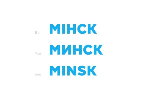
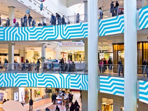
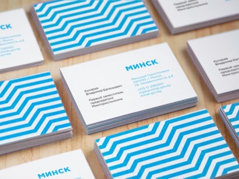
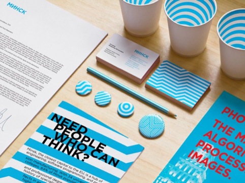
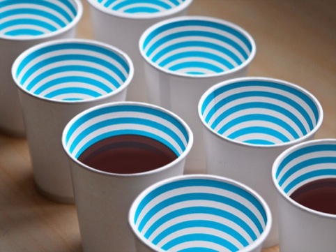
Developed for the Minsk Tourist Information Centre, the branding is based around a flexible series of light blue lines, rather than a graphic device.
INSTID, which specialises in place branding and has offices in London and Moscow, was appointed to the work in July 2012 following a tender process.
Dr Natasha Grand, head of research at INSTID, says, ‘Despite being a national capital and a city of considerable size (a population of nearly 2 million) Minsk lacked a clear identity.’
INSTID was asked to develop a new look which would attract foreign investment and visitors as well as helping residents feel proud of Minsk.

Grand says, ‘Given the lack of any common symbols for the city we decided against a fixed decorative symbol.’

INSTID describes the new look as a ‘visual style platform’. Grand says ‘We designated alternating blue and white stripes of equal width as the key and only imperative for the city visuals and opened them to the Minsk residents, businesses and public bodies to interpret and use.’
Grand says the branding was developed around the core idea of ‘Think Minsk’ and inspired by elements such as the city’s user-friendly layout and developing software programming, engineering and manufacturing industries.

She says the graphic style is already being used by some local corporations, including software developer EPAM, while a series of souvenirs based on the style is set to launch next month.
INSTID is also developing a brand book for Minsk, which it will hand over in July.


Read this next


I wonder how this clever graphic identity would play out in urban signage and wayfinding? And/or placemaking, gateway, or public art elements? How far does the city plan to extend the identity?
Pat Knapp
SEGD
http://www.segd.org