A new look for the Whitney – a ‘responsive W’
Dutch consultancy Experimental Jetset has created a new identity for the Whitney Museum of American Art in New York, which is based around the concept of ‘a responsive W’.
Video:
The Whitney is set to move in 2015 to a new building, designed by architect Renzo Piano, and tasked Experimental Jetset with developing a new identity to replace the previous word mark, designed by Pentagram’s Abbott Miller.
Source: Jens Mortensen
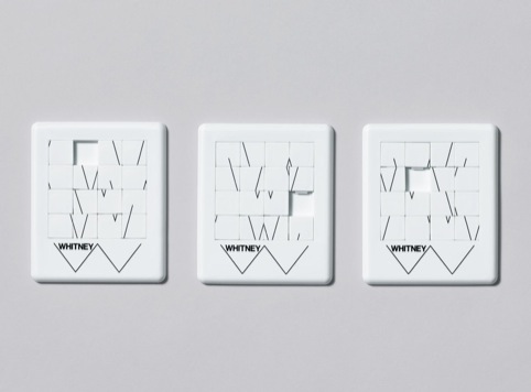
Whitney game
Experimental Jetset says the W mark can also be read as showing a pulse – ‘the heartbeat of New York’ – as well as representing and institution that is open and closed and looks to the past and future.
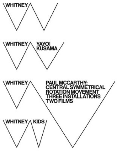
It is also representative, the consultancy says, of the Whitney’s non-linear approach to art history – and the industrial architecture of the new Whitney building.
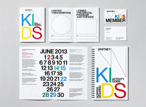
Experimental Jetset says it also had to develop an identity that would work with the Whitney’s ‘single image’ approach to publicising exhibitions – in which reproductions of artworks are used as the main way to represent upcoming shows.
Source: Jens Mortensen
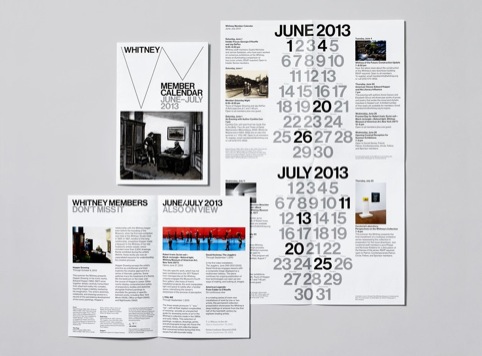
Whitney printed material
The consultancy says, ‘We did try to convince the Whitney of a fully typographical (“text only”) approach. When we didn’t succeed in that, we proposed a “multi-image” approach.
‘However, this proposal was rejected as well. In other words, we had to find a way to deal with the “single-image” approach – and we’d better make it our own.’
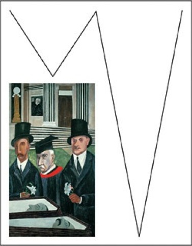
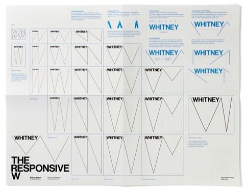
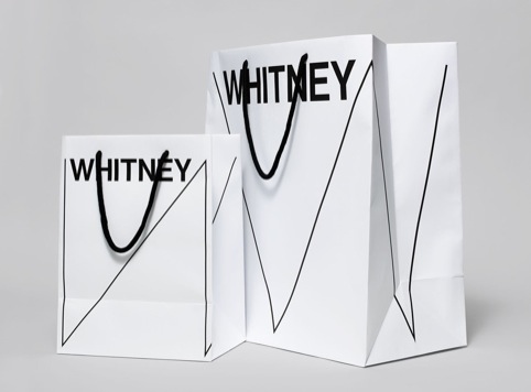
In response, Experimental Jetset developed the idea of a ‘responsive W’ which can fit into the space left behind when images of certain artworks, in their original proportions, are represented on printed matter, which comes with its own dimensions.
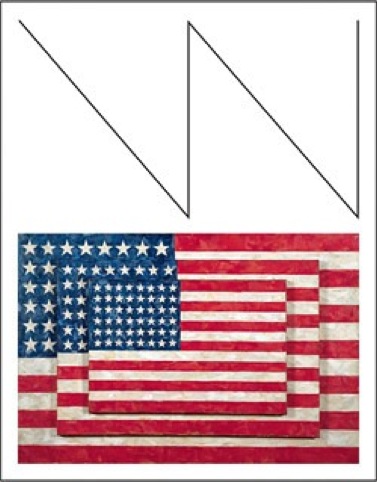
The consultancy says, ‘The image we had in our heads was pretty much that of a carpenter’s “folding ruler”: the letter W as a set of four sticks or rods that can be folded (or unfolded) to fit any context).
‘By representing the institute as a line drawing, whose shape is dicated by the (shape of) the artwork, the implication is that art comes first and the institute follows.’
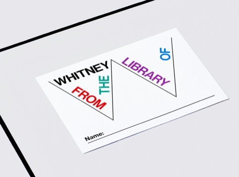
Experimental Jetset says the W can also be used as ‘a flexible typographic grid’ and filled with copy or images to represent different artists or exhibitions.
Source: Jens Mortensen
Whitney card
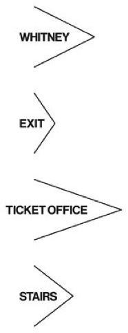
Experimental Jetset also developed a signage system which can be based on the flexible W.
The new identity uses Neue Haas Grotesk, which was recently redrawn by New York-based Christian Schwartz. Experimental Jetset says, ‘in our view, NHG has a sharpness that is typical for NYC.’
Source: Jens Mortensen
Whitney kids material
Experimental Jetset has handed the identity system over to the Whitney in-house design team, who will work on print applications, while Linked by Air will work on the website and Entro will develop the signage system.
Source: Jens Mortensen
Whitney bags
Read this next


I like the new W.
Do you think they designed a responsive A, a responsive N and a responsive K to go with it?
Comment of the day Rob 🙂
The logo’s a bit too WEAK, and also looks like N’s and V’s. Why do we so often see Museums not brand themselves as strongly as they could/should?