Everton FC unveils new crest
• UPDATE: Following online protests from Everton fans about the new crest, the club has announced that it will consult with supporters to develop a new badge for the 2014/15 season. You can read Everton FC’s statement in full here: www.evertonfc.com.

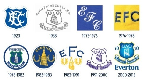
Premiership football club Everton has unveiled a new club crest, which has been designed by its in-house graphics team.
The new crest replaces an incumbent one, which has been in place for 13 years and ‘was often misrepresented, suffering regularly from the omission of key elements like our name and our year of formation,’ the club says.
On the new design the Everton Tower, (Prince Rupert’s Tower) has been redrawn, and two laurel wreaths – the Olympian sign for success – have ben dropped along with the club’s Latin motto ‘Nil Satis Nisi Optimum’.
The wreaths have been replaced by the club’s formation date (1878) within the shield, and the club’s name has also been brought into the shield.
Project Manager, Jim Fantozzi says, ‘The outgoing version of the crest is often misrepresented. You see it being used in the media with the Everton name removed or the 1878 taken away. Beyond that, the complexity of the crest made it difficult to reproduce for certain print, broadcast and digital media.’
Nigel Payne, creative manager at Everton, says, balancing the elements and making them work within the logo as a whole ‘rather than as individual pieces that could be stripped away or used incorrectly’ has been key.
To this end the tower has been redrawn to appear modernised and simplified, but in a way that bears a stronger resemblance to the actual building, the club says.
Similarly the shield has been redrawn to better hold the elements and the font modernised to give more prominence.
Everton says it consulted its fans, and commercial partners – which include Kitbag and Nike – parties whose ‘input and ideas were fed into the design process,’ according to the club, which also says it spoke to ‘branding experts.’
‘We researched our history, we reviewed the evolution of our crest and we benchmarked against other major sporting brands,’ says the club.
The process began in autumn 2012 and included a period of consultation on the Everton fans official forum, according to the club.
The Latin motto Nil Satis Nisi Optimum will still be used in applied branding, like here by the dug-out, and Everton says, ‘It will remain highly visible throughout the Club – in physical form around the stadium and training ground.’
However, some fans have dubbed the crest change ‘embarrassing’, and criticised the decision to drop the wreathes and Latin motto. A petition calling on Everton to drop the rebrand has so far attracted more than 21 000 signatories.
Read this next

-
Post a comment


