RNLI launches new look
Missouri Creative has created new branding for the Royal National Lifeboat Institution (RNLI), creating a look ‘inspired by the RNLI world’.
The consultancy was briefed to create a more consistent visual language for the charity’s materials ‘which would reflect the RNLI’s unique brand personality’, according to Missouri Creative.
The RNLI logo has not been changed, though the brand guidelines detail new colours, photography and typography to be used across the charity’s marketing and brand communications.
Stuart Wood, creative partner at Misssouri Creative, says, ‘Our solution has been to develop a language where all creative is based around three key values of the RNLI’s tone of voice – Active, Personal and Reliable.
‘These three parts can then be toned up and down according to message, mood, channel and audience – using different balances of colour, typography and imagery’.
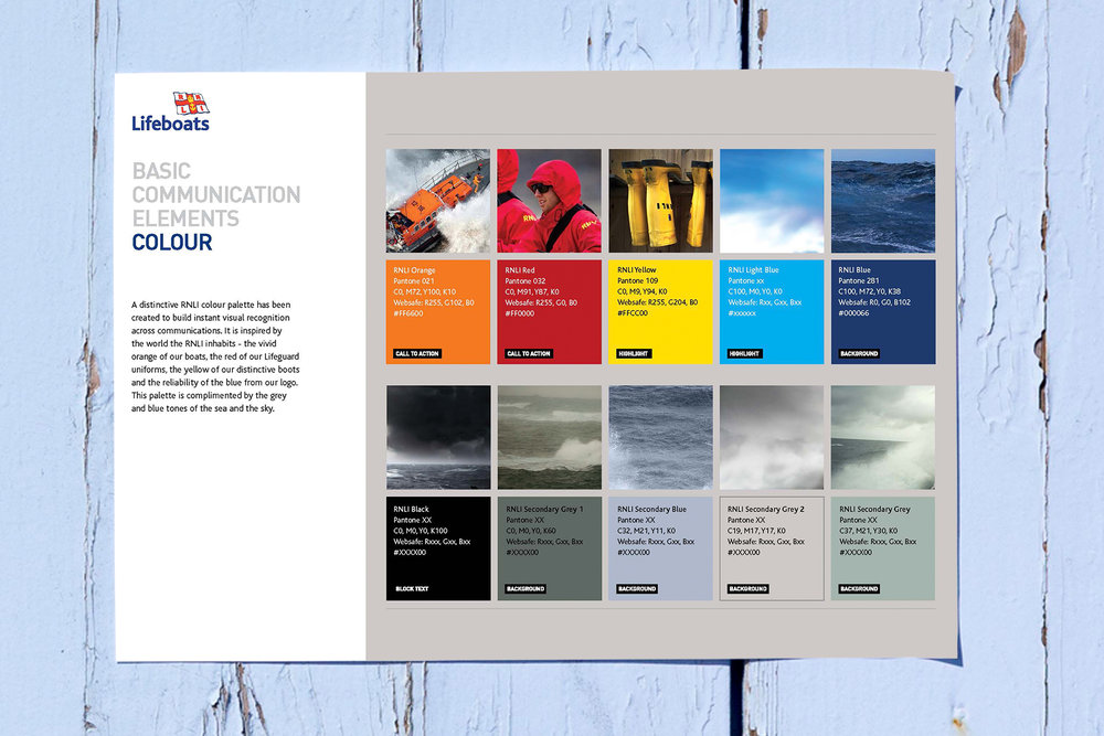
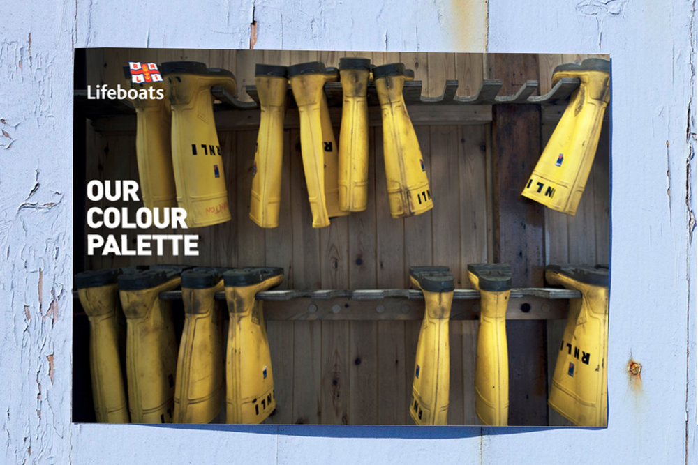
The new colour palette draws on the ‘vivid orange’ of the RNLI boats, red lifeguard uniforms, yellow boots worn by RNLI staff at sea and the incumbent logo’s blue. Grey and other blue tones are used, too, referencing the sea and the sky.

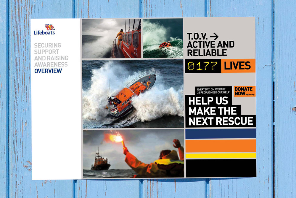
The new visual identity is accompanied with a new copywriting style, which can be modified depending on the target audience of the communications.
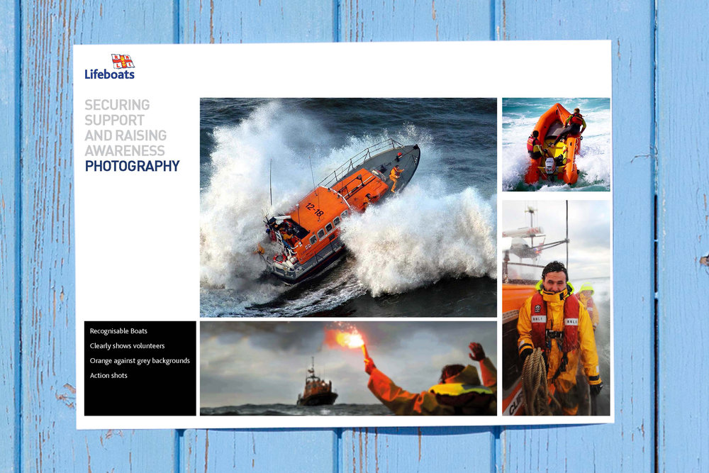
‘If we’re targeting an audience that isn’t likely to know much about the RNLI, we’ll dial up the active tone with bold, punchy copylines, action-packed photos and vibrant colours’, says Wood.
‘But when talking to loyal supporters, the emphasis will be more on the RNLI’s personal and reliable side – using more familiar copy, combined with photos and colours drawn from the more reflective end of our colour palette.’
The new guidelines will now be used to inform a redesign of the packaging for RNLI products sold through the charity’s online shop, mail order catalogue and network of 140 high street shops.


So much thought gone into this- it’s really wonderful to see and read.