Philips launches new identity
Dutch technology company Philips is rolling out a new identity and brand positioning, which it says is centred on ‘innovation and people’.

The new identity has been developed by the Philips design team, working with partners including Interbrand, Ogilvy and OneVoice, and follows a social media campaign in which Philips revealed an element of the new identity piece-by-piece.
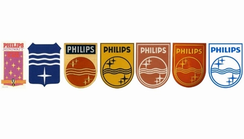
The new positioning uses the strapline ‘innovation and you’ and Philips is also launching a reworked version of its ‘shield’ logo – first used in 1934 – which a spokesman says ‘will start to play a bit more of a role’ in the company’s branding.

Philips says the redesigned shield will play an important role ‘as brands increasingly require emotional icons as part of their identity system’.
The new brand positioning, the company says, ‘is rooted in Philips’ strong belief that innovation is only meaningful if it is based on a deep understanding of people’s needs and desires’.
http://www.youtube.com/watch?v=0eVo9CpHEs8
Philips will continue to use its blue wordmark, which it says ‘remains true to its legacy, rooted in its early years at the beginning of the 20th century’.
The company says the new shield has been ‘modernised for use in the digital age, while retaining its heritage of stars and waves’.

It says the ‘stark symmetry’ of the previous shield design has been ‘replaced with curvier lines in the waves and in the top edge of the emblem’.
Philips adds, ‘With two thicker and softer waves and solid fill, the shield was made to look more robust, visually impactful and easier to apply on digital platforms.’
The company is also launching a new ‘digital storytelling platform’ which will showcase a range of Philips innovations such as the Philips Hue personal wireless lighting system.
Read this next


Interesting use of the term: ‘New Identity’.
It took three companies working together to create this ‘New Identity’.
~Nice!
You forgot to show us a pic of the new identity.
Oh, you don’t mean that’s it? It hasn’t changed at all.
Okay, thanks for adding more pics today.
I still think the shield logo is actually rendered useless against the strong word mark. You don’t need two logos on the same bit of communication.
I do like the stars being used in the headlines though. Now there’s emotion with it’s twinkle factor. And I like the curvature evoking the shape of the star. Surely more could have been done here to capitalise on this asset as there is still recognition of the Philips stars.
The shield, you can drop I’m afraid. It just looks old fashioned and a bit of a funny shaver icon of old.
from three lines to two lines. full colour, better shield and more sparkling. Subtle but great update!
innovation and you….hmmmm. sounds like a brand line from a japanese or korean consumer electronics company like LG, Toshiba etc. , which is exactly what Philips is trying to get away from. Well, I’m sure the agencies and consultants involved are all smiles…
I might rip that off for a tennis club logo I’m doing.