What’s your favourite animal-based logo?
A new book draws together Animal Logos. What’s your favourite animal-based logo and why?
Video:

‘There are so many great examples of animals used in brand identities – the fox for Hadfields by Wolff Olins springs to mind as an early example of animal-based branding with (ahem) legs. But one that stands out for me is the Toblerone bear. Hidden in the famous peak of the Matterhorn, the bear – the symbol for Bern, Toblerone’s place of origin – isn’t immediately obvious, but once you see it you’ll never forget it. An iconic piece of branding for an iconic product.’
Jamie Ellul, creative director, Supple Studio
Source: Believe Creative

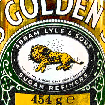
‘It falls between logo and packaging design, but it’s a stunning example of both. Lyles Golden Syrup and Black Treacle tins both feature a lion. A dead lion, surrounded by what look to be flies. The design dates from 1884 and is based on the biblical story of Samson, who killed the lion, only to return to it and find bees had built a honeycomb inside it – those flies are in fact bees. Can bees build a honeycomb in a dead lion? How does this help sell syrup? Who knows, but I can only surmise that Abram Lyle must have been on a mighty sugar rush when he came up with it, because it’s truly weird. It’s a piece of design familiar to everyone, stuck in our minds like the tins are stuck to our kitchen shelves, but it’s not till you start looking that you see the macabre truth. No doubt related in some form to the Toblerone Bear, in that once you see it, you can’t not see it. Like the FedEx arrow, but a lot older. Golden syrup – not so sweet after all.’
Noel Lyons, partner, Kent Lyons

‘I recall having a similar conversation with a group of designers about their favourite logo out of Puma, Jaguar and Slazenger. I think Puma was always top (cat) logo. This feels like a bit of a confession, a guilty pleasure. My favourite animal-based logo is not a cat, it’s a dog. The black K9 of Danish discount supermarket Netto. I think it’s a Minicher Schnauzer holding a woven basket in it’s mouth. I like it so much because it has never failed to make me smile, every time I have seen it! I am not too keen on the colour palette though, yellow and black always looks like a hazard.’
Mr Gresty, designer
Video:

‘I think I’d go for MGM studio. As a child, nothing was more thrilling than sitting in a dark cinema and seeing the studio’s motto – “art for art’s sake” – emblazoned in Latin. All the best classic films were MGM. Hearing that lion roar at the beginning of a film takes me back to the simpler days of choosing a video in your local blockbuster and of course rewinding the cassette at the end.’
Lizzie Mary Cullen, illustrator
Source: Martin Burns

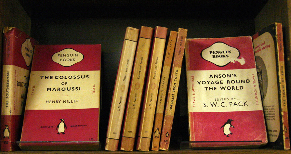
‘I’m guessing I can’t have the Playboy Bunny as my answer for two consecutive Voxpop questions, and I probably shouldn’t say Pudsey Bear as a shameless plug for our ping pong bat auction to raise money for BBC Children in Need (although I think I just did, but it is for a good cause so please forgive me). But for me I would say a sign of a truly successful logo is that it can stand the test of time and be as relevant today as it was a long time ago. And with that in mind the Penguin Books logo is almost the same now as it was in its first few iterations over 70 years ago. Not bad for an old bird…’
Algy Batten, partner, Fivefootsix
Read this next


As a car man, I’d have to go with Ferrari. The Cavellin Rampante (Prancing Horse) is simple, elegant and beautifully effective.
Created to honour the heroics of a mother’s son, the yellow of Modenaand of course the green, red and white of Italy.
In it’s whole it signifies so much, and deconstructed to show this proud Stubbs like horse, it’s able to convey everything the Ferrari marque stands for…power, beauty, mistque and elegance.
Perfection.