Lance Wyman: “It’s important to remember that you don’t know everything”
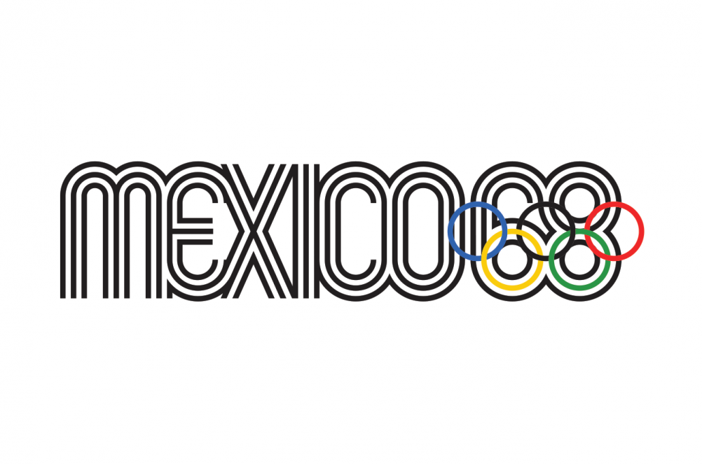
This month, acclaimed graphic designer Lance Wyman, most famous for his Mexico ’68 Olympic logo, held an exhibition of his work at the Sheffield Institute of Arts Gallery.
We speak to the skilled iconographer about the power of pictures, the importance of sketching, and why designers should work on more public-facing projects.

“I’d like to see graphic design become more of a profession that gets out in the streets,” says Lance Wyman. “It’s always been very strong in publishing and advertising, and corporations have learnt how to use it – but we have a bigger part to play as designers.”
Wyman, renowned designer of such iconography as the Mexico ’68 Olympic logo, is a strong believer that design should be engrained into every day life so that it not only communicates aesthetically, but also makes people’s lives easier.


Having completed more than 140 visual identity projects over a 50-year career, the 78-year-old New York-based designer has done his fair share of corporate work – from Volkswagen branding to that of nightclubs and I.T. companies. But alongside these, he’s created universal design systems used day-in day-out by people from all over the world, which use the power of imagery to break down language barriers.
A strong believer that a picture – or pictogram, more specifically – can tell 1,000 words, Wyman put this idea into action by designing metro map systems in Mexico City (1968) then later Washington D.C. (1971) that used icons rather than words.


This idea was maverick for the 1960s, and not instantly well-received in Mexico. “People would say things like, ‘Why do you want to use icons? Do you want people to think we’re a bunch of illiterates?’,” says Wyman. “But the point was, if you were coming from China, you wouldn’t understand Spanish – you could tell your friend to meet you at the ‘duck station’ instead. It wasn’t an easy sell back then, but I knew it was important because of the Olympic experience.”
But unclear images can be just as confusing as words in a foreign language – which is why icons need to be “legible and identifiable” to communicate effectively, says Wyman.
“Imagery can be dumb, just as words can,” says Wyman. “The difference is that as long as the icon is identifiable, you’ll have a system that doesn’t rely on language – that’s a big plus.”
He says he’s drawn inspiration from figures such as the late John Follis, a founding father of wayfinding design and signage, the late Paul Rand, who “brought graphic design to the corporate world” through brands such as IBM and ABC, and Margaret Calvert – creator of “some of the best out-on-the-street designs that have ever been done”.

And while the Mexico ’68 Olympics logo was one of the most notable of Wyman’s career, he appreciates the permanence that comes from creating whole city systems, compared to how fleeting events graphics can be. “All the effort that goes into developing the identity elements and wayfinding strategy, it all disappears,” he says. “I thought it would be great to do something that didn’t disappear – that’s when the Mexico City metro gave me that opportunity, and I’ve been doing projects like that ever since.”
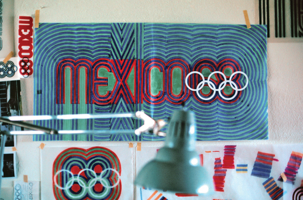
It’s no surprise that Wyman wants his work to last when he spends so much time developing his ideas – his Olympic logo was formulated after a “lot of research into the early cultures of Mexico”, with trips to the country’s Museum of Anthropology. His advice to young designers is to always explore the culture you’re trying to convey.
“I grew up in New York and we didn’t learn much about Latin America back then, so it was a discovery,” says Wyman. “I’ve always told my students ‘Don’t overlook the obvious’. Every part of every city has its history – it’s very important to remember that you don’t know everything. In Mexico, all of a sudden I found what I needed to know.”
Shapes derived from Mexican artefacts were used alongside experimentation with geometry to incorporate the year ‘68’ and the Olympic five rings, forming the final visual identity.

“My quest is to get through many layers of communication through fairly simple forms,” says Wyman. “I usually start with a concept, a way of expressing whatever the idea wants to be, then I start sketching.”
“Nowadays, I then go straight to a computer and go through variations in a very refined way, before reaching a final vector image,” he adds. “Before, it took time, cutting variations in film or drawing them in ink – but the final result is usually always the same.”
It’s this process of development that Wyman thinks is key to creating meaningful design. This month, the designer opened an exhibition at Sheffield’s Institute of Arts Gallery, which showcases not only his final work, but also the rough sketches, drawings and logbooks that enabled him to get there.
“I want to show that you start with sketches, and wind up with a refined result – but something has to happen in-between,” says Wyman. “If I can help young designers realise their concept is important, and that they shouldn’t get snowed by all the bells and whistles of technology or popular styles, I’ll feel like I’ve been successful.”
This connected way of working has enabled Wyman to recreate many previous projects in new forms. He cites one of his most memorable and rewarding projects to date working on the visual identity for a university museum in Tlatelolco in Mexico. The icon, which reincarnates the Olympic Mexico ’68 logo alongside a dove symbol, serves as a memorial to the Tlatelolco massacre, which saw hundreds of students and civilians killed by military in the same year as the Olympics.

Mexico City, Mexico, 2014
“The identity goes full circle,” says Wyman. “I developed the identity for the Olympics, students used those graphics for anti-government demonstrations, which was in many ways disastrous, and now I’ve used them again as a memorial. There’s a human quality involved – it’s very powerful, and it’s a rewarding experience to be part of something like that in a positive way.”
Although well into his eighth decade, Wyman’s work is not done creating powerful design for the people. Currently working on projects including a map for the National Gallery in Washington D.C., and an entire city signage system for Mexico City that will no doubt incorporate the designer’s previous work, it seems appropriate to ask how the designer continues to find inspiration and creativity.
“It’s kind of built in,” says Wyman. “With the trademarks of iconography, you’re almost forced to do something unique. It’s stimulating, the problem solving is endless.”
And there’s nothing more motivating than knowing your work has had an effect on people’s lives. “Getting out on the streets keeps it interesting because you see people living with it,” he says. “I get emails from people who grew up in Washington and Mexico City talking about icons they like at certain stations – you can’t do better than that.”


And Lance is an Industrial Design graduate of Pratt Institute, not Graphic Design. It must be an amazing feeling to realize that you have created work that will never go out of style. Groundbreaking and unique and always fresh. I am sorry to have to miss this exhibit.