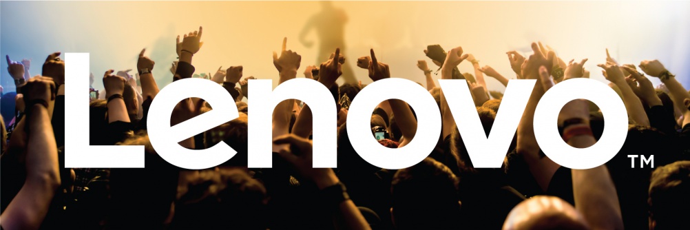
Lenovo launches “bold and disruptive” new identity
The Chinese tech company describes its new identity as “digital- first and dynamic”.

Chinese tech company Lenovo has launched a new identity, which it describes as “dynamic, bold and disruptive”.
Lenovo says the rebrand marks “the culmination of Lenovo’s decade-long multifaceted transformation”, as well as the ten-year anniversary of Lenovo’s acquisition of IBM’s personal computer business.
The new look was unveiled at Lenovo’s Tech World event in Beijing. It was developed by DLKW Lowe, according to Lenovo.
The new identity is a wordmark with a slanted “e”. The mark can be used with different colours and backgrounds.

Lenovo’s chief marketing officer for Asia Pacific Nick Reynolds says the identity is based on the brand proposition of “never stand still”.
Reynolds says the design has been created to be “digital-first” and “social-first”.
He adds: “This is not a traditional, static logo. It’s not rigid, it’s not linear and it’s not fixed. It’s dynamic, it’s bold and disruptive.”
“It’s not just about the capital ‘L’ or the font – it’s about the movement and the passion.”

Lenovo also unveiled a series of new products and concepts at the Tech World event, including a dual-screen smartwatch proposal and “smart shoes”, which display the wearer’s mood and track health and fitness data.
-
Post a comment


