Louise Fili on a life in food and design
New York designer Louise Fili has made a career of finding elegant design solutions often influenced by European Modernism and a love affair with food, but when it comes to logos there’s nothing she likes more than “cleaning up other people’s mess”.

The first thing that strikes you about Louise Fili’s work is that it’s in many ways the product of her background as an Italian American.
Specialising in graphic design for restaurants and later food packaging, Fili has become famous for finding elegant design solutions that often draw on the tropes of European Art Deco and Modernism.
Her early memories growing up in New Jersey in the 1950s were her family’s waking thoughts of food and how conversation would quickly turn to “What are we having for dinner tonight?”
Fili’s eponymous studio, set up in 1989 in New York, would inevitably take a foody direction, but her career started in earnest ten years prior to this as art director of Pantheon Books, which began a decade of designing some 2,000 book jackets.
Fili spoke last week at the AdobeMax conference in Los Angeles, where she looked back on a long career and shared her experiences.
While Fili took on “a lot of French restaurants” with her fledgling consultancy she was also balancing this with book projects.
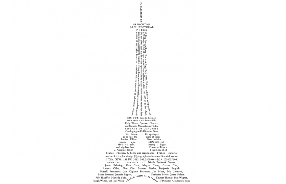
Messing with copyright pages became a pleasing trick, which she brought to many of these after initially encountering incandescent publishers who were “apoplectic and saw it as blasphemy.” Fili persevered and was able to sculpt a cat, a coffee cup, the Eifel Tower and many other symbols out of formulaic and prosaic words.
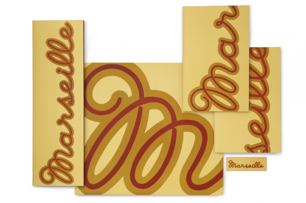
Fili would take countless trips to Europe, particularly to Italy, embarking on personal field trips to help her build up a forensic collection of images of signs, which were then bundled up into ring binders, arranged by city.

This inspiration has influenced her restaurant projects, both directly and indirectly. Sometimes she has found herself poring over them with other designers and interior architects, as was the case with the West Side French restaurant Marseilles. She sketched out the identity before it was turned into a Vector script and finally a neon sign.
Fili’s identity solutions have come in many other forms though and sometimes she’s even had to break her own rules.

The Picholine restaurant identity is “a visual mnemonic” designed in response to the name – a type of French olive – which is “difficult to spell, pronounce and remember.”
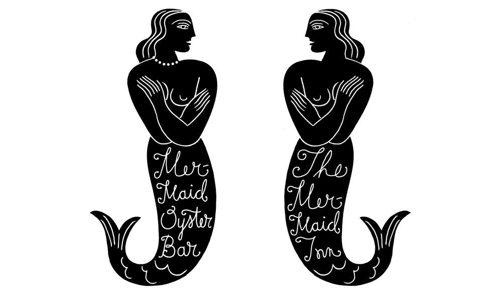
Meanwhile for The Mermaid Inn, “a whimsical restaurant in the style of a seafood shack” Fili broker her rule that “you should never illustrate the title” by doing exactly that.
“It’s the kind of place you might stumble across walking along a beach, although it happened to be located in [New York’s] East Village,” she says. This means there was a need to explain this visually as there was no obvious context. Later The Mermaid Oyster Bar opened, so Fili flipped the Mermaid round and gave her a pearl choker.
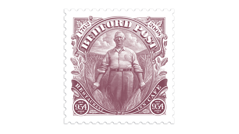
A very different route was taken for Bedford Post, a café, restaurant and inn, owned by actor Richard Gere.
Gere provided a grainy photo of his grandfather, which Fili brought into a stamp concept. “It was really scratchy and grey so needed a lot of work,” she says.
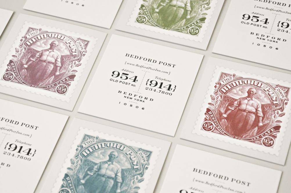
Several colour options were chosen and Gere liked all of them so these were saved for business cards.
Fili has come to work on a lot of food packaging, often clarifying and refreshing existing identities in the process. “Sometimes we change a lot but keep the key elements and sometimes we change everything. But I get enormous satisfaction from cleaning up someone else’s mess. I love logo makeovers.”
She’s worked with a few ice cream brands, admittedly partly fuelled by her love of gelato – and as with free restaurant meals, writing free ice cream into the contracts is another perk. She even serves gelato to clients at her studio and uses it as an icebreaker.
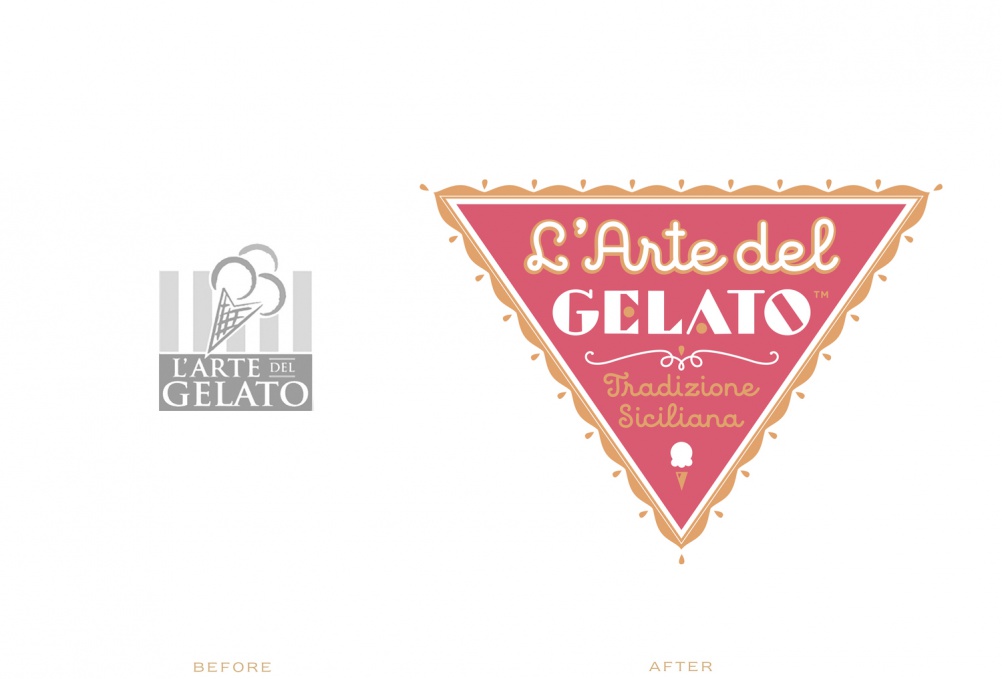
“Most of my clients never give me briefs so I play 20 questions with them. Gelato is a good way to start – It put’s them at ease. I’ll present them ideas and then we discuss. The one they like is usually the one I want them to like.”
A long career and formidable reputation help Fili to politely reinforce her authority if she’s working with a troublesome client. “If they say ‘We’re looking to you for your experience’ I remind them they said that.”
She says she is in a position where she can say no to clients – “If I don’t like the food I won’t do it, or if the product is against the way I want to live my life then I say no, and I also love firing clients.”
Her best tip though is, when meeting clients for the first time, asking, “Who are the decision makers?” “Because if the big boss is too busy, there’s nothing worse than someone below trying to second-guess what their boss wants. In that instance I’d just reschedule the meeting.”
A young designer in the audience asks her, “How do you know when it’s time to raise your rates?”, to which she replies: “It’s always time to raise your rates, even if your clients are crying poverty.”
Much of Fili’s work is appreciated for its timeless quality and asked to think about this she says: “It’s important to look at things from the past and understand why they look better. When you’re working on a computer you have to make things look like they weren’t done on one, otherwise everything ends up looking slightly glib.”
There was advice for those starting their own studio – “Never depend on one type of work or client or wait for the phone to ring,” says Fili, who is an advocate of using any free time to pursue personal projects. “Use personal projects to find your own voice,” she says.
We also get an insight into her working practices. She works with two assistants and there might be up to 25 projects on the go at any one time – although some of these will be dormant – and while a logo project may take her three weeks, a packaging project may take around six weeks.
The assistants are always hired through Twitter. “I figure if they’re already following my work that’s the best place to advertise,” she says.
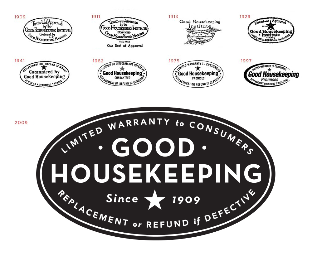
Bar a few exceptions – Tiffany & Co and Good Housekeeping included – Fili prefers to work with smaller companies and won’t get involved with making brand guidelines. “If they ask for them I give them an extortionate price to scare them off.”
Incidentally, she’s married to author and design critic Steven Heller. One curious voice from the crowd asks, “Do you ever give him ideas?” to which she replies, “Sometimes I’ll see things I’ve mentioned to him on his blog. How else is he going to come up with it?”


-
Post a comment


