NB Studio creates a new visual identity for Surname & Surname
NB Studio has created a new identity for Surname & Surname, a division of PR giant Blue Rubicon focused towards consumer-facing brands.
The name Surname & Surname had already been established when Blue Rubicon approached NB Studio at the beginning of the year.
According to NB Studio, the name suggests a tongue-in-cheek, ‘anti-egocentric’ version of the traditional PR agency format.
NB Studio says it made use of this playful element while combining it with an attention to simplicity and rigour.
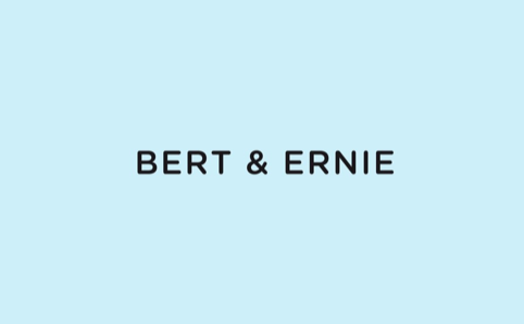
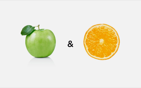
The font, Gotham Rounded, is intersected with an ampersand, a recurring motif that will permeate the messaging and materials of the company.
NB Studio provided Surname & Surname with a visual toolkit designed to emphasise background space, centralised text, a box-orientated organisation of text, and a limited colour palette featuring chalky blue, green and pink.
Nick Finney, creative director at NB Studio says, ‘A lot of other “funky” consultancies for consumer-facing brands seem to focus on loud text, neons, and an overflow of information – with homepages full of puns, jokes, twitter-feeds.
‘It was our challenge to show the successes and creative range of Surname & Surname, whilst maintaining a ‘less is more’ aesthetic. We’ve developed a visual toolkit for them which fits their style of modern, agile creativity.’
The identity was launched on the Surname & Surname website, and will be rolled out across presentation and pitching materials, documentation, business cards and packaging.
Read this next


Nicely done, I like the tongue in cheek nod to the founding partners surnames.
Some of the executions remind me of http://www.gabrieleskelton.com/