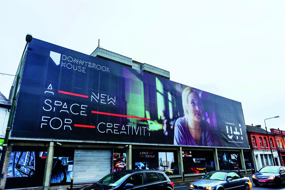
North brands property developer U+I
The new identity is inspired by a trade union motto of “be united and industrious”.

North has created the identity for property developer U+I, which has been formed from a merger between Development Securities and Cathedral Group.
Cathedral Group was acquired by Development Securities in May 2014 and has been operating as a subsidiary since then. Now the two companies are coming together in a new building in Victoria, designed by Coffey Architects with interiors by Ab Rogers Design.
U+I creative director Martyn Evans says the name U+I is inspired by the history of Morden Wharf development in Greenwich.
The site was near the headquarters of the Dock, Wharf, Riverside & General Labourers’ Union, whose motto was “be united and industrious”.
This has been shortened to U+I and can, Evans says, be used in a number of ways. For example, invitations to the company’s launch party feature the phrase “uncork and imbibe”.
Evans says: “We briefed North to create a classic identity that would stand the test of time. It had to be very simple.”
The black-and-white logo features a line that aims to evoke the horizon, with buildings above and foundations below, says Evans.
He adds: “Every one of our developments has its own brand and we need a corporate identity that can sit on top of these and not interfere.
“It has to look good on a crane 100m up in the sky and also at the bottom-right of a website. It has to be versatile and usable.”
Discover more:
• How an old vinyl factory is being turned into a product design incubator


Makes me think of the medical abbreviation for Urinary Tract Infection….
Yup, literally what I came here to say myself. They really should of mum tested this one.
I must admit the first thing I saw was UTI…
For a company where: “…two companies are coming together…” and calling it ‘You & I’ it seems odd to create a logo where the elements are being separated, broken apart and divided.
Yep UTI – Urinary Tract Infection was the first thing that I saw unfortunately, shame as I like it otherwise