Stefanie Posavec on data visualisation – from new book Communication Design
Stefanie Posavec is a US-born designer who moved to London after completing her MA at Central Saint Martins College of Art and Design. After a period working as a cover designer for Penguin Books, she now works freelance on information design, data visualisation, book cover design, and book design. Projects include the MyFry app, OK GO album artwork, Left vs. Right poster (with David McCandless), and a recent Facebook residency as a data artist.
Posavec’s personal work explores data illustration and has been featured in numerous design books and exhibited internationally at sites including the Museum of Modern Art in New York and the Victoria & Albert in London. She regularly speaks about information design at conferences.
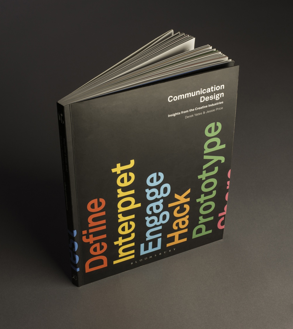
This interview with Posavec is taken from the book Communication Design: Insights from the Creative Industries, by Derek Yates and Jessie Price, which is published by Fairchild Books priced at £26.99 and is available here.
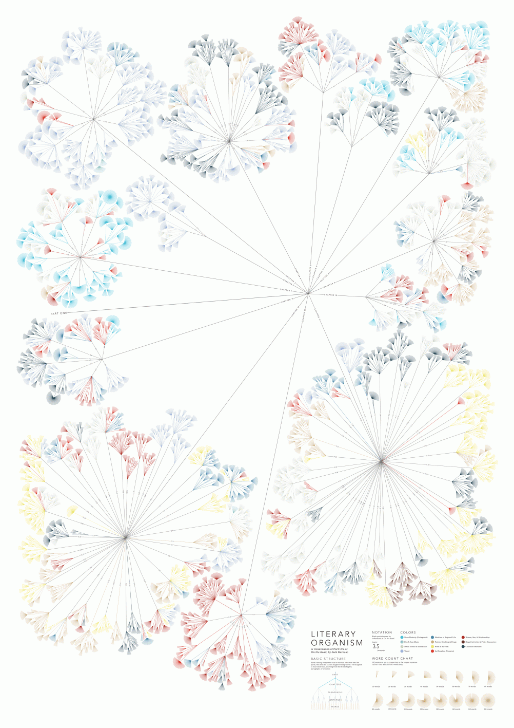
Stefanie Posavec started exploring data visualisation while studying at St. Martins, inspired by another student’s work and an interest in “John Maeda and things that are algorithmic, where you create a set of rules that are used to generate a visual.” She explains that “I wanted to transform something I loved, which was literature, into something visual, which would let people see it from a different angle. I focused on On The Road, because that was a book that I really loved and gathered data from the text in order to visualise it.”
In the end, it was Posavec’s interest in literature, rather than information, that led to her next job, working as a cover designer for Penguin. But when her On The Road project was exhibited a couple of years later and then blogged about, clients started approaching her about data visualisations, opening up a different career path. “It was on Boing Boing, and 50 people in a day emailed me. Digital transmission is helping these small ideas kick around in a way that they couldn’t before.”
When she worked with David McCandless on the Left vs. Right website, Stefanie’s online exposure increased again. She says that McCandless and other data journalists have helped make the field “really populist. People have been doing information design and data representation forever, but I think there was a very particular point where the entire world became interested in it.”

Posavec’s data work tends to be split between “traditional information design, which is more serious, that’s my day job and I don’t necessarily put it in a portfolio” and “the weirder stuff, which feels more illustrative and is often half self- initiated.” Although the illustrative projects tend to be less commercial, she says it’s still the work that clients are interested in. “I think people are buying a way of thinking, so if they hire me for a commercial project they might not get something so arty but they’ll have that sense of ability applied to something very serious.”
Posavec doesn’t code, although she thinks she “needs to learn some basics.” Instead, she works by hand on self-initiated projects, spending “lots of time reading and rereading text and counting words or numbers or just going through subject matter repeatedly until I have all the data in a notebook, and then I use that data to create my graphics.” She says, “I think I need to learn how to access larger datasets, but for me it’s important to go through that marking process, because when I do, the ideas form in my head.” When working with programmers, or data experts, Posavec still needs “to have my hands and my head around the data at some point. Even if I’m not analysing the data, I need the person doing that to tell me the highs and the lows and the ranges, so I can start sketching, and thinking about what something will look like.”
For client work, Posavec is more likely to work with data experts, often working in tandem with a data researcher who “crafts stories, finds the datasets and content for a client, and makes sure everything is truthful and accurate, and then I’m the one [who] shapes that visually.” This kind of data journalism, or statistical storytelling, has a growing market because, as Posavec points out, “that’s the way people understand stories now.”
Talking about her working process, Posavec explains she is guided by her subject matter, both the raw data and the larger concepts: “I’m using the data to create form, so I try to find meaningful data in the subject matter – data that creates interesting patterns and where the pattern has meaning. So even if the main intention of the design work isn’t to show insight but just to be decorative, or communicative, you can still see that there’s a harmony, or something interesting.”
The data shapes the work in numerous, sometimes unexpected, ways. “There’s this process of discovery—you don’t know what shape the data is going to take so there’s always this unexpectedness, this experimentation… It can be really frustrating because data can only take certain forms dictated by the numbers and relationships within the datasets, and clients will ask why something can’t look a particular way, and I have to say because the data is not shaped like that, you just can’t do it.”
Despite those limitations, Posavec still tries “to find ways of communicating with a more intangible feeling about the data, shaping it metaphorically.” For example, “For the OK GO artwork, the album was called Of the Blue Colour of the Sky, and it was based on an old pseudo-scientific text that talked about how blue lights could heal people and mentioned prisms and rainbows and ice and diamonds. So those were the colours and shapes we were trying to use when we made it.”

It’s important to Posavec that her work connects on this more emotional level, as well as to the viewer’s understanding that the pieces are based on meaningful data. “It’s a balancing act. I want the work to appeal to someone [who’s] passing by, but when they learn about what made it, it connects with them on another level, they see that it’s a pattern, data made visual. And if I can, I’ll have an explanation so that if they want to understand what it means they can access that to some degree. Those are three levels that I’m always trying to reconcile.”
Posavec’s diverse portfolio is all about finding new ways for people to experience information, and in the future she is interested in working more with “things that are dynamic. I’d like to design for something that is changing and shifting, rather than flat graphics. Or think about how data can be physical.” She admires projects like Stanford’s Kindred Britain “where there’s a lot of data, and you’re not going to get it instantly,” but the visualisation helps bring the complex connections to life and can tell stories. She says, “I’m interested in how you can communicate information in a way that’s creative or new.”
This interview with Stefanie Posavec is taken from new book Communication Design: Insights from the Creative Industries, by Derek Yates and Jessie Price, which is published by Fairchild Books priced at £26.99 and available here. The book also features interviews with Simon Manchipp from SomeOne, Mat Heinl from Moving Brands, Mills from Ustwo and many more. You can find out more here.
Read this next

-
Post a comment


