“Lager Lovelies” – examining the role of women in 20th century advertising
Graphic designers Sophie Dyer and Maeve Redmond are working with artist Fiona Jardine and curators Panel on an ambitious exhibition, The Persistence of Type, which will explore female character types in 20th-century advertising.
The Glasgow Tramway show focuses on Scottish brands British Caledonian Airways and Tennent’s Lager and how they helped define this archetype.
Redmond, Dyer and Jardine are creating original graphic design, branding and advertising to help tell this story. We caught up with Dyer, Redmond and Jardine to find out more.
Design Week: The exhibition explores female character types in 20th century advertising. What is the story you’re trying to tell or the message you’re hoping to convey?
Sophie Dyer, Maeve Redmond and Fiona Jardine: We’re working with advertising in a few different ways. We looked at the use of the “Lager Lovely” on cans of Tennent’s between 1962 – 1991 as an iteration of the “girl-next-door” archetype, and we’ve looked at certain connections between that and the figure of the air-hostess as a woman working in a more obviously effective role at the same time.
We’ve also looked at the archives of Forth, a pioneering graphic design company that was active in Scotland from 1954 to 1989.
Our research was open-ended and speculative, and we want the exhibition to be the same. Tramway is a venue with a well-established visual art and theatre programme in which graphic design usually plays a supporting role. We’ve used it the primary medium of expression, and we hope we’ve used it to pose questions and create gaps rather than fulfill any functional criteria of legibility.
DW: How have graphic design and visual art influenced and established female character types in 20th century advertising and what is this character type?
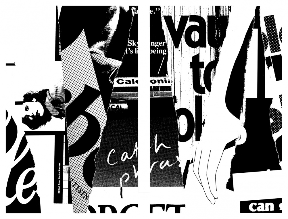
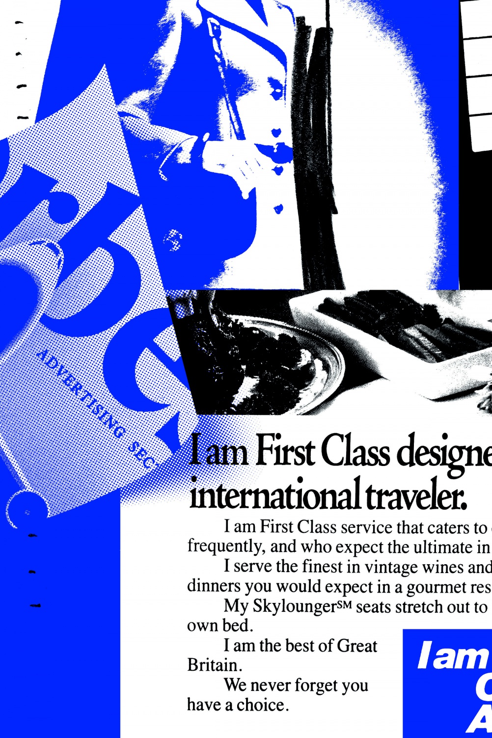
SD, MR & FJ: That’s a very broad question, and Erving Goffman’s seminal study “Gender Advertisements” is a good place to start if you want to begin to answer it. There is no single “type” and dominant character types vary according to context and chronology: they change. We became interested in how corporate bodies and marketing strategies use personal names to suggest and control intimacy. The styling and naming of Tennent’s Lager Lovelies are emblematic in this respect. We also thought about the way that handwriting, pseudo-calligraphic and decorative or “feminine” fonts are used in a humanising and improvisational way. We are interested in how type functions as image and image as type.
![TPOT_Image6[2]](https://s3.eu-central-1.amazonaws.com/centaur-wp/designweek/prod/content/uploads/2015/06/TPOT_Image62-1002x1503.jpg)
DW: Why have you focused on the brands British Caledonian Airways and Tennent’s Lager?
SD, MR & FJ: The Persistence of Type originated in conversations we had in the course of producing another exhibition a couple of years ago, which touched upon the use of general staff – clerks and typists – as amateur models for look-books produced by Barrie Knitwear in Hawick during the 1950s and 60s. When we looked at a promotional film made by the National Association of Woollen Manufacturers, we were struck by a sequence which saw aircrew enjoying time off at a country hotel between flights. That sequence is full of glamour and innuendo, and the interrelationship between women, landscape and was one we formulated into a notion of the picturesque qualities of “runway representatives” like the British Caledonian Girls. “She goes further than you think”, one of the straplines used by BCal in their corporate advertising, says it all really. The association between BCal and Tennent’s came about partly because we were interested in the Scottish graphic and advertising landscape, in beginning to investigate the history of it.
We also perceive a conceptual and material connection between the two industries – brewing and air travel – in general and that centres on the fact that both trade on strong notions of escape. In the period in which we concentrated our research the American carrier National Airlines, which ran a controversial “I’m Cheryl. Fly Me” campaign. It’s a diminutive form of address which is over-familiar to accelerate intimacy between product or service and consumer. Arguably, a full name would have made the model or air hostess too singular – a woman can be individualised, but only so far. The campaigns sought to establish make women generic enough not to be professional (and uncaring) but professional enough to perform tasks associated with effective labour.
DW: You’re exploring the subject through graphic and digital design that you have created. What will people see and experience?
SD, MR & FJ: The main graphic elements in the gallery are five 4-sheet screen-printed posters, two of which are stacked vertically to recreate the height of a billboard. We are also working on an extension of the designs in the gallery; this will be on display on a billboard in Bell Street, Glasgow from 27 July. In the gallery we have information screens showing a simple animation and we’ve produced a free broadsheet to read. There will also be a screening of the short film Catch Phrases, Catch Images: A conversation between Harun Farocki and Vilém Flusser (1986), in which they analyse the front page of the German tabloid, BILD Zeitung. As well as a participating in Mairi McKenzie’s ‘Fashion Cultures’ event later in July with a talk about ‘soft focus’.
DW: Can you tell us about the exhibition design and the performance aspect?
SD, MR & FJ: We want the space to function a bit like a waiting room, or a departure lounge – something between the two. We’ve worked again with Panel – the curatorial team of Lucy McEachan and Catriona Duffy, who extended the initial invitation to work on ‘Barrie Girls’ to us. It’s a collaborative effort on all aspects of exhibition research and development. We’ve commissioned Steff Norwood to design and produce civic-style seating, and Anna McLauchlan, a cultural geographer who has trained in hatha yoga, will repurpose it as a performance space. She’s working on a sequence derived from the timetable of “Ann’s Day”, (one of the Lager Lovely campaigns), and from her interest in brand identities. The exhibition design and performance are central to the show and they are both props in and part of the narratives that we pieced together from the archives, newspapers and photographs in the lead up to the show.
The Persistence of Type runs from 20 June – 9 August at Tramway, 25 Albert Drive, Glasgow, G41 2PE
Read this next

-
Post a comment


