What is your favourite ‘dead’ logo?
Newly updated book Logo RIP is a collection of defunct, outdated and scrapped logos. What is your favourite dead logo and why?

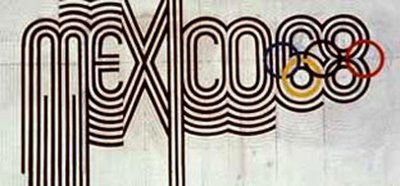
‘Not all logos are designed to last. Sometimes their purpose is to capture the spirit of a specific event or time. My favourite ‘dead’ logo was designed by Lance Wyman for the Mexico Olympics 1968. It was the first to break with what I would call the ‘five rings + something local’ formula. No geographic references, just the spirit of the era. If the Olympics are about sporting progress, this was the equivalent in logo design.’
Gilmar Wendt, principal, Gilmar Wendt & Co

‘An old favourite of mine was Knapp shoes by Chermayeff & Geismer. The simplest of adjustments to the letterform K to make the legs have feet and it does the job perfectly. I remember seeing the logo in an old design book when I was young and laughing at how proud that letter K looked of it’s new shoes. I’ve never had a pair of Knapps but I think I’d be strutting around in them with a big smile on my face.’
Jack Renwick, founder, Jack Renwick Studio


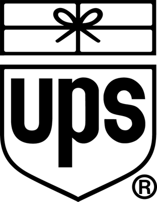
‘I was devastated by the death of Paul Rand’s UPS logo in 2003. Rand must have felt he created an immortal design in 1961, the noble aim of any identity designer. Design Bridge shared this goal with the creation of the Champions League identity in 1992. How can an enduring and memorable identity that captures meaning so clearly, ever be replaced? When an organisation changes, a great idea can become obsolete. Despite the genius of the great Paul Rand, some things were beyond his powers, but his mark is enduring and memorable.’
Asa Cook, creative director, Design Bridge
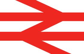
‘I’d like to nominate the British Rail symbol as my all-time favorite dead logo. Originally sketched out on the back of an envelope, and later designed by Gerry Barney at the Design Research Unit, it was commissioned by British Railways as part of a major corporate overhaul and relaunch as British Rail in 1965. Every time I see it, I marvel at it ingenuity, simplicity and it’s perfect relevance to travelling by train. For me, the fact that it’s two things in one – the double arrow, symbolising the directions of travel, and the rail lines, that the arrows sit on, makes it even more special. As a designer, I’ve spent my career searching for ways to distil ideas to their absolute essence, and for ways to make things distinctive and memorable, and the symbol the BR symbol has always been at the back of my mind as a brilliant example of how to do this. Not only was the symbol a brilliant piece of design, but when it launched with a specially commissioned typeface and iconography by Jock Kinneir and Margaret Calvert, the whole design programme was simply stunning. To complement to main BR version, there was a separate version on a blue background, with the double arrows round the wrong way, for Sealink – BR’s ferry network travel by train. I really do miss it like a long lost relative, and every time I travel by train, I still try to search it out, but sadly it’s nowhere to be seen. R.I.P. British Rail.’
James Beveridge, creative director and managing partner, Further Creative
Read this next


Interesting selection, big fan of the British rail logo too.
What about the old Saab logo?
http://image.spreadshirt.com/image-server/image/composition/1820748/view/1/producttypecolor/70/type/png/width/280/height/280/old-saab-logo_design.png
The Britsh leyland logo gets my vote it was the label that was located on some of the worst designed vehicles ever created except of course for the wonderful Mini.
I agree the British Rail logo is one of the all time greats.
It is not entirely dead – it can be seen from time to time as a generic station symbol.