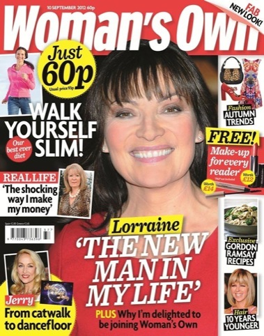
Woman’s Own redesigned in print and online
Weekly magazine Woman’s Own, which celebrates its 80th birthday next month, has been redesigned in print and online.
IPC Connect, the magazine’s publisher, seconded art director Phil Attaway from Style At Home, who worked on the redesign, joining a development team led by Woman’s Own editor Catherine Westwood, who wanted the title to have more focus on fashion, food, beauty content and real-life stories.
Westwood says, ‘The brief was to clean up the colour palette and create strong handwriting, so if a page was torn out you would know that it’s Woman’s Own.
‘A lot of our competitors have become quite homogenised in their look which is quite cartoon-like, so we needed a strong design.’
To this end a new slab serif font has been introduced, alongside a new palette of primary colours including ‘peacock blue,’ cyan and 100 per cent yellow.
In the previous design ‘mustard yellow often clashed with purple so we’ve wiped out mustard yellow,’ says Westwood.
‘We’ve tried not to throw the baby out with the bathwater’ says Westwood who wanted to ‘refine rather then revolutionise’ the design but recognises the magazine hadn’t been redesigned for seven years.
‘We couldn’t for example have acres of white space as we use standard weekly paper stock, which isn’t white. But neither have we made the pages too dense with colour.’
Womansown.co.uk now has a more interactive design so readers can ‘engage with the brand and each other,’ according to publisher IPC Connect which says the site will be ‘mobile optimised’ to offer content on the move.
Read this next

-
Post a comment


