99 years of the Johnston typeface
Next year marks the centenary of the introduction of the Johnston typeface, designed by Edward Johnston as the corporate font for transport in London and still in use today.

The Johnston typeface was first introduced in 1916 and used on the London Underground. Today it is used on signage, London Underground printed material and of course the equally iconic Tube map, designed by Harry Beck. Simon Garfield, author of Just My Type, describes Johnston as “one of the most iconic, enduring and best-loved fonts in the world”.
Edward Johnston was commissioned to develop the typeface by London transport administrator Frank Pick – who would later commission Beck to design the Tube Map.
Source: Alexander Baxevanis
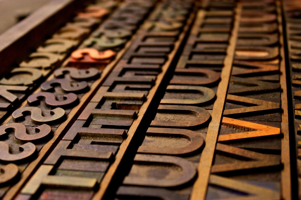
Woodblocks of Johnston type
According to Garfield, Pick briefed Johnston to create a typeface that would “belong unmistakeably to the times in which we lived”. It would be “straightforward and manly” with each letter in the alphabet “a strong and unmistakeable symbol”. Johnston himself says he approached the task with “the austerity of an engineer”.
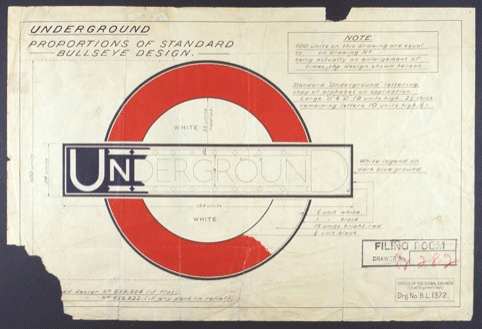
Author David Lawrence – whose book A Logo for London covers both Johnston’s typeface designs and his later designs for the London Underground roundel – says Johnston “ruthlessly discarded the florid typography and gilded heraldry that Victorian engineering had taken up to assert its heritage”.
Johnston initially worked on the typeface with his student Eric Gill – who would later create the Johnston-influenced Gill Sans. According again to Garfield, the initial letters Johnston produced were the capitals B, D, E, N, O and U.
The lower-case “l” with its distinctive upturned boot and the lower-case “I” with its diamond-shaped dot, would come later.

Source: John Keogh
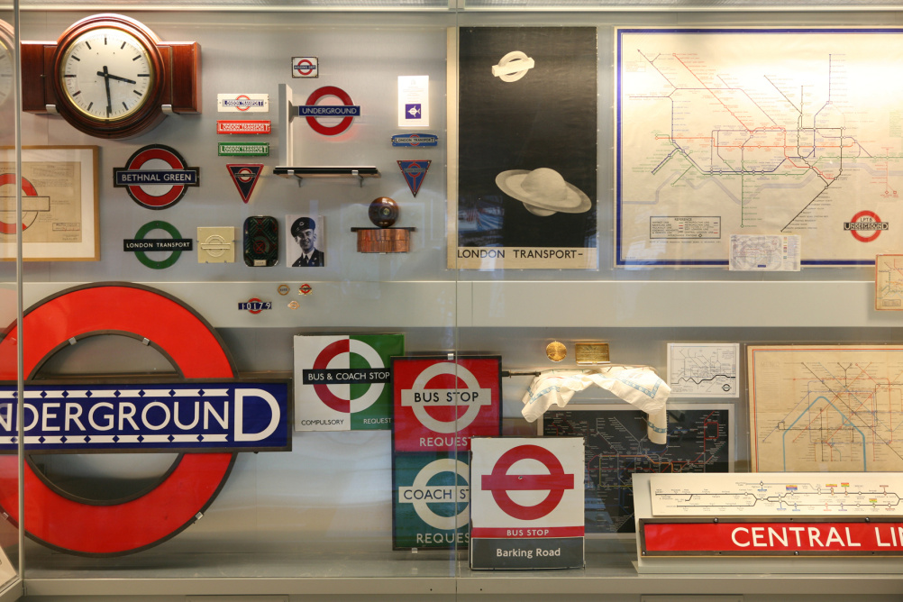
London Underground sign – showing the diamond-dot “i”
Johnston died in 1944 and according to Garfield had expressed regret that his work had been more honoured abroad than at home. He is quoted as saying “This particular design… seems to have made a great impression in parts of Central Europe – where I understand it has given me a reputation which my own country is too practical to recognise.”
Today, the Johnston font is registered to Transport for London and found across the transport network. It has also appeared in wayfinding for the London 2012 Olympics and in overlays on BBC TV show Sherlock.
Ahead of the centenary of the typeface’s introduction, London Transport Museum is hosting a series of guided tours, which will tell the story of what the museum refers to as “designs so strong and adaptable that they now represent the idea of London itself”.
For more information on the London Transport Museum Johnston tours, visit www.ltmuseum.co.uk.


See the excellent article on the (slight) modification LU made for modern use in the article in London Reconnections: http://www.londonreconnections.com/2009/a-typeface-for-the-underground/